SlideShare ist ein Scribd-Unternehmen logo
1 von 23
Downloaden Sie, um offline zu lesen
Lecturer: Rachel Hawkins
VIRTU DESIGN INSTITUTE
WORKING IN DIGITAL DESIGN
VDIS10021
PREPARING FOR
COMPLEX DIGITAL PRINT
VIRTU DESIGN INSTITUTE: WORKING IN DIGITAL DESIGN - VDIS10021 2
CONTENTS: What is digital printing?
The difference between Ink & Toner
What is offset printing?
Develop a relationship with your
printer!
File formats for print
File set up
Finishing: Folding/cutting/knife-
lines/substrates/papers/fabric/
lightbox
Converting RGB to CMYK
Pre-press & Preflight
Soft Proofing & Proofing
VIRTU DESIGN INSTITUTE: WORKING IN DIGITAL DESIGN - VDIS10021 3
What is
Digital
Print?
Digital printing refers to
methods of printing from
a digital-based image
directly to a variety of
media. It usually refers
to professional printing
where small-run jobs from
desktop publishing and
other digital sources are
printed using large-format
and/or high-volume laser
or inkjet printers. Digital
printing has a higher
cost per page than more
traditional offset printing
methods, but this price is
usually offset by avoiding
the cost of all the technical
steps required to make
printing plates. It also allows
for on-demand printing,
short turnaround time, and
even a modification of the
image (variable data) used
for each impression. The
savings in labor and the
ever-increasing capability of
digital presses means that
digital printing is reaching
the point where it can match
or supersede offset printing
technology’s ability to
produce larger print runs of
several thousand sheets at a
low price.
The greatest difference
between digital printing and
traditional methods such
as lithography, flexography,
gravure, or letterpress is that
there is no need to replace
printing plates in digital
printing, whereas in analog
printing the plates are
repeatedly replaced. This
results in quicker turnaround
time and lower cost when
using digital printing, but
typically a loss of some
fine-image detail by most
commercial digital printing
processes. The most
popular methods include
inkjet or laser printers that
deposit pigment or toner
onto a wide variety of
substrates including paper,
photo paper, canvas, glass,
metal, marble, and other
substances.
In many of the processes,
the ink or toner does not
permeate the substrate,
as does conventional ink,
but forms a thin layer on
the surface that may be
additionally adhered to the
substrate by using a fuser
fluid with heat process
(toner) or UV curing process
(ink).
Sourced from: Wikipedia, Aug 14.
http://en.wikipedia.org/wiki/Digital_printing
VIRTU DESIGN INSTITUTE: WORKING IN DIGITAL DESIGN - VDIS10021 4
The
difference
between
Ink &
Toner:
Ink Cartridges:
Ink Cartridges are used in inkjet
printers. The cartridge contains
liquid ink, usually absorbed
in a sponge. When creating a
document, the print head simply
deposits ink wherever it needs to
go on the page. Color cartridges
have three colors in addition to
black and if any of the colors run
out the others are essentially
useless. Most printers can create
black from combining the other
three colors, however.
Many inkjet cartridges do contain
some basic electronics, such as
a chip that communicates with
the printer. It is also possible to
refill ink cartridges using a kit
bought from printer supply stores.
Though the process can be tricky
and doesn’t always produce a
working cartridge, it can also be
significantly cheaper than buying a
completely new one.
Toner Cartridges:
Toner cartridges are used in laser
printers. Instead of liquid ink, they
are filled with a fine powder that
can be magnetically charged.
When printing documents, an
electrically charged drum picks up
the tiny particles and rolls them
onto the page according to the
pattern you printed. A laser then
fuses these particles to the page
with heat.
Some toner cartridges actually
include the drum as part of the
cartridge, meaning that the entire
until has to be replaced. Naturally,
cartridges for these designs are
much more costly. However,
most are simply containers for
the toner powder. While it is
usually more difficult to refill toner
cartridges than inkjets cartridges,
it can still be done with the
right kit. Most users have them
refilled professionally or buy a
replacement.
So what is the difference?
The biggest difference between
ink and toner cartridges is in how
long they last. The typical life of
an inkjet cartridge might be 500
pages, depending on heavily you
printed your pages. Ink cartridges
can also stop working early if the
heads dry out or become clogged.
For that reason, it is critical to use
the printer at least once every
week.
Toner cartridges, on the other
hand, typically last for at least 2,000
pages and cartridges for large laser
printers last even longer. You can
expect to pay for this long shelf
life, however. That points to the
second major difference between
the two types – cost. Some toner
cartridges for rare or older laserjet
printers can be so expensive that
it is nearly cheaper to replace the
printer outright than replace the
toner.
In summary, therefore, the
difference between ink and toner
cartridges is a matter of how you
use your printer. For high volume
printing, laser printers and toner
cartridges provide lower costs
per page and are typically more
reliable under heavy usage. For
home printing where low initial
cost is more important than
the ongoing cost per page, ink
cartridges are usually the best
option. No matter what your
printer, however, you can always
save money when you buy discount
eco friendly printer ink online for 50
to 70% less at Inkpal.
Sourced from: Inkpal, Aug 14.
http://www.inkpal.com/ink-news/what-are-the-
main-differences-between-ink-cartridges-and-
toner-cartridges/
VIRTU DESIGN INSTITUTE: WORKING IN DIGITAL DESIGN - VDIS10021 5
What is
Offset
Print?
Offset printing or web offset printing is
a commonly used printing technique
in which the inked image is transferred
(or “offset”) from a plate to a rubber
blanket, then to the printing surface.
When used in combination with the
lithographic process, which is based
on the repulsion of oil and water,
the offset technique employs a flat
(planographic) image carrier on which
the image to be printed obtains ink
from ink rollers, while the non-printing
area attracts a water-based film (called
“fountain solution”), keeping the non-
printing areas ink-free. The modern
“web” process feeds a large reel of
paper through a large press machine
in several parts, typically for several
metres, which then prints continuously
as the paper is fed through.
History:
Lithography was initially created to be
an inexpensive method of reproducing
artwork. This printing process was
limited to use on flat, porous surfaces
because the printing plates were
produced from limestone. In fact, the
word ‘lithograph’ historically means
“An image from stone.” or “Print from
stone.”
The first rotary offset lithographic
printing press was created in England
and patented in 1875 by Robert
Barclay. This development combined
mid-19th century transfer printing
technologies and Richard March Hoe’s
1843 rotary printing press—a press that
used a metal cylinder instead of a flat
stone. The offset cylinder was covered
with specially treated cardboard that
transferred the printed image from
the stone to the surface of the metal.
Later, the cardboard covering of the
offset cylinder was changed to rubber,
which is still the most commonly used
material.
Offset printing today:
Offset lithography is one of the
most common ways of creating
printed matter. A few of its common
applications include: newspapers,
magazines, brochures, stationery, and
books. Compared to other printing
methods, offset printing is best
suited for economically producing
large volumes of high quality prints
in a manner that requires little
maintenance. Many modern offset
presses use computer to plate systems
as opposed to the older computer to
film work flows, which further increases
their quality.
Advantages of offset printing
compared to other printing methods
include:
• Consistent high image quality. Offset
printing produces sharp and clean
images and type more easily than, for
example, letterpress printing; this is
because the rubber blanket conforms
to the texture of the printing surface.
• Quick and easy production of
printing plates.
• Longer printing plate life than on
direct litho presses because there
is no direct contact between the
plate and the printing surface.
Properly developed plates used with
optimized inks and fountain solution
may achieve run lengths of more
than a million impressions.
• Cost. Offset printing is the cheapest
method for producing high quality
prints in commercial printing
quantities.
A further advantage of offset printing
is the possibility of adjusting the
amount of ink on the fountain roller
with screw keys. Most commonly, a
metal blade controls the amount of ink
transferred from the ink trough to the
fountain roller. By adjusting the screws,
the gap between the blade and the
fountain roller is altered, leading to the
amount of ink applied to the roller to
be increased or decreased in certain
areas. Consequently the density of the
colour in the respective area of the
image is modified. On older machines
the screws are adjusted manually,
but on modern machines the screw
keys are operated electronically by
the printer controlling the machine,
enabling a much more precise result.
Disadvantages of offset printing
compared to other printing methods
include:
• Slightly inferior image quality
compared to rotogravure or
photogravure printing.
• Propensity for anodized aluminum
printing plates to become sensitive
(due to chemical oxidation) and print
in non-image/background areas
when developed plates are not cared
for properly.
• Time and cost associated with
producing plates and printing press
setup. As a result, very small quantity
printing jobs may now use digital
offset machines.
Sourced from: Wikipedia, Aug 14.
http://en.wikipedia.org/wiki/Offset_printing
VIRTU DESIGN INSTITUTE: WORKING IN DIGITAL DESIGN - VDIS10021 6
Develop a
relationship
with your
printer!
Any successful business person with tell
you that networking and good business
relationships are the key to success.
In the case of the Graphic Designer,
a good relationship with your print
providers will give you a competitive
edge as well as making your life a lot
more pleasant.
If you choose a good quality printer (not
the cheapest or online only) the print
specialists will be friendly and happy to
engage with you and your projects. Print
specialists are experts in their field and
have a wealth of knowledge that they
will be happy to share with you. They are
also interested to push the boundaries
and experiment with stock and finishes
so don’t be shy.
Use your printer as a resource for
information. Ask them your questions
and for advice. They will be more than
happy to help you out.
As a student, you have an excuse to not
know much and they will be sympathetic.
Now is the time to learn.
From personal experience I can tell you
that if you have a good relationship with
your printers they will call you if they see
something wrong with your job, they will
call you with more economical options
and they will pay more attention to your
job. They are also more likely to do
you a favor on a tight timeline or when
something does go wrong.
Printers want your experiences with
them to be successful, however every
relationship is double sided. You can
help guarantee a positive relationship
by working with them in deliberate
ways. Here are 8 tips:
1. Make it personal. Find yourself a
print provider you can relate to. Since
your goal is to develop a long-term
business relationship, ask yourself, “Do
I like talking to this person?” Respect
and trust are mandatory. And the less
you know about printing, the more
you need to depend on your printer to
educate you. Find out early on if your
printer can offer customized solutions to
your needs. A good print salesperson
is flexible and accommodating. Pick a
printer who’ll go the extra mile.
2. Keep your printer in the loop. The
earlier the better. The single biggest
mistake that consumers make with their
print jobs is failure to involve the printer
soon enough. Every print job is unique.
The success of your print jobs depends
in large part on your communicating
early and often with your printer. Think
of your printer as a creative partner, not
just a supplier. Communicate timelines
clearly and let them know when the file is
coming.
3. Play fair. Since every job is a custom
job, respect that it can take time to
print something well. Don’t cry wolf and
impose artificial deadlines when in reality
you could wait another day or two. If you
want to develop a good relationship
with your printers, be honest and
straightforward with them.
4. Be specific. Every detail about a print
job affects its price: the format, number
of pages, quantity, inks, paper, folds, and
so on. As a client, it’s your responsibility
to compile these details, called specs,
for the printer. Get the printer to help,
then use these specs to request an
estimate before you send a job to print.
5. Get desktop publishing advice.
How you prepare your files is very, very
important to a printer. The platform of
choice among printers is still the Mac
computer. They expect you to use
the appropriate software. Digital file
preparation is complex, and no two
designers “build” a job alike. Some
printers have their own digital prepress
specialists to clean up your files. This
stage, called preflighting, costs you time
and money.
6. Parlez-vous “printing?” If not, ask
lots of questions. Don’t be intimidated
by “printer-speak.” Printing is highly
technical. Unless you’re used to
dealing with printers, chances are
you’ll find it all a bit intimidating. If you
don’t understand something, ask for
clarification in English. Printers are used
to educating their consumers.
7. Be clear about responsibilities.
Clarify what your role is vs. the printer’s.
I have had a case where the printer did
me a favor and corrected a typo for me.
The proof was sent to me for approval
and I signed it off. I rushed the proof
reading process due to time constraints.
My team and I failed to notice the typo
that the printer had typeset, and we
gave the “OK to print.” When the job
was delivered, we noticed the typo. But
we were responsible -- not the printer.
My signature on the proof gave the
printer a green light to proceed. So, be
clear about who is responsible for what.
Proofreading ranks way up there among
a designers responsibilities.
8. Proof & Proof Again. When you are
proofing you need to look for typos,
alignment, and for anything that is
missing or shouldn’t be there. You are
also looking a image quality and colour
correctness. If you are concerned about
the colour reproduction of the job you
should ask your printer for a printed
colour proof or to be present for a press-
check. You can do this for both digital
and offset printing processes. It is a
good idea to use a proofing checklist.
VIRTU DESIGN INSTITUTE: WORKING IN DIGITAL DESIGN - VDIS10021 7
File
formats
for
print
The best format to send a
finished print ready piece
of art is a flattened PDF.
.PDF (Preferred for most files)
PDF (short for Portable Document
Format) is a file format developed
by Adobe as a means of distributing
compact, platform-independent
documents. PDF captures formatting
information from a variety of desktop
publishing applications, making it
possible to send formatted documents
and have them appear on the recipient’s
monitor or printer as they were
intended.
If you are sending a logo or
special text treatment, an
EPS file is Ideal.
.EPS (Preferred for large signs and
banners)
EPS (short for Encapsulated PostScript)
is a vector format designed for printing
to PostScript printers and image
setters. It is considered the best choice
of graphics format for high resolution
printing of illustrations. EPS files are
created and edited in illustration
programs such as Adobe Illustrator.
Vector graphics are a scalable,
resolution-independent format
composed of individual objects or
shapes. Vector images can be resized
easily without loss of quality making
them an ideal format for initial logo
designs and illustrations to be used in
multiple sizes.
If you are sending artwork
that you need to have
manipulated by a pre-
press specialist before it is
printed, send the raw file.
.PSD, .AI, .INDD (best for files that need
editing by the pre-press specialist)
If you are providing artwork for a
complex job that involves a knifeline,
you may be required to provide the raw
file. This could be the case for product
packaging. In this instance you would
provide a layered Illustrator files with all
fonts outlined and images embedded.
In rare cases, a layered PSD may be
appropriate. The only drawback to a
PSD is the file size. Most likely the file
will need to be written to a disk and
mailed or uploaded to an FTP site.
Therefore if time is a factor you may
need to go with another format so
that it can be e-mailed. If you have an
option when saving your files to send to
a printer try to avoid the JPG format. If
you use the PDF, EPS or PSD formats
your Images will print better and you will
be happier with the results.
VIRTU DESIGN INSTITUTE: WORKING IN DIGITAL DESIGN - VDIS10021 8
File
Setup
To ensure you setup your
file appropriately for print
you need to know what
the end product is going to
look like.
You will need to consider
the shape and size of the
finished print.
You will need to decide the
paper stock to determine
ink weights.
You will need to specify
finishes like spot gloss
varnishes through to
embossing and foiling
options.
InDesign Illustrator
Once you have determined these factors you will be able to determine which software is most applicable to the
layout/configuration of the file... either Indesign or Illustrator.
As a guide, if the file is a single or double sided sheet and has several complex finishes, it will be likely that
Illustrator is the better software. If the file has multiple pages, like a booklet or magazine, no matter how many
finishes, it is better setup in Indesign.
If the print is full bleed (images, types or blocks of colour extend over printed edge) you will need to include
bleed in the file setup.
VIRTU DESIGN INSTITUTE: WORKING IN DIGITAL DESIGN - VDIS10021 9
Finishing is a general term
printers use for anything
that happens to a job after
it’s been printed. That
means things like cutting,
folding, binding, foiling,
embossing, varnishes
and so on are all finishing
processes. Many printers
can handle the most simple
finishing processes in
house. Other more complex
finishes might need to be
outsourced to specialist
print finishing companies.
There are endless types
of varnishes and effects
that can be achieved like
Machine Sealing, Varnishing
(Gloss or Matt), UV
Varnish, Spot UV, Textured
Varnishes, Sparkly varnishes
with metallic flakes, Tinted
varnishes as well as latex for
scratch panels.
All these above mentioned
finishes are required to be
included in specific ways in
your print file so they are
clear to the printer. This is
generally done by putting
the effect on a different
page or layer with nothing
else with it. Speak to
your printer about how to
include the finishing effect
in your file. They can give
you detailed instructions.
There are also endless
opportunities with paper
stocks and printing
substrates like lightbox,
canvas, textiles (Georgette,
vinyl, etc) and self adhesive
vinyls (stickers for cars and
windows. Each of these
requires specialised printing
knowledge and attention
to ink weights to avoid over
saturation.
Die-lines/Knife-lines
- varnishes - other
embellishments:
These are the fun part,
but they still need artwork
to be produced. They are
often not set up correctly,
often the knife line does
not overprint (ie. Leaves
white line underneath);
perforations are marked
as dotted lines on the art,
when there should really
only be indicators instead
of an actual printed line.
Some of these can get a
bit tricky, so the best thing
is to talk to your printer /
pre-press specialist and ask
them how these finishes
should be indicated on the
artwork. The worst thing to
do is to send that urgent file
away with no instructions or
unclear instructions as it will
be printed wrong or take
longer.
Variable data:
Items such as tickets,
scratchies & personalised
letters may have variable
data printed on them.
Wedding invites fit into this
category also. It can be
hard for printers to gather
all the required information
and documents. Be
organised and supply the
printers with an excel sheet
or the database, packaging
InDesign file or illustrator
file and pdf. Give them
example pdfs of what the
finished product should
look like.
Finishing/Folding/
Prototyping:
Prototypes are good,
sometimes absolutely
necessary. Once you have
tried out, how many ways
there are of folding an A4
to a DL you will know why.
For multi page publications
you should do a digital
printed prototype. For
other jobs, especially those
out of the ordinary, you
really need to have a folded
prototype to understand,
how you expect things to
look in the end. Otherwise,
someone will be guessing.
And if it’s that night shift
operator, who wants to get
the job done, chances are
that his idea of which one
should be the back panel
in a brochure might not be
the same as yours. It’s all
important to note that not
each panel will be equal
in size, they may vary by
1-2mm to allow the folded
document to lay flat.
Finishing:
Folding,
cutting,
knifelines,
substrates,
papers,
fabric &
lightbox
VIRTU DESIGN INSTITUTE: WORKING IN DIGITAL DESIGN - VDIS10021 10
Photoshop
There are two ways to convert RGB to CMYK and
vice versa in Photoshop.
1.Open the image file in Photoshop, then go to Edit
> Convert to Profile.
Once there, select your target profile (a copy of
which should be in the [Your Computer] > Library
> ColorSync > Profiles folder, or else it will not
appear in the pulldown menu).
Then select a rendering intent appropriate for
your image (to simplify, Perceptual if the relevant
image colors are out of the target’s gamut,
otherwise Relative Colorimetric). If you select
Relative Colorimetric, it’s also a good idea to
check “Use Black Point Compensation”.
2. Go to Image > Mode > CMYK to convert your
image.
The disadvantage of converting this way is that it
does not offer the degree of control that you have
with Convert to Profile, and limits you instead to
the target space and conversion controls set in
the application’s Color Settings, which may not be
appropriate for your purposes.
Illustrator
Open the file in Illustrator, then go to Edit > Assign
Profile.
Indesign
Open the image file in Photoshop, then go to Edit
> Convert to Profile.
Converting
RGB to
CMYK
It’s best if you do colour
management of images in
Photoshop. All other files should be
colour managed in the software of
origin. For example;
A. Logos developed in Illustrator
should be colour managed in
Illustrator.
B. A multipage book layout
document should be colour
managed in Indesign while its links
are colour managed in the software
of origin (Photoshop & Illustrator).
Be aware that it is possible to see
colors in RGB that you can’t make
with CMYK due to RGB’s larger colour
gamut. For this reason your images
may appear dull after conversion.
Once you have converted the image
to CMYK, you will need to go back
and adjust the colour to the desired
appearance.
VIRTU DESIGN INSTITUTE: WORKING IN DIGITAL DESIGN - VDIS10021 11
Colour:
CMYK vs
Pantone
Spot
Colours
(PMS)
Most printing is basic CMYK
however in some instances you may
choose to print with a spot Pantone
colour to ensure colour consistency
across several items of collateral.
Spot colours are premixed
flat colours and ensure colour
accuracy. CMYK may have slight
variations from print run to print run
depending on the machine and it’s
maintenance. Photos and images
are always printed in CMYK as they
have gradients and variations in the
colour.
InDesign
Illustrator
Spot colours have a
different icon to RGB
and CMYK colours as an
indicator in the swatches
tab. If you double click on
the swatch you can edit it
as above.
Spot colours
appear differently
to RGB and CMYK
colours as an
indicator in the
swatches tab. If
you double click
on the swatch you
can edit it.
VIRTU DESIGN INSTITUTE: WORKING IN DIGITAL DESIGN - VDIS10021 12
When you design artwork
for print, standard
practice is to send a PDF
to your printer once it
has been approved by
your client. There are
several steps that lead to
this point and things you
need to do to ensure that
the end result is exactly
what you and your client
are after. Sending files
to your printer has lost
a lot of its complexity,
the universal adoption
of PDF, improved
software applications and
automated checks have
made life in pre-press a
whole lot easier. There are
still some errors, though,
that persist even in PDFs,
and that could ruin your
print job.
SOME QUESTIONS TO
ASK ARE:
Are you confident the
size is correct? Have the
colours been set to print
standards or client brand
guidelines? What about
font usage? Does the
printer have the font? Will
the printer know what to
do with my file?
So many things can go
wrong, costing you and
your client money. Below
are 12 Pre-press Tips that
cover the major aspects
for correction in your
artwork. Follow the steps
below to make sure your
file will be in excellent
shape for sending to print.
1. File names, filing of the
job and version tracking.
Every designer needs
a clear tracking system
for their files ensuring
information about the
client, job and document
version number are precise.
You should be systematic
with how you file work for
clients and always keep
back up of that work. It is
a good idea to include a
job description, document
dimensions, date and
version number in the file
name for easy identification.
For example; JAdams_
BusCard_90x55mm_Feb14_
v3.indd
2. You are responsible for
the design
Before you start designing,
make sure you have a clear
purposeful design brief.
What is the main purpose
of the design? How will
the finished product be
used. What are the clients
motivations? Who will
source the printer and
send the job to print?
Understanding all these
points will assist you in
setting up the design
file properly from the
beginning.
3. Proofread & have
artwork approved as final
The odd thing is that clients
can be calm about minor
errors in the design, like
lines not being of same
thickness or such. But errors
in text are fatal. Use a good
proofreader, it could be
a family member, partner
or colleague but you
need someone with fresh
eyes and good grammar.
Once proofread and the
artwork is signed off, get
approval in writing from
the client. An email is great
confirmation. Unfortunately,
even if artwork is signed
off and there is an error,
changes and re-print will
be made generally as a
shared cost. You must make
sure your client is happy
in the end for future and
referred business. Get in
writing (preferably email)
final client approval of the
artwork before the job is
sent to the printer. Verbal
communication cannot be
relied upon if something
goes wrong.
4. Make sure the artwork
is the correct size.
Does the design brief
specify the size? Have you
checked Document Setup
again? Or the outmost
frame in Illustrator? Double
check the orientation! Is it
210×297mm (DL) as Width
by Height? Is it portrait or
landscape? Did the client
say an A4 because it looks
like an A4 or is it 220×286?
For ads, contact the
publication by phone, email
or web. Check with the
printers which is the most
economical size and how
many fit to a print sheet.
Always double check if you
aren’t sure.
5. Define bleed and trim
marks in the file
Bleed is the distance the
artwork needs to extend
beyond the final size of
the artwork and it can vary.
3mm on each side is most
common. In some cases it
may not be needed at all,
nor the trim marks, usually if
there is no colour or image
over the edge. Clarify with
the printer before you
Good
Design
Practice
12Pre-press
tips
VIRTU DESIGN INSTITUTE: WORKING IN DIGITAL DESIGN - VDIS10021 13
create your PDF, and open
the PDF afterward to check
inclusion.
6. Typefaces/Fonts
Ensure the typeface(s) used
correlates to the clients
corporate identity manual.
Are you using the correct
typeface for your client? Are
there any unnecessary fonts
that shouldn’t be included
the file? In Illustrator check
Document Info or Find Font…
and in InDesign Find Font…
under Type in the menu.
When delivering artwork as a
PDF for print there is normally
no reason to outline the fonts.
For advertising however best
practice is to outline the fonts.
7. Logo usage
Using client logos is
really important for brand
recognition so it is really
important the it prints
correctly. Make sure the logo
file is properly embedded or
linked for clarity. Ensure the
logo usage correlates to the
corporate identity guidelines
& style guide. Make sure it is
in perfect proportion. Keep
the colour of the logo in the
right format for the media
used. For print, use the logo
in vector format if possible
(ai. eps. pdf.). Logos sent to
you inside Word documents
are no good as they will be
low resolution. For print, the
format should be CMYK, not
Pantone unless the work is
going to be printed with spot
colours.
8. Colour - this is a big one
Keep the colour of the artwork
in accordance with the media
used.
There are two types of colour
used for print. CMYK and
Pantone Colours (PMS). For
most digital or offset printing
you will use CMYK printing.
Therefore all images should
be in CMYK. Photos will most
often be in CMYK while logos
may be printed in PMS. No
colour profiles should be
attached to the pictures.
Your pictures should be jpg,
tiff or psd format. Avoid
eps. The reason: If you are
using transparency in your
artwork, like drop shadows or
transparent type or colours,
your PDF will most likely have
torn the photos into strips.
This can be avoided by using
the pictures as native PSD.
If you are including Pantone
(PMS) colours, make sure only
those colours used are in the
file. In InDesign and Illustrator,
go to the Swatch panel and
in the fly-out menu choose:
Select all unused and delete
those colours. If in doubt,
contact your printer. They will
help you and will most likely
send you the correct settings
for programs that fit the jobs
going to his printer.
9. Pictures sizes are big
enough
Pay close attention to the
resolution of the pictures
used. Most common minimum
resolution for print is 300dpi.
You should try not to enlarge
pictures by more than 20%
of the original size. This is
just a thumb rule. When you
change the size inside your
document you will change
the output resolution too. A
300dpi picture will be 600ppi
if you minimise it by 50%.
Way too high a resolution.
Enlarging too much might get
the resolution down resulting
in pixelised/blurry images.
You can adjust images sizes
in photoshop to be exact.
Properly managed image sizes
will also keep your file size
down.
10. Preflight the artwork
Preflighting the artwork
before sending to the print
shop is a must. If you have
done all the things mentioned
above, you have manually
preflighted a great deal of
what is needed. InDesign has
a preflight feature. Window >
Output > Preflight. There you
can see an overview of the
document, check fonts, links
etc. Also, you can see the red
or green dots at the bottom
of the window that indicates
various errors you may have in
your file.
11. Ensure the final PDF is
high resolution
Did you send your client a
low resolution PDF earlier in
the day? Did you remember
to switch over to a high
resolution output? Are you
using the built in PDF settings
of InDesign or Illustrator?
Ask your printer for PDF job
settings. The built in settings
are usually not what is used
for professional PDF output.
Or at least know which of
the built in settings you
are supposed to use. High
Quality Print and Press Quality
settings are tempting to use if
you want quality (because of
the names), but in most cases
you will have to use PDF/X-
1a:2001. Consult your printer
here.
12. File size
It is really important that
your final file size is not
overwhelming otherwise it will
make file handling difficult
and time consuming. Files
that are too big without
reason can slow the printing
process with more time
needed for the technology
to read your file. It will also
make transporting your file
difficult via email, or ftp sites.
Generally speaking around
10MB is an acceptable file
size. If the artwork contains
several large images and is
a large file then it may be
bigger. It is just important
to not have images that are
really large for no reason.
VIRTU DESIGN INSTITUTE: WORKING IN DIGITAL DESIGN - VDIS10021 14
PREFLIGHT CHECK LIST: Check your file for the following
All artwork and images have been extended at least 3 mm
bleed beyond the finished page size.
Logos or graphics created in vector programs such as
Illustrator, have all type converted to paths or outlines.
The pasteboard surrounding all your design pages is empty.
No overflowing text boxes or images.
All images are correctly positioned and linked.
Live type and vital images are at least 5 mm within the trimmed
document edge.
All fonts are either included, embedded or outlined.
You have only used fonts that you intend to use for output.
Colours and images are converted from RGB to CMYK or
special and Pantone colours are specified as spot colours.
All PMS colour swatches that will be printed in CMYK have
been converted to CMYK values.
All issues with duplicate Pantone colour swatches are resolved
(eg. PMS 185C, 185U, 185CV) (Coated (C) vs Uncoated (U))
All unused PMS colour swatches should be deleted.
All black text is 100% Black, not CMYK Black (Registration).
Large black solids and backgrounds have been specified as a
Rich Black mix.
Varnishing and special treatment areas identified as SPOT
colours.
Total ink density is appropriate for the stock type: 300% coated,
280% uncoated, 250% newsprint
The document dimensions are the right size for printing,
folding and trimming.
Trim, fold and registration marks are included.
Overprint settings have been checked.
All pages are supplied as single pages – not spreads!
Finished artwork as a press-ready PDF with correct pagination.
All documents have been thoroughly proof-read and double-
checked before submission.
VIRTU DESIGN INSTITUTE: WORKING IN DIGITAL DESIGN - VDIS10021 15
Preflight - Check and double check your file
InDesign has a preflight capability to check your file for errors. When you send a file to print, the printers will run
an advanced preflight to check your file before print. They will either correct your file (and charge you for it) or they
will ask you to re-supply the artwork. Doing a preflight yourself can save you the back and forth. You can do this by
checking all aspects listed in the checklist at the beginning of this lecture.
InDesign
VIRTU DESIGN INSTITUTE: WORKING IN DIGITAL DESIGN - VDIS10021 16
Missing Fonts - Type > Find Font.
Frequently you may receive a file from someone else and not have the font they have used installed on your
computer. The software will alert you to this fact and you need to source and install the font to make sure the
appearance of the artwork is in tact. The software usually uses a default font in place of the missing font.
InDesign Illustrator
VIRTU DESIGN INSTITUTE: WORKING IN DIGITAL DESIGN - VDIS10021 17
Outline Fonts - Type > Create Outlines.
Select the type or type box and then go to ‘Type’ in the top menu bar and ‘Create Outlines’. Creating outlines
means that the text becomes a shape and holds its integrity should the font be separated from the file.
InDesign Illustrator
VIRTU DESIGN INSTITUTE: WORKING IN DIGITAL DESIGN - VDIS10021 18
Resolution- Image size and DPI (dots per inch)
Image sizes and DPI (dots per inch) can be edited in Photoshop. DPI is used to describe the resolution,
number of dots per inch in a digital print and the printing resolution of a hard copy print. Up to a point,
printers with higher DPI produce clearer and more detailed output. As a general guide: 72dpi = screen
resolution (low), 300dpi = high resolution print.
Photoshop
VIRTU DESIGN INSTITUTE: WORKING IN DIGITAL DESIGN - VDIS10021 19
Links - Making sure image links are intact
Most printing is basic CMYK however in some instances you may choose to print with a spot Pantone colour to
ensure colour consistency across several items of collateral. Spot colours are premixed flat colours and ensure
colour accuracy. CMYK may have slight variations from print run to print run depending on the machine and it’s
maintenance. Photos and images are always printed in CMYK as they have gradients and variations in the colour.
InDesign Illustrator
Red question mark or yellow exclamation mark
indicate that the link is missing or the source file
has been edited. It needs to be relinked. The
link info gives great information on the file name
and where it was originally linked from to help
you find it. The link info also tells you what scale
the image is eg. 50% or 170% (enlarged). This
can help you to manage if the DPI of the image
has changed due to enlargement.
Red cross or yellow exclamation mark
indicate that the link is missing or the
source file has been edited. It needs to be
relinked.
In both InDesign and Illustrator their is the
option to ‘Embed’ links. This will save you
looking for the link if it gets lost. It is also often
required when providing illustrator files to print
if they have images, most often with product
packaging. It will however increase your file size
dramatically.
VIRTU DESIGN INSTITUTE: WORKING IN DIGITAL DESIGN - VDIS10021 20
Marks & Bleeds - Exporting your file for print
To export your file to print with the correct marks and bleeds is heavily dependent on your file setup being correct. If the
file setup is accurate then the software will do all the work for you. In InDesign you go File > Export. The Export window has
several basic options for Low Res, High Res and Press settings. Are common advanced setting used for press advertising and
printing is PDF/X-1A:2001. You can then manage your crop and trim marks on the ‘Marks and Bleed’ tab.
InDesign
VIRTU DESIGN INSTITUTE: WORKING IN DIGITAL DESIGN - VDIS10021 21
Marks & Bleeds - Exporting your file for print cont.
In Illustrator you go to File > Save As. In the ‘Save As’ window there is a drop down menu that allows you to choose the file
type, ai. pdf. etc.
Illustrator has the same Low Res, High Res and Press settings as well as PDF/X-1A:2001 for selection. You can then manage
your image compression, crop and trim marks in the same way as InDesign.
Illustrator
VIRTU DESIGN INSTITUTE: WORKING IN DIGITAL DESIGN - VDIS10021 22
Soft
Proofing
Soft proofing is the ability
to view a simulation of how
your image will look when
out-put to the printer on
your monitor, based on the
chosen profile.
Photoshop has a soft
proofing workflow built in to
the software. Please refer to
the Soft Proofing Guide in the
Lecture 5 Downloads.
What is soft proofing?
Soft proofing is a catch-all
phrase for proofing files on
your monitor rather than using
a good old-fashioned paper
proof.
There are broadly two types
of soft proofing: Content and
layout proofing & Contract
proofing.
Content and layout proofing
is used for a wide variety
of media, whereas contract
proofing tends to be for print
only.
Content and layout proofing:
Content and layout proofing
does what it says on the tin.
Is the content correct? Are
there any typos? How does
the layout look? Have the
correct images been used? Is
everything on-brand? And so
on.
Content proofing is (or should
be) used by agencies of all
types, marketing departments,
designers, web site
developers, in fact anyone who
produces a graphical image or
text for approval by someone
else.
Tools for this type of soft
proofing include:
• PDF files sent via e-mail
• FTP sites for upload and
download of larger files
• Desk based proofing
software
• Web based proofing
systems (ProofHQ falls in this
category and we think it’s the
only way to go, but that’s not
the point of this post!)
Content and layout proofing
takes place earlier in the design
and production cycle. It should
be highly collaborative, so that
the creator works closely with
reviewers to make sure that the
brief has been met.
Content and layout proofing
often requires a large amount
of project management to
make sure that reviewers
have received their proofs,
that they respond on time
and that their comments are
acted on.Version control also
becomes important to ensure
that changes are tracked
through the various iterations
of a piece of work.
Contract proofing
The second type of soft
proofing is contract proofing.
This uses more complex color-
management systems that try
and replicate the exactness
of hard-copy proofs on the
monitor. Contract proofs are
called that because from a
legal perspective, an approved
proof is a binding contract.
By signing a contract proof
printers and customers are
agreeing that they accept the
quality of the reproduction
on the specified paper using
the specified ink. They are
saying that a print run will be
acceptable if it matches the
quality of the contract proof.
Common features of both
types of soft proofing
include:
• Viewing a proof for content
and colour.
• Letting several people view
the proof simultaneously or
consecutively
• Marking up a proof to show
changes
• Viewing old versions and
new versions together
• Providing electronic sign-off
• Archiving the proof for later
viewing.
Proofing
A print proof is a hard copy
print of your design to
demonstrate both the quality
of the file and the accuracy
of the printing based on
following your directions or
matching a guide or original.
You may wish to print your own
proofs prior to sending the job
to the printer. Sometimes it is
easier to proof read on a hard
copy than on screen.
Proof prints are usually printed
“full-frame”, which means that
all of your image will show.
The “opposite” of full frame
is “cropped”, which means
that some of the image area
will be cut off to match the
proportions of the ordered
image.
Once approved, printers keep
a copy on file of all proof prints
sent to you as a reference.
Once you receive a print proof,
you should review it in detail
against your proofing checklist.
If changes are desired, you can
discuss those changes with the
printer.
Print proofs may be simple
digital prints or done as a
Epson or ISO print which
ensure closer colour accuracy.
If you make changes and
require additional printers
proofs you will most likely be
charge an additional fee.
For offset printing jobs, you
may want to do a press check
after approving yor hard copy
proofs.
Press-check
For large offset printing jobs
you may want to do a press
check. You need to discuss
this with your printer as they
will need to let you know
what time to be at the press.
A press check allows you to
do a final check on colour
before the whole print run is
done. The printers are able to
make subtle adjustments to
colour for you to make the job
perfect.
VIRTU DESIGN INSTITUTE: WORKING IN DIGITAL DESIGN - VDIS10021 23
Grab a cup of tea and find
somewhere quiet
You’ll need a print-out of your
final approved PDF for reference
as you check your printers proof.
It’s easy to check what’s on the
proof, but all too often, people
don’t spot when an element has
dropped off completely. Having
both in front of you will help
avoid this.
Get a fresh pair of eyes
After looking at the same job
time and again, it’s good to
get someone else to check,
particularly when it comes to
proofing text. When you know
what’s coming next, it’s easy
to skim over words or fill in the
blanks if something’s missing.
Reading the text out loud can
help. This way, expression and
punctuation errors become
more obvious. Calling telephone
numbers and typing lengthy URLs
into your browser are simple ways
of checking these details.
Don’t get too hung up on
colour
As proofs aren’t printed on the
specified stock, please bear in
mind that there are bound to be
some differences between the
proof and the completed job.
For example, using an uncoated
paper will make a huge difference
to the finished effect. If colour is
critical, you can include Pantone
colours or request a press-pass.
Colour
Offset: The printed proof for
your offset job will not be printed
on the same stock as your print
job, due to setup cost prices. So
therefore, please bear in mind
that there are bound to be some
differences between the proof
and the completed job. If colour
is critical, you should request a
press check or an ISO proof.
Digital: The colour in digital
proofs is made up from the 4
process colours (CMYK), so if
your job is spot colour (specified
from a Pantone), you should use
your Pantone swatch book as an
indication of the final colour. If
required, a printed proof on the
stock your job is set to be printed
on can be provided.
Take plenty of time
Checking is easier when you’ve
stepped away from the job for a
while. Usually, there’s a day or two
between sign-off and receiving
the printers proofs. It’s far better
to wait a while to check a proof
properly.
Graphic Design Print Proof Checklist
PROOF CHECKLIST: Before you sign off your proof, make sure that you and your colleague
have ticked all the relevant boxes below. Mark any final edits clearly on the proof.
Spelling and grammar.
Watch out for words the
spell check won’t catch,
such as it’s/its, their/there,
your/you’re, were/where,
then/than, and to/too.
Consistent and correct
spelling of specialised
words. Such as product
or brand names, and
terminology.
Duplication. Check for
two identical words or
numbers that are next to
each other.
Contact details. Check
that contact names,
telephone, and fax
numbers are correct. Also
check email and web
addresses.
Product codes and
reference numbers.
Overall consistency with
other materials.
Logo. Check it’s the
correct version, alongside
consistency of size and
positioning.
General layout and
colour/imagery. If it’s a
product shot, make sure
it’s the correct model
and most up-to-date
shot. Check any final
retouching meets with
your approval.
Pagination. Is the
document’s size, page
numbering and ordering
correct?
Small print. Have
you added this where
relevant and checked the
content to ensure legal
compliance?
Punctuation. Is it
correct and consistent
throughout?
Has someone else
read the proof and
completed the
checklist?
Have you and a
colleague signed the
proof?
Have you marked up
and final amends on
the proof and signed
it? If there are extensive
changes, you may need
to resupply artwork.
Proofed & Approved by: Proofed & Approved by:

Weitere ähnliche Inhalte

Was ist angesagt?

The printing processes
The printing processesThe printing processes
The printing processesJutka Czirok
 
Modern Graphic Design
Modern Graphic DesignModern Graphic Design
Modern Graphic DesignYekaterina22
 
Printing processes
Printing processesPrinting processes
Printing processesJutka Czirok
 
Aula - Produção Gráfica - Processos de Impressão
Aula - Produção Gráfica - Processos de ImpressãoAula - Produção Gráfica - Processos de Impressão
Aula - Produção Gráfica - Processos de ImpressãoGabriel Ferraciolli
 
Chapter 9 pattern and texture
Chapter 9 pattern and textureChapter 9 pattern and texture
Chapter 9 pattern and textureTracie King
 
Impresión digital
Impresión digitalImpresión digital
Impresión digitalDavidInfante
 
Graphic Design Elements and Principles - Tips and inspiration
Graphic Design Elements and Principles - Tips and inspirationGraphic Design Elements and Principles - Tips and inspiration
Graphic Design Elements and Principles - Tips and inspirationShahria Hossain
 
Offset printing vs digital printing
Offset printing vs digital printingOffset printing vs digital printing
Offset printing vs digital printingBrett Spinn
 
Materiais e Processos Gráficos - Papéis
Materiais e Processos Gráficos - PapéisMateriais e Processos Gráficos - Papéis
Materiais e Processos Gráficos - PapéisDaniel Soto
 
Equipos de reprografia
Equipos de reprografiaEquipos de reprografia
Equipos de reprografiaTerkrey
 
Modern printing technologies
Modern printing technologiesModern printing technologies
Modern printing technologiesMd Ali Hossain
 

Was ist angesagt? (20)

The printing processes
The printing processesThe printing processes
The printing processes
 
Impresión offset
Impresión offsetImpresión offset
Impresión offset
 
Modern Graphic Design
Modern Graphic DesignModern Graphic Design
Modern Graphic Design
 
Printing processes
Printing processesPrinting processes
Printing processes
 
Aula - Produção Gráfica - Processos de Impressão
Aula - Produção Gráfica - Processos de ImpressãoAula - Produção Gráfica - Processos de Impressão
Aula - Produção Gráfica - Processos de Impressão
 
How offset printing works
How offset printing worksHow offset printing works
How offset printing works
 
Chapter 9 pattern and texture
Chapter 9 pattern and textureChapter 9 pattern and texture
Chapter 9 pattern and texture
 
Impresión digital
Impresión digitalImpresión digital
Impresión digital
 
Graphic Design Elements and Principles - Tips and inspiration
Graphic Design Elements and Principles - Tips and inspirationGraphic Design Elements and Principles - Tips and inspiration
Graphic Design Elements and Principles - Tips and inspiration
 
Que es imposicion
Que es imposicionQue es imposicion
Que es imposicion
 
Offset
OffsetOffset
Offset
 
Offset printing vs digital printing
Offset printing vs digital printingOffset printing vs digital printing
Offset printing vs digital printing
 
Materiais e Processos Gráficos - Papéis
Materiais e Processos Gráficos - PapéisMateriais e Processos Gráficos - Papéis
Materiais e Processos Gráficos - Papéis
 
Modern Printing Technology
Modern Printing TechnologyModern Printing Technology
Modern Printing Technology
 
Equipos de reprografia
Equipos de reprografiaEquipos de reprografia
Equipos de reprografia
 
Modern printing technologies
Modern printing technologiesModern printing technologies
Modern printing technologies
 
Sistemas de Impresión
Sistemas de ImpresiónSistemas de Impresión
Sistemas de Impresión
 
Impressão
ImpressãoImpressão
Impressão
 
The typography
The typographyThe typography
The typography
 
TECNICAS DE IMPRESION
TECNICAS DE IMPRESIONTECNICAS DE IMPRESION
TECNICAS DE IMPRESION
 

Ähnlich wie Digital Print

Print based media production
Print based media productionPrint based media production
Print based media productionbubblybubbly
 
The print industry rethwrthewrhwrthy
The print industry rethwrthewrhwrthyThe print industry rethwrthewrhwrthy
The print industry rethwrthewrhwrthysrethah
 
Camtasia getting started guide
Camtasia getting started guideCamtasia getting started guide
Camtasia getting started guidemarija gulijeva
 
The print industry
The print industryThe print industry
The print industrylolregf
 
Print lo1 pro forma homework
Print lo1 pro forma homeworkPrint lo1 pro forma homework
Print lo1 pro forma homeworkJonah Adshead
 
The print industry
The print industryThe print industry
The print industrylolregf
 
Lecture 8 digital printing of textiles
Lecture 8 digital printing of textilesLecture 8 digital printing of textiles
Lecture 8 digital printing of textilesAdane Nega
 
Lecture 8 digital printing of textiles
Lecture 8 digital printing of textilesLecture 8 digital printing of textiles
Lecture 8 digital printing of textilesAdane Nega
 
Lecture 8 digital printing of textiles
Lecture 8 digital printing of textilesLecture 8 digital printing of textiles
Lecture 8 digital printing of textilesAdane Nega
 
Lecture 8 digital printing of textiles
Lecture 8 digital printing of textilesLecture 8 digital printing of textiles
Lecture 8 digital printing of textilesAdane Nega
 
Print lo1 pro forma
Print lo1 pro formaPrint lo1 pro forma
Print lo1 pro formaOliviaBolt
 
Print lo1 pro forma
Print lo1 pro formaPrint lo1 pro forma
Print lo1 pro formaOliviaBolt
 
Printers and its types
Printers and its typesPrinters and its types
Printers and its typesAreeba Aftab
 

Ähnlich wie Digital Print (20)

Print lo1 pro forma
Print lo1 pro formaPrint lo1 pro forma
Print lo1 pro forma
 
INKJET PRINTERS
INKJET PRINTERSINKJET PRINTERS
INKJET PRINTERS
 
Print based media production
Print based media productionPrint based media production
Print based media production
 
litho offset
litho offsetlitho offset
litho offset
 
The print industry rethwrthewrhwrthy
The print industry rethwrthewrhwrthyThe print industry rethwrthewrhwrthy
The print industry rethwrthewrhwrthy
 
Camtasia getting started guide
Camtasia getting started guideCamtasia getting started guide
Camtasia getting started guide
 
The print industry
The print industryThe print industry
The print industry
 
Print lo1
Print lo1Print lo1
Print lo1
 
Print lo1 pro forma homework
Print lo1 pro forma homeworkPrint lo1 pro forma homework
Print lo1 pro forma homework
 
The print industry
The print industryThe print industry
The print industry
 
Lecture 8 digital printing of textiles
Lecture 8 digital printing of textilesLecture 8 digital printing of textiles
Lecture 8 digital printing of textiles
 
Lecture 8 digital printing of textiles
Lecture 8 digital printing of textilesLecture 8 digital printing of textiles
Lecture 8 digital printing of textiles
 
Lecture 8 digital printing of textiles
Lecture 8 digital printing of textilesLecture 8 digital printing of textiles
Lecture 8 digital printing of textiles
 
Lecture 8 digital printing of textiles
Lecture 8 digital printing of textilesLecture 8 digital printing of textiles
Lecture 8 digital printing of textiles
 
Print lo1
Print lo1Print lo1
Print lo1
 
Print lo1 pro forma
Print lo1 pro formaPrint lo1 pro forma
Print lo1 pro forma
 
Print lo1 pro forma
Print lo1 pro formaPrint lo1 pro forma
Print lo1 pro forma
 
Printers and its types
Printers and its typesPrinters and its types
Printers and its types
 
Introduction to Printers
Introduction to PrintersIntroduction to Printers
Introduction to Printers
 
Unit 18 Task 1
Unit 18 Task 1Unit 18 Task 1
Unit 18 Task 1
 

Mehr von Virtu Institute

Lecture 5 - Writing a project report
Lecture 5 - Writing a project reportLecture 5 - Writing a project report
Lecture 5 - Writing a project reportVirtu Institute
 
Lecture 5 - Packaging Materials and Labelling
Lecture 5 - Packaging Materials and LabellingLecture 5 - Packaging Materials and Labelling
Lecture 5 - Packaging Materials and LabellingVirtu Institute
 
Lecture 4 - Sustainable Packaging Design
Lecture 4 - Sustainable Packaging DesignLecture 4 - Sustainable Packaging Design
Lecture 4 - Sustainable Packaging DesignVirtu Institute
 
Legislation, Codes of Practice and Standards in Graphic Design
Legislation, Codesof Practice and Standards in Graphic DesignLegislation, Codesof Practice and Standards in Graphic Design
Legislation, Codes of Practice and Standards in Graphic DesignVirtu Institute
 
Digital strategy for ebusiness
Digital strategy for ebusinessDigital strategy for ebusiness
Digital strategy for ebusinessVirtu Institute
 
Managing Design and eBusiness - Lecture 2
Managing Design and eBusiness - Lecture 2Managing Design and eBusiness - Lecture 2
Managing Design and eBusiness - Lecture 2Virtu Institute
 
Managing Design and eBusiness - Lecture 1
Managing Design and eBusiness - Lecture 1Managing Design and eBusiness - Lecture 1
Managing Design and eBusiness - Lecture 1Virtu Institute
 
Design and the Environment - Sustainable Design
Design and the Environment - Sustainable DesignDesign and the Environment - Sustainable Design
Design and the Environment - Sustainable DesignVirtu Institute
 
Design and the Environment - Cradle to Grave
Design and the Environment - Cradle to GraveDesign and the Environment - Cradle to Grave
Design and the Environment - Cradle to GraveVirtu Institute
 
Asset Management and Workflow
Asset Management and WorkflowAsset Management and Workflow
Asset Management and WorkflowVirtu Institute
 
Photomedia in Creative Practice (MANIPULATE IMAGES)
Photomedia in Creative Practice (MANIPULATE IMAGES)Photomedia in Creative Practice (MANIPULATE IMAGES)
Photomedia in Creative Practice (MANIPULATE IMAGES)Virtu Institute
 
Photomedia in Creative Practice (CREATE IMAGES)
Photomedia in Creative Practice (CREATE IMAGES)Photomedia in Creative Practice (CREATE IMAGES)
Photomedia in Creative Practice (CREATE IMAGES)Virtu Institute
 
Lecture 3 - Visual Communication Theories
Lecture 3 - Visual Communication TheoriesLecture 3 - Visual Communication Theories
Lecture 3 - Visual Communication TheoriesVirtu Institute
 
Lecture 2 - Film VS. Digital Photography
Lecture 2 - Film VS. Digital PhotographyLecture 2 - Film VS. Digital Photography
Lecture 2 - Film VS. Digital PhotographyVirtu Institute
 
Introduction to Digital Design
Introduction to Digital DesignIntroduction to Digital Design
Introduction to Digital DesignVirtu Institute
 
A little about Designing
A little about DesigningA little about Designing
A little about DesigningVirtu Institute
 
Lecture 4 - Media Strategy
Lecture 4 - Media StrategyLecture 4 - Media Strategy
Lecture 4 - Media StrategyVirtu Institute
 
Lecture 3 - Problem Statement
Lecture 3 - Problem StatementLecture 3 - Problem Statement
Lecture 3 - Problem StatementVirtu Institute
 

Mehr von Virtu Institute (20)

Lecture 5 - Writing a project report
Lecture 5 - Writing a project reportLecture 5 - Writing a project report
Lecture 5 - Writing a project report
 
Lecture 5 - Packaging Materials and Labelling
Lecture 5 - Packaging Materials and LabellingLecture 5 - Packaging Materials and Labelling
Lecture 5 - Packaging Materials and Labelling
 
Lecture 4 - Sustainable Packaging Design
Lecture 4 - Sustainable Packaging DesignLecture 4 - Sustainable Packaging Design
Lecture 4 - Sustainable Packaging Design
 
Legislation, Codes of Practice and Standards in Graphic Design
Legislation, Codesof Practice and Standards in Graphic DesignLegislation, Codesof Practice and Standards in Graphic Design
Legislation, Codes of Practice and Standards in Graphic Design
 
Web Design
Web DesignWeb Design
Web Design
 
Digital strategy for ebusiness
Digital strategy for ebusinessDigital strategy for ebusiness
Digital strategy for ebusiness
 
Managing Design and eBusiness - Lecture 2
Managing Design and eBusiness - Lecture 2Managing Design and eBusiness - Lecture 2
Managing Design and eBusiness - Lecture 2
 
Managing Design and eBusiness - Lecture 1
Managing Design and eBusiness - Lecture 1Managing Design and eBusiness - Lecture 1
Managing Design and eBusiness - Lecture 1
 
Design and the Environment - Sustainable Design
Design and the Environment - Sustainable DesignDesign and the Environment - Sustainable Design
Design and the Environment - Sustainable Design
 
Design and the Environment - Cradle to Grave
Design and the Environment - Cradle to GraveDesign and the Environment - Cradle to Grave
Design and the Environment - Cradle to Grave
 
OHS and Copyright
OHS and CopyrightOHS and Copyright
OHS and Copyright
 
Asset Management and Workflow
Asset Management and WorkflowAsset Management and Workflow
Asset Management and Workflow
 
Photomedia in Creative Practice (MANIPULATE IMAGES)
Photomedia in Creative Practice (MANIPULATE IMAGES)Photomedia in Creative Practice (MANIPULATE IMAGES)
Photomedia in Creative Practice (MANIPULATE IMAGES)
 
Photomedia in Creative Practice (CREATE IMAGES)
Photomedia in Creative Practice (CREATE IMAGES)Photomedia in Creative Practice (CREATE IMAGES)
Photomedia in Creative Practice (CREATE IMAGES)
 
Lecture 3 - Visual Communication Theories
Lecture 3 - Visual Communication TheoriesLecture 3 - Visual Communication Theories
Lecture 3 - Visual Communication Theories
 
Lecture 2 - Film VS. Digital Photography
Lecture 2 - Film VS. Digital PhotographyLecture 2 - Film VS. Digital Photography
Lecture 2 - Film VS. Digital Photography
 
Introduction to Digital Design
Introduction to Digital DesignIntroduction to Digital Design
Introduction to Digital Design
 
A little about Designing
A little about DesigningA little about Designing
A little about Designing
 
Lecture 4 - Media Strategy
Lecture 4 - Media StrategyLecture 4 - Media Strategy
Lecture 4 - Media Strategy
 
Lecture 3 - Problem Statement
Lecture 3 - Problem StatementLecture 3 - Problem Statement
Lecture 3 - Problem Statement
 

Kürzlich hochgeladen

Captivating Charm: Exploring Marseille's Hillside Villas with Our 3D Architec...
Captivating Charm: Exploring Marseille's Hillside Villas with Our 3D Architec...Captivating Charm: Exploring Marseille's Hillside Villas with Our 3D Architec...
Captivating Charm: Exploring Marseille's Hillside Villas with Our 3D Architec...Yantram Animation Studio Corporation
 
Dubai Call Girls Pro Domain O525547819 Call Girls Dubai Doux
Dubai Call Girls Pro Domain O525547819 Call Girls Dubai DouxDubai Call Girls Pro Domain O525547819 Call Girls Dubai Doux
Dubai Call Girls Pro Domain O525547819 Call Girls Dubai Douxkojalkojal131
 
Call Girls in Kalkaji Delhi 8264348440 call girls ❤️
Call Girls in Kalkaji Delhi 8264348440 call girls ❤️Call Girls in Kalkaji Delhi 8264348440 call girls ❤️
Call Girls in Kalkaji Delhi 8264348440 call girls ❤️soniya singh
 
Kala jadu for love marriage | Real amil baba | Famous amil baba | kala jadu n...
Kala jadu for love marriage | Real amil baba | Famous amil baba | kala jadu n...Kala jadu for love marriage | Real amil baba | Famous amil baba | kala jadu n...
Kala jadu for love marriage | Real amil baba | Famous amil baba | kala jadu n...babafaisel
 
Kurla Call Girls Pooja Nehwal📞 9892124323 ✅ Vashi Call Service Available Nea...
Kurla Call Girls Pooja Nehwal📞 9892124323 ✅  Vashi Call Service Available Nea...Kurla Call Girls Pooja Nehwal📞 9892124323 ✅  Vashi Call Service Available Nea...
Kurla Call Girls Pooja Nehwal📞 9892124323 ✅ Vashi Call Service Available Nea...Pooja Nehwal
 
Editorial design Magazine design project.pdf
Editorial design Magazine design project.pdfEditorial design Magazine design project.pdf
Editorial design Magazine design project.pdftbatkhuu1
 
VIP Kolkata Call Girl Gariahat 👉 8250192130 Available With Room
VIP Kolkata Call Girl Gariahat 👉 8250192130  Available With RoomVIP Kolkata Call Girl Gariahat 👉 8250192130  Available With Room
VIP Kolkata Call Girl Gariahat 👉 8250192130 Available With Roomdivyansh0kumar0
 
Best VIP Call Girls Noida Sector 47 Call Me: 8448380779
Best VIP Call Girls Noida Sector 47 Call Me: 8448380779Best VIP Call Girls Noida Sector 47 Call Me: 8448380779
Best VIP Call Girls Noida Sector 47 Call Me: 8448380779Delhi Call girls
 
Punjabi Housewife Call Girls Service Gomti Nagar \ 9548273370 Indian Call Gir...
Punjabi Housewife Call Girls Service Gomti Nagar \ 9548273370 Indian Call Gir...Punjabi Housewife Call Girls Service Gomti Nagar \ 9548273370 Indian Call Gir...
Punjabi Housewife Call Girls Service Gomti Nagar \ 9548273370 Indian Call Gir...nagunakhan
 
Fashion trends before and after covid.pptx
Fashion trends before and after covid.pptxFashion trends before and after covid.pptx
Fashion trends before and after covid.pptxVanshNarang19
 
VIP Call Girls Service Mehdipatnam Hyderabad Call +91-8250192130
VIP Call Girls Service Mehdipatnam Hyderabad Call +91-8250192130VIP Call Girls Service Mehdipatnam Hyderabad Call +91-8250192130
VIP Call Girls Service Mehdipatnam Hyderabad Call +91-8250192130Suhani Kapoor
 
Best VIP Call Girls Noida Sector 44 Call Me: 8448380779
Best VIP Call Girls Noida Sector 44 Call Me: 8448380779Best VIP Call Girls Noida Sector 44 Call Me: 8448380779
Best VIP Call Girls Noida Sector 44 Call Me: 8448380779Delhi Call girls
 
The_Canvas_of_Creative_Mastery_Newsletter_April_2024_Version.pdf
The_Canvas_of_Creative_Mastery_Newsletter_April_2024_Version.pdfThe_Canvas_of_Creative_Mastery_Newsletter_April_2024_Version.pdf
The_Canvas_of_Creative_Mastery_Newsletter_April_2024_Version.pdfAmirYakdi
 
VIP Russian Call Girls in Gorakhpur Deepika 8250192130 Independent Escort Ser...
VIP Russian Call Girls in Gorakhpur Deepika 8250192130 Independent Escort Ser...VIP Russian Call Girls in Gorakhpur Deepika 8250192130 Independent Escort Ser...
VIP Russian Call Girls in Gorakhpur Deepika 8250192130 Independent Escort Ser...Suhani Kapoor
 
WAEC Carpentry and Joinery Past Questions
WAEC Carpentry and Joinery Past QuestionsWAEC Carpentry and Joinery Past Questions
WAEC Carpentry and Joinery Past QuestionsCharles Obaleagbon
 
CALL ON ➥8923113531 🔝Call Girls Kalyanpur Lucknow best Female service 🧵
CALL ON ➥8923113531 🔝Call Girls Kalyanpur Lucknow best Female service  🧵CALL ON ➥8923113531 🔝Call Girls Kalyanpur Lucknow best Female service  🧵
CALL ON ➥8923113531 🔝Call Girls Kalyanpur Lucknow best Female service 🧵anilsa9823
 
Top Rated Pune Call Girls Koregaon Park ⟟ 6297143586 ⟟ Call Me For Genuine S...
Top Rated  Pune Call Girls Koregaon Park ⟟ 6297143586 ⟟ Call Me For Genuine S...Top Rated  Pune Call Girls Koregaon Park ⟟ 6297143586 ⟟ Call Me For Genuine S...
Top Rated Pune Call Girls Koregaon Park ⟟ 6297143586 ⟟ Call Me For Genuine S...Call Girls in Nagpur High Profile
 
VIP Call Girls Service Bhagyanagar Hyderabad Call +91-8250192130
VIP Call Girls Service Bhagyanagar Hyderabad Call +91-8250192130VIP Call Girls Service Bhagyanagar Hyderabad Call +91-8250192130
VIP Call Girls Service Bhagyanagar Hyderabad Call +91-8250192130Suhani Kapoor
 
CALL ON ➥8923113531 🔝Call Girls Aminabad Lucknow best Night Fun service
CALL ON ➥8923113531 🔝Call Girls Aminabad Lucknow best Night Fun serviceCALL ON ➥8923113531 🔝Call Girls Aminabad Lucknow best Night Fun service
CALL ON ➥8923113531 🔝Call Girls Aminabad Lucknow best Night Fun serviceanilsa9823
 

Kürzlich hochgeladen (20)

Captivating Charm: Exploring Marseille's Hillside Villas with Our 3D Architec...
Captivating Charm: Exploring Marseille's Hillside Villas with Our 3D Architec...Captivating Charm: Exploring Marseille's Hillside Villas with Our 3D Architec...
Captivating Charm: Exploring Marseille's Hillside Villas with Our 3D Architec...
 
Dubai Call Girls Pro Domain O525547819 Call Girls Dubai Doux
Dubai Call Girls Pro Domain O525547819 Call Girls Dubai DouxDubai Call Girls Pro Domain O525547819 Call Girls Dubai Doux
Dubai Call Girls Pro Domain O525547819 Call Girls Dubai Doux
 
young call girls in Pandav nagar 🔝 9953056974 🔝 Delhi escort Service
young call girls in Pandav nagar 🔝 9953056974 🔝 Delhi escort Serviceyoung call girls in Pandav nagar 🔝 9953056974 🔝 Delhi escort Service
young call girls in Pandav nagar 🔝 9953056974 🔝 Delhi escort Service
 
Call Girls in Kalkaji Delhi 8264348440 call girls ❤️
Call Girls in Kalkaji Delhi 8264348440 call girls ❤️Call Girls in Kalkaji Delhi 8264348440 call girls ❤️
Call Girls in Kalkaji Delhi 8264348440 call girls ❤️
 
Kala jadu for love marriage | Real amil baba | Famous amil baba | kala jadu n...
Kala jadu for love marriage | Real amil baba | Famous amil baba | kala jadu n...Kala jadu for love marriage | Real amil baba | Famous amil baba | kala jadu n...
Kala jadu for love marriage | Real amil baba | Famous amil baba | kala jadu n...
 
Kurla Call Girls Pooja Nehwal📞 9892124323 ✅ Vashi Call Service Available Nea...
Kurla Call Girls Pooja Nehwal📞 9892124323 ✅  Vashi Call Service Available Nea...Kurla Call Girls Pooja Nehwal📞 9892124323 ✅  Vashi Call Service Available Nea...
Kurla Call Girls Pooja Nehwal📞 9892124323 ✅ Vashi Call Service Available Nea...
 
Editorial design Magazine design project.pdf
Editorial design Magazine design project.pdfEditorial design Magazine design project.pdf
Editorial design Magazine design project.pdf
 
VIP Kolkata Call Girl Gariahat 👉 8250192130 Available With Room
VIP Kolkata Call Girl Gariahat 👉 8250192130  Available With RoomVIP Kolkata Call Girl Gariahat 👉 8250192130  Available With Room
VIP Kolkata Call Girl Gariahat 👉 8250192130 Available With Room
 
Best VIP Call Girls Noida Sector 47 Call Me: 8448380779
Best VIP Call Girls Noida Sector 47 Call Me: 8448380779Best VIP Call Girls Noida Sector 47 Call Me: 8448380779
Best VIP Call Girls Noida Sector 47 Call Me: 8448380779
 
Punjabi Housewife Call Girls Service Gomti Nagar \ 9548273370 Indian Call Gir...
Punjabi Housewife Call Girls Service Gomti Nagar \ 9548273370 Indian Call Gir...Punjabi Housewife Call Girls Service Gomti Nagar \ 9548273370 Indian Call Gir...
Punjabi Housewife Call Girls Service Gomti Nagar \ 9548273370 Indian Call Gir...
 
Fashion trends before and after covid.pptx
Fashion trends before and after covid.pptxFashion trends before and after covid.pptx
Fashion trends before and after covid.pptx
 
VIP Call Girls Service Mehdipatnam Hyderabad Call +91-8250192130
VIP Call Girls Service Mehdipatnam Hyderabad Call +91-8250192130VIP Call Girls Service Mehdipatnam Hyderabad Call +91-8250192130
VIP Call Girls Service Mehdipatnam Hyderabad Call +91-8250192130
 
Best VIP Call Girls Noida Sector 44 Call Me: 8448380779
Best VIP Call Girls Noida Sector 44 Call Me: 8448380779Best VIP Call Girls Noida Sector 44 Call Me: 8448380779
Best VIP Call Girls Noida Sector 44 Call Me: 8448380779
 
The_Canvas_of_Creative_Mastery_Newsletter_April_2024_Version.pdf
The_Canvas_of_Creative_Mastery_Newsletter_April_2024_Version.pdfThe_Canvas_of_Creative_Mastery_Newsletter_April_2024_Version.pdf
The_Canvas_of_Creative_Mastery_Newsletter_April_2024_Version.pdf
 
VIP Russian Call Girls in Gorakhpur Deepika 8250192130 Independent Escort Ser...
VIP Russian Call Girls in Gorakhpur Deepika 8250192130 Independent Escort Ser...VIP Russian Call Girls in Gorakhpur Deepika 8250192130 Independent Escort Ser...
VIP Russian Call Girls in Gorakhpur Deepika 8250192130 Independent Escort Ser...
 
WAEC Carpentry and Joinery Past Questions
WAEC Carpentry and Joinery Past QuestionsWAEC Carpentry and Joinery Past Questions
WAEC Carpentry and Joinery Past Questions
 
CALL ON ➥8923113531 🔝Call Girls Kalyanpur Lucknow best Female service 🧵
CALL ON ➥8923113531 🔝Call Girls Kalyanpur Lucknow best Female service  🧵CALL ON ➥8923113531 🔝Call Girls Kalyanpur Lucknow best Female service  🧵
CALL ON ➥8923113531 🔝Call Girls Kalyanpur Lucknow best Female service 🧵
 
Top Rated Pune Call Girls Koregaon Park ⟟ 6297143586 ⟟ Call Me For Genuine S...
Top Rated  Pune Call Girls Koregaon Park ⟟ 6297143586 ⟟ Call Me For Genuine S...Top Rated  Pune Call Girls Koregaon Park ⟟ 6297143586 ⟟ Call Me For Genuine S...
Top Rated Pune Call Girls Koregaon Park ⟟ 6297143586 ⟟ Call Me For Genuine S...
 
VIP Call Girls Service Bhagyanagar Hyderabad Call +91-8250192130
VIP Call Girls Service Bhagyanagar Hyderabad Call +91-8250192130VIP Call Girls Service Bhagyanagar Hyderabad Call +91-8250192130
VIP Call Girls Service Bhagyanagar Hyderabad Call +91-8250192130
 
CALL ON ➥8923113531 🔝Call Girls Aminabad Lucknow best Night Fun service
CALL ON ➥8923113531 🔝Call Girls Aminabad Lucknow best Night Fun serviceCALL ON ➥8923113531 🔝Call Girls Aminabad Lucknow best Night Fun service
CALL ON ➥8923113531 🔝Call Girls Aminabad Lucknow best Night Fun service
 

Digital Print

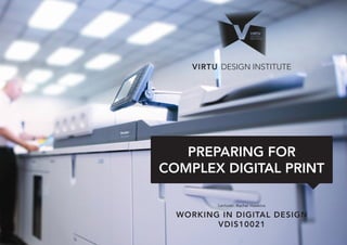
  • 1. Lecturer: Rachel Hawkins VIRTU DESIGN INSTITUTE WORKING IN DIGITAL DESIGN VDIS10021 PREPARING FOR COMPLEX DIGITAL PRINT
  • 2. VIRTU DESIGN INSTITUTE: WORKING IN DIGITAL DESIGN - VDIS10021 2 CONTENTS: What is digital printing? The difference between Ink & Toner What is offset printing? Develop a relationship with your printer! File formats for print File set up Finishing: Folding/cutting/knife- lines/substrates/papers/fabric/ lightbox Converting RGB to CMYK Pre-press & Preflight Soft Proofing & Proofing
  • 3. VIRTU DESIGN INSTITUTE: WORKING IN DIGITAL DESIGN - VDIS10021 3 What is Digital Print? Digital printing refers to methods of printing from a digital-based image directly to a variety of media. It usually refers to professional printing where small-run jobs from desktop publishing and other digital sources are printed using large-format and/or high-volume laser or inkjet printers. Digital printing has a higher cost per page than more traditional offset printing methods, but this price is usually offset by avoiding the cost of all the technical steps required to make printing plates. It also allows for on-demand printing, short turnaround time, and even a modification of the image (variable data) used for each impression. The savings in labor and the ever-increasing capability of digital presses means that digital printing is reaching the point where it can match or supersede offset printing technology’s ability to produce larger print runs of several thousand sheets at a low price. The greatest difference between digital printing and traditional methods such as lithography, flexography, gravure, or letterpress is that there is no need to replace printing plates in digital printing, whereas in analog printing the plates are repeatedly replaced. This results in quicker turnaround time and lower cost when using digital printing, but typically a loss of some fine-image detail by most commercial digital printing processes. The most popular methods include inkjet or laser printers that deposit pigment or toner onto a wide variety of substrates including paper, photo paper, canvas, glass, metal, marble, and other substances. In many of the processes, the ink or toner does not permeate the substrate, as does conventional ink, but forms a thin layer on the surface that may be additionally adhered to the substrate by using a fuser fluid with heat process (toner) or UV curing process (ink). Sourced from: Wikipedia, Aug 14. http://en.wikipedia.org/wiki/Digital_printing
  • 4. VIRTU DESIGN INSTITUTE: WORKING IN DIGITAL DESIGN - VDIS10021 4 The difference between Ink & Toner: Ink Cartridges: Ink Cartridges are used in inkjet printers. The cartridge contains liquid ink, usually absorbed in a sponge. When creating a document, the print head simply deposits ink wherever it needs to go on the page. Color cartridges have three colors in addition to black and if any of the colors run out the others are essentially useless. Most printers can create black from combining the other three colors, however. Many inkjet cartridges do contain some basic electronics, such as a chip that communicates with the printer. It is also possible to refill ink cartridges using a kit bought from printer supply stores. Though the process can be tricky and doesn’t always produce a working cartridge, it can also be significantly cheaper than buying a completely new one. Toner Cartridges: Toner cartridges are used in laser printers. Instead of liquid ink, they are filled with a fine powder that can be magnetically charged. When printing documents, an electrically charged drum picks up the tiny particles and rolls them onto the page according to the pattern you printed. A laser then fuses these particles to the page with heat. Some toner cartridges actually include the drum as part of the cartridge, meaning that the entire until has to be replaced. Naturally, cartridges for these designs are much more costly. However, most are simply containers for the toner powder. While it is usually more difficult to refill toner cartridges than inkjets cartridges, it can still be done with the right kit. Most users have them refilled professionally or buy a replacement. So what is the difference? The biggest difference between ink and toner cartridges is in how long they last. The typical life of an inkjet cartridge might be 500 pages, depending on heavily you printed your pages. Ink cartridges can also stop working early if the heads dry out or become clogged. For that reason, it is critical to use the printer at least once every week. Toner cartridges, on the other hand, typically last for at least 2,000 pages and cartridges for large laser printers last even longer. You can expect to pay for this long shelf life, however. That points to the second major difference between the two types – cost. Some toner cartridges for rare or older laserjet printers can be so expensive that it is nearly cheaper to replace the printer outright than replace the toner. In summary, therefore, the difference between ink and toner cartridges is a matter of how you use your printer. For high volume printing, laser printers and toner cartridges provide lower costs per page and are typically more reliable under heavy usage. For home printing where low initial cost is more important than the ongoing cost per page, ink cartridges are usually the best option. No matter what your printer, however, you can always save money when you buy discount eco friendly printer ink online for 50 to 70% less at Inkpal. Sourced from: Inkpal, Aug 14. http://www.inkpal.com/ink-news/what-are-the- main-differences-between-ink-cartridges-and- toner-cartridges/
  • 5. VIRTU DESIGN INSTITUTE: WORKING IN DIGITAL DESIGN - VDIS10021 5 What is Offset Print? Offset printing or web offset printing is a commonly used printing technique in which the inked image is transferred (or “offset”) from a plate to a rubber blanket, then to the printing surface. When used in combination with the lithographic process, which is based on the repulsion of oil and water, the offset technique employs a flat (planographic) image carrier on which the image to be printed obtains ink from ink rollers, while the non-printing area attracts a water-based film (called “fountain solution”), keeping the non- printing areas ink-free. The modern “web” process feeds a large reel of paper through a large press machine in several parts, typically for several metres, which then prints continuously as the paper is fed through. History: Lithography was initially created to be an inexpensive method of reproducing artwork. This printing process was limited to use on flat, porous surfaces because the printing plates were produced from limestone. In fact, the word ‘lithograph’ historically means “An image from stone.” or “Print from stone.” The first rotary offset lithographic printing press was created in England and patented in 1875 by Robert Barclay. This development combined mid-19th century transfer printing technologies and Richard March Hoe’s 1843 rotary printing press—a press that used a metal cylinder instead of a flat stone. The offset cylinder was covered with specially treated cardboard that transferred the printed image from the stone to the surface of the metal. Later, the cardboard covering of the offset cylinder was changed to rubber, which is still the most commonly used material. Offset printing today: Offset lithography is one of the most common ways of creating printed matter. A few of its common applications include: newspapers, magazines, brochures, stationery, and books. Compared to other printing methods, offset printing is best suited for economically producing large volumes of high quality prints in a manner that requires little maintenance. Many modern offset presses use computer to plate systems as opposed to the older computer to film work flows, which further increases their quality. Advantages of offset printing compared to other printing methods include: • Consistent high image quality. Offset printing produces sharp and clean images and type more easily than, for example, letterpress printing; this is because the rubber blanket conforms to the texture of the printing surface. • Quick and easy production of printing plates. • Longer printing plate life than on direct litho presses because there is no direct contact between the plate and the printing surface. Properly developed plates used with optimized inks and fountain solution may achieve run lengths of more than a million impressions. • Cost. Offset printing is the cheapest method for producing high quality prints in commercial printing quantities. A further advantage of offset printing is the possibility of adjusting the amount of ink on the fountain roller with screw keys. Most commonly, a metal blade controls the amount of ink transferred from the ink trough to the fountain roller. By adjusting the screws, the gap between the blade and the fountain roller is altered, leading to the amount of ink applied to the roller to be increased or decreased in certain areas. Consequently the density of the colour in the respective area of the image is modified. On older machines the screws are adjusted manually, but on modern machines the screw keys are operated electronically by the printer controlling the machine, enabling a much more precise result. Disadvantages of offset printing compared to other printing methods include: • Slightly inferior image quality compared to rotogravure or photogravure printing. • Propensity for anodized aluminum printing plates to become sensitive (due to chemical oxidation) and print in non-image/background areas when developed plates are not cared for properly. • Time and cost associated with producing plates and printing press setup. As a result, very small quantity printing jobs may now use digital offset machines. Sourced from: Wikipedia, Aug 14. http://en.wikipedia.org/wiki/Offset_printing
  • 6. VIRTU DESIGN INSTITUTE: WORKING IN DIGITAL DESIGN - VDIS10021 6 Develop a relationship with your printer! Any successful business person with tell you that networking and good business relationships are the key to success. In the case of the Graphic Designer, a good relationship with your print providers will give you a competitive edge as well as making your life a lot more pleasant. If you choose a good quality printer (not the cheapest or online only) the print specialists will be friendly and happy to engage with you and your projects. Print specialists are experts in their field and have a wealth of knowledge that they will be happy to share with you. They are also interested to push the boundaries and experiment with stock and finishes so don’t be shy. Use your printer as a resource for information. Ask them your questions and for advice. They will be more than happy to help you out. As a student, you have an excuse to not know much and they will be sympathetic. Now is the time to learn. From personal experience I can tell you that if you have a good relationship with your printers they will call you if they see something wrong with your job, they will call you with more economical options and they will pay more attention to your job. They are also more likely to do you a favor on a tight timeline or when something does go wrong. Printers want your experiences with them to be successful, however every relationship is double sided. You can help guarantee a positive relationship by working with them in deliberate ways. Here are 8 tips: 1. Make it personal. Find yourself a print provider you can relate to. Since your goal is to develop a long-term business relationship, ask yourself, “Do I like talking to this person?” Respect and trust are mandatory. And the less you know about printing, the more you need to depend on your printer to educate you. Find out early on if your printer can offer customized solutions to your needs. A good print salesperson is flexible and accommodating. Pick a printer who’ll go the extra mile. 2. Keep your printer in the loop. The earlier the better. The single biggest mistake that consumers make with their print jobs is failure to involve the printer soon enough. Every print job is unique. The success of your print jobs depends in large part on your communicating early and often with your printer. Think of your printer as a creative partner, not just a supplier. Communicate timelines clearly and let them know when the file is coming. 3. Play fair. Since every job is a custom job, respect that it can take time to print something well. Don’t cry wolf and impose artificial deadlines when in reality you could wait another day or two. If you want to develop a good relationship with your printers, be honest and straightforward with them. 4. Be specific. Every detail about a print job affects its price: the format, number of pages, quantity, inks, paper, folds, and so on. As a client, it’s your responsibility to compile these details, called specs, for the printer. Get the printer to help, then use these specs to request an estimate before you send a job to print. 5. Get desktop publishing advice. How you prepare your files is very, very important to a printer. The platform of choice among printers is still the Mac computer. They expect you to use the appropriate software. Digital file preparation is complex, and no two designers “build” a job alike. Some printers have their own digital prepress specialists to clean up your files. This stage, called preflighting, costs you time and money. 6. Parlez-vous “printing?” If not, ask lots of questions. Don’t be intimidated by “printer-speak.” Printing is highly technical. Unless you’re used to dealing with printers, chances are you’ll find it all a bit intimidating. If you don’t understand something, ask for clarification in English. Printers are used to educating their consumers. 7. Be clear about responsibilities. Clarify what your role is vs. the printer’s. I have had a case where the printer did me a favor and corrected a typo for me. The proof was sent to me for approval and I signed it off. I rushed the proof reading process due to time constraints. My team and I failed to notice the typo that the printer had typeset, and we gave the “OK to print.” When the job was delivered, we noticed the typo. But we were responsible -- not the printer. My signature on the proof gave the printer a green light to proceed. So, be clear about who is responsible for what. Proofreading ranks way up there among a designers responsibilities. 8. Proof & Proof Again. When you are proofing you need to look for typos, alignment, and for anything that is missing or shouldn’t be there. You are also looking a image quality and colour correctness. If you are concerned about the colour reproduction of the job you should ask your printer for a printed colour proof or to be present for a press- check. You can do this for both digital and offset printing processes. It is a good idea to use a proofing checklist.
  • 7. VIRTU DESIGN INSTITUTE: WORKING IN DIGITAL DESIGN - VDIS10021 7 File formats for print The best format to send a finished print ready piece of art is a flattened PDF. .PDF (Preferred for most files) PDF (short for Portable Document Format) is a file format developed by Adobe as a means of distributing compact, platform-independent documents. PDF captures formatting information from a variety of desktop publishing applications, making it possible to send formatted documents and have them appear on the recipient’s monitor or printer as they were intended. If you are sending a logo or special text treatment, an EPS file is Ideal. .EPS (Preferred for large signs and banners) EPS (short for Encapsulated PostScript) is a vector format designed for printing to PostScript printers and image setters. It is considered the best choice of graphics format for high resolution printing of illustrations. EPS files are created and edited in illustration programs such as Adobe Illustrator. Vector graphics are a scalable, resolution-independent format composed of individual objects or shapes. Vector images can be resized easily without loss of quality making them an ideal format for initial logo designs and illustrations to be used in multiple sizes. If you are sending artwork that you need to have manipulated by a pre- press specialist before it is printed, send the raw file. .PSD, .AI, .INDD (best for files that need editing by the pre-press specialist) If you are providing artwork for a complex job that involves a knifeline, you may be required to provide the raw file. This could be the case for product packaging. In this instance you would provide a layered Illustrator files with all fonts outlined and images embedded. In rare cases, a layered PSD may be appropriate. The only drawback to a PSD is the file size. Most likely the file will need to be written to a disk and mailed or uploaded to an FTP site. Therefore if time is a factor you may need to go with another format so that it can be e-mailed. If you have an option when saving your files to send to a printer try to avoid the JPG format. If you use the PDF, EPS or PSD formats your Images will print better and you will be happier with the results.
  • 8. VIRTU DESIGN INSTITUTE: WORKING IN DIGITAL DESIGN - VDIS10021 8 File Setup To ensure you setup your file appropriately for print you need to know what the end product is going to look like. You will need to consider the shape and size of the finished print. You will need to decide the paper stock to determine ink weights. You will need to specify finishes like spot gloss varnishes through to embossing and foiling options. InDesign Illustrator Once you have determined these factors you will be able to determine which software is most applicable to the layout/configuration of the file... either Indesign or Illustrator. As a guide, if the file is a single or double sided sheet and has several complex finishes, it will be likely that Illustrator is the better software. If the file has multiple pages, like a booklet or magazine, no matter how many finishes, it is better setup in Indesign. If the print is full bleed (images, types or blocks of colour extend over printed edge) you will need to include bleed in the file setup.
  • 9. VIRTU DESIGN INSTITUTE: WORKING IN DIGITAL DESIGN - VDIS10021 9 Finishing is a general term printers use for anything that happens to a job after it’s been printed. That means things like cutting, folding, binding, foiling, embossing, varnishes and so on are all finishing processes. Many printers can handle the most simple finishing processes in house. Other more complex finishes might need to be outsourced to specialist print finishing companies. There are endless types of varnishes and effects that can be achieved like Machine Sealing, Varnishing (Gloss or Matt), UV Varnish, Spot UV, Textured Varnishes, Sparkly varnishes with metallic flakes, Tinted varnishes as well as latex for scratch panels. All these above mentioned finishes are required to be included in specific ways in your print file so they are clear to the printer. This is generally done by putting the effect on a different page or layer with nothing else with it. Speak to your printer about how to include the finishing effect in your file. They can give you detailed instructions. There are also endless opportunities with paper stocks and printing substrates like lightbox, canvas, textiles (Georgette, vinyl, etc) and self adhesive vinyls (stickers for cars and windows. Each of these requires specialised printing knowledge and attention to ink weights to avoid over saturation. Die-lines/Knife-lines - varnishes - other embellishments: These are the fun part, but they still need artwork to be produced. They are often not set up correctly, often the knife line does not overprint (ie. Leaves white line underneath); perforations are marked as dotted lines on the art, when there should really only be indicators instead of an actual printed line. Some of these can get a bit tricky, so the best thing is to talk to your printer / pre-press specialist and ask them how these finishes should be indicated on the artwork. The worst thing to do is to send that urgent file away with no instructions or unclear instructions as it will be printed wrong or take longer. Variable data: Items such as tickets, scratchies & personalised letters may have variable data printed on them. Wedding invites fit into this category also. It can be hard for printers to gather all the required information and documents. Be organised and supply the printers with an excel sheet or the database, packaging InDesign file or illustrator file and pdf. Give them example pdfs of what the finished product should look like. Finishing/Folding/ Prototyping: Prototypes are good, sometimes absolutely necessary. Once you have tried out, how many ways there are of folding an A4 to a DL you will know why. For multi page publications you should do a digital printed prototype. For other jobs, especially those out of the ordinary, you really need to have a folded prototype to understand, how you expect things to look in the end. Otherwise, someone will be guessing. And if it’s that night shift operator, who wants to get the job done, chances are that his idea of which one should be the back panel in a brochure might not be the same as yours. It’s all important to note that not each panel will be equal in size, they may vary by 1-2mm to allow the folded document to lay flat. Finishing: Folding, cutting, knifelines, substrates, papers, fabric & lightbox
  • 10. VIRTU DESIGN INSTITUTE: WORKING IN DIGITAL DESIGN - VDIS10021 10 Photoshop There are two ways to convert RGB to CMYK and vice versa in Photoshop. 1.Open the image file in Photoshop, then go to Edit > Convert to Profile. Once there, select your target profile (a copy of which should be in the [Your Computer] > Library > ColorSync > Profiles folder, or else it will not appear in the pulldown menu). Then select a rendering intent appropriate for your image (to simplify, Perceptual if the relevant image colors are out of the target’s gamut, otherwise Relative Colorimetric). If you select Relative Colorimetric, it’s also a good idea to check “Use Black Point Compensation”. 2. Go to Image > Mode > CMYK to convert your image. The disadvantage of converting this way is that it does not offer the degree of control that you have with Convert to Profile, and limits you instead to the target space and conversion controls set in the application’s Color Settings, which may not be appropriate for your purposes. Illustrator Open the file in Illustrator, then go to Edit > Assign Profile. Indesign Open the image file in Photoshop, then go to Edit > Convert to Profile. Converting RGB to CMYK It’s best if you do colour management of images in Photoshop. All other files should be colour managed in the software of origin. For example; A. Logos developed in Illustrator should be colour managed in Illustrator. B. A multipage book layout document should be colour managed in Indesign while its links are colour managed in the software of origin (Photoshop & Illustrator). Be aware that it is possible to see colors in RGB that you can’t make with CMYK due to RGB’s larger colour gamut. For this reason your images may appear dull after conversion. Once you have converted the image to CMYK, you will need to go back and adjust the colour to the desired appearance.
  • 11. VIRTU DESIGN INSTITUTE: WORKING IN DIGITAL DESIGN - VDIS10021 11 Colour: CMYK vs Pantone Spot Colours (PMS) Most printing is basic CMYK however in some instances you may choose to print with a spot Pantone colour to ensure colour consistency across several items of collateral. Spot colours are premixed flat colours and ensure colour accuracy. CMYK may have slight variations from print run to print run depending on the machine and it’s maintenance. Photos and images are always printed in CMYK as they have gradients and variations in the colour. InDesign Illustrator Spot colours have a different icon to RGB and CMYK colours as an indicator in the swatches tab. If you double click on the swatch you can edit it as above. Spot colours appear differently to RGB and CMYK colours as an indicator in the swatches tab. If you double click on the swatch you can edit it.
  • 12. VIRTU DESIGN INSTITUTE: WORKING IN DIGITAL DESIGN - VDIS10021 12 When you design artwork for print, standard practice is to send a PDF to your printer once it has been approved by your client. There are several steps that lead to this point and things you need to do to ensure that the end result is exactly what you and your client are after. Sending files to your printer has lost a lot of its complexity, the universal adoption of PDF, improved software applications and automated checks have made life in pre-press a whole lot easier. There are still some errors, though, that persist even in PDFs, and that could ruin your print job. SOME QUESTIONS TO ASK ARE: Are you confident the size is correct? Have the colours been set to print standards or client brand guidelines? What about font usage? Does the printer have the font? Will the printer know what to do with my file? So many things can go wrong, costing you and your client money. Below are 12 Pre-press Tips that cover the major aspects for correction in your artwork. Follow the steps below to make sure your file will be in excellent shape for sending to print. 1. File names, filing of the job and version tracking. Every designer needs a clear tracking system for their files ensuring information about the client, job and document version number are precise. You should be systematic with how you file work for clients and always keep back up of that work. It is a good idea to include a job description, document dimensions, date and version number in the file name for easy identification. For example; JAdams_ BusCard_90x55mm_Feb14_ v3.indd 2. You are responsible for the design Before you start designing, make sure you have a clear purposeful design brief. What is the main purpose of the design? How will the finished product be used. What are the clients motivations? Who will source the printer and send the job to print? Understanding all these points will assist you in setting up the design file properly from the beginning. 3. Proofread & have artwork approved as final The odd thing is that clients can be calm about minor errors in the design, like lines not being of same thickness or such. But errors in text are fatal. Use a good proofreader, it could be a family member, partner or colleague but you need someone with fresh eyes and good grammar. Once proofread and the artwork is signed off, get approval in writing from the client. An email is great confirmation. Unfortunately, even if artwork is signed off and there is an error, changes and re-print will be made generally as a shared cost. You must make sure your client is happy in the end for future and referred business. Get in writing (preferably email) final client approval of the artwork before the job is sent to the printer. Verbal communication cannot be relied upon if something goes wrong. 4. Make sure the artwork is the correct size. Does the design brief specify the size? Have you checked Document Setup again? Or the outmost frame in Illustrator? Double check the orientation! Is it 210×297mm (DL) as Width by Height? Is it portrait or landscape? Did the client say an A4 because it looks like an A4 or is it 220×286? For ads, contact the publication by phone, email or web. Check with the printers which is the most economical size and how many fit to a print sheet. Always double check if you aren’t sure. 5. Define bleed and trim marks in the file Bleed is the distance the artwork needs to extend beyond the final size of the artwork and it can vary. 3mm on each side is most common. In some cases it may not be needed at all, nor the trim marks, usually if there is no colour or image over the edge. Clarify with the printer before you Good Design Practice 12Pre-press tips
  • 13. VIRTU DESIGN INSTITUTE: WORKING IN DIGITAL DESIGN - VDIS10021 13 create your PDF, and open the PDF afterward to check inclusion. 6. Typefaces/Fonts Ensure the typeface(s) used correlates to the clients corporate identity manual. Are you using the correct typeface for your client? Are there any unnecessary fonts that shouldn’t be included the file? In Illustrator check Document Info or Find Font… and in InDesign Find Font… under Type in the menu. When delivering artwork as a PDF for print there is normally no reason to outline the fonts. For advertising however best practice is to outline the fonts. 7. Logo usage Using client logos is really important for brand recognition so it is really important the it prints correctly. Make sure the logo file is properly embedded or linked for clarity. Ensure the logo usage correlates to the corporate identity guidelines & style guide. Make sure it is in perfect proportion. Keep the colour of the logo in the right format for the media used. For print, use the logo in vector format if possible (ai. eps. pdf.). Logos sent to you inside Word documents are no good as they will be low resolution. For print, the format should be CMYK, not Pantone unless the work is going to be printed with spot colours. 8. Colour - this is a big one Keep the colour of the artwork in accordance with the media used. There are two types of colour used for print. CMYK and Pantone Colours (PMS). For most digital or offset printing you will use CMYK printing. Therefore all images should be in CMYK. Photos will most often be in CMYK while logos may be printed in PMS. No colour profiles should be attached to the pictures. Your pictures should be jpg, tiff or psd format. Avoid eps. The reason: If you are using transparency in your artwork, like drop shadows or transparent type or colours, your PDF will most likely have torn the photos into strips. This can be avoided by using the pictures as native PSD. If you are including Pantone (PMS) colours, make sure only those colours used are in the file. In InDesign and Illustrator, go to the Swatch panel and in the fly-out menu choose: Select all unused and delete those colours. If in doubt, contact your printer. They will help you and will most likely send you the correct settings for programs that fit the jobs going to his printer. 9. Pictures sizes are big enough Pay close attention to the resolution of the pictures used. Most common minimum resolution for print is 300dpi. You should try not to enlarge pictures by more than 20% of the original size. This is just a thumb rule. When you change the size inside your document you will change the output resolution too. A 300dpi picture will be 600ppi if you minimise it by 50%. Way too high a resolution. Enlarging too much might get the resolution down resulting in pixelised/blurry images. You can adjust images sizes in photoshop to be exact. Properly managed image sizes will also keep your file size down. 10. Preflight the artwork Preflighting the artwork before sending to the print shop is a must. If you have done all the things mentioned above, you have manually preflighted a great deal of what is needed. InDesign has a preflight feature. Window > Output > Preflight. There you can see an overview of the document, check fonts, links etc. Also, you can see the red or green dots at the bottom of the window that indicates various errors you may have in your file. 11. Ensure the final PDF is high resolution Did you send your client a low resolution PDF earlier in the day? Did you remember to switch over to a high resolution output? Are you using the built in PDF settings of InDesign or Illustrator? Ask your printer for PDF job settings. The built in settings are usually not what is used for professional PDF output. Or at least know which of the built in settings you are supposed to use. High Quality Print and Press Quality settings are tempting to use if you want quality (because of the names), but in most cases you will have to use PDF/X- 1a:2001. Consult your printer here. 12. File size It is really important that your final file size is not overwhelming otherwise it will make file handling difficult and time consuming. Files that are too big without reason can slow the printing process with more time needed for the technology to read your file. It will also make transporting your file difficult via email, or ftp sites. Generally speaking around 10MB is an acceptable file size. If the artwork contains several large images and is a large file then it may be bigger. It is just important to not have images that are really large for no reason.
  • 14. VIRTU DESIGN INSTITUTE: WORKING IN DIGITAL DESIGN - VDIS10021 14 PREFLIGHT CHECK LIST: Check your file for the following All artwork and images have been extended at least 3 mm bleed beyond the finished page size. Logos or graphics created in vector programs such as Illustrator, have all type converted to paths or outlines. The pasteboard surrounding all your design pages is empty. No overflowing text boxes or images. All images are correctly positioned and linked. Live type and vital images are at least 5 mm within the trimmed document edge. All fonts are either included, embedded or outlined. You have only used fonts that you intend to use for output. Colours and images are converted from RGB to CMYK or special and Pantone colours are specified as spot colours. All PMS colour swatches that will be printed in CMYK have been converted to CMYK values. All issues with duplicate Pantone colour swatches are resolved (eg. PMS 185C, 185U, 185CV) (Coated (C) vs Uncoated (U)) All unused PMS colour swatches should be deleted. All black text is 100% Black, not CMYK Black (Registration). Large black solids and backgrounds have been specified as a Rich Black mix. Varnishing and special treatment areas identified as SPOT colours. Total ink density is appropriate for the stock type: 300% coated, 280% uncoated, 250% newsprint The document dimensions are the right size for printing, folding and trimming. Trim, fold and registration marks are included. Overprint settings have been checked. All pages are supplied as single pages – not spreads! Finished artwork as a press-ready PDF with correct pagination. All documents have been thoroughly proof-read and double- checked before submission.
  • 15. VIRTU DESIGN INSTITUTE: WORKING IN DIGITAL DESIGN - VDIS10021 15 Preflight - Check and double check your file InDesign has a preflight capability to check your file for errors. When you send a file to print, the printers will run an advanced preflight to check your file before print. They will either correct your file (and charge you for it) or they will ask you to re-supply the artwork. Doing a preflight yourself can save you the back and forth. You can do this by checking all aspects listed in the checklist at the beginning of this lecture. InDesign
  • 16. VIRTU DESIGN INSTITUTE: WORKING IN DIGITAL DESIGN - VDIS10021 16 Missing Fonts - Type > Find Font. Frequently you may receive a file from someone else and not have the font they have used installed on your computer. The software will alert you to this fact and you need to source and install the font to make sure the appearance of the artwork is in tact. The software usually uses a default font in place of the missing font. InDesign Illustrator
  • 17. VIRTU DESIGN INSTITUTE: WORKING IN DIGITAL DESIGN - VDIS10021 17 Outline Fonts - Type > Create Outlines. Select the type or type box and then go to ‘Type’ in the top menu bar and ‘Create Outlines’. Creating outlines means that the text becomes a shape and holds its integrity should the font be separated from the file. InDesign Illustrator
  • 18. VIRTU DESIGN INSTITUTE: WORKING IN DIGITAL DESIGN - VDIS10021 18 Resolution- Image size and DPI (dots per inch) Image sizes and DPI (dots per inch) can be edited in Photoshop. DPI is used to describe the resolution, number of dots per inch in a digital print and the printing resolution of a hard copy print. Up to a point, printers with higher DPI produce clearer and more detailed output. As a general guide: 72dpi = screen resolution (low), 300dpi = high resolution print. Photoshop
  • 19. VIRTU DESIGN INSTITUTE: WORKING IN DIGITAL DESIGN - VDIS10021 19 Links - Making sure image links are intact Most printing is basic CMYK however in some instances you may choose to print with a spot Pantone colour to ensure colour consistency across several items of collateral. Spot colours are premixed flat colours and ensure colour accuracy. CMYK may have slight variations from print run to print run depending on the machine and it’s maintenance. Photos and images are always printed in CMYK as they have gradients and variations in the colour. InDesign Illustrator Red question mark or yellow exclamation mark indicate that the link is missing or the source file has been edited. It needs to be relinked. The link info gives great information on the file name and where it was originally linked from to help you find it. The link info also tells you what scale the image is eg. 50% or 170% (enlarged). This can help you to manage if the DPI of the image has changed due to enlargement. Red cross or yellow exclamation mark indicate that the link is missing or the source file has been edited. It needs to be relinked. In both InDesign and Illustrator their is the option to ‘Embed’ links. This will save you looking for the link if it gets lost. It is also often required when providing illustrator files to print if they have images, most often with product packaging. It will however increase your file size dramatically.
  • 20. VIRTU DESIGN INSTITUTE: WORKING IN DIGITAL DESIGN - VDIS10021 20 Marks & Bleeds - Exporting your file for print To export your file to print with the correct marks and bleeds is heavily dependent on your file setup being correct. If the file setup is accurate then the software will do all the work for you. In InDesign you go File > Export. The Export window has several basic options for Low Res, High Res and Press settings. Are common advanced setting used for press advertising and printing is PDF/X-1A:2001. You can then manage your crop and trim marks on the ‘Marks and Bleed’ tab. InDesign
  • 21. VIRTU DESIGN INSTITUTE: WORKING IN DIGITAL DESIGN - VDIS10021 21 Marks & Bleeds - Exporting your file for print cont. In Illustrator you go to File > Save As. In the ‘Save As’ window there is a drop down menu that allows you to choose the file type, ai. pdf. etc. Illustrator has the same Low Res, High Res and Press settings as well as PDF/X-1A:2001 for selection. You can then manage your image compression, crop and trim marks in the same way as InDesign. Illustrator
  • 22. VIRTU DESIGN INSTITUTE: WORKING IN DIGITAL DESIGN - VDIS10021 22 Soft Proofing Soft proofing is the ability to view a simulation of how your image will look when out-put to the printer on your monitor, based on the chosen profile. Photoshop has a soft proofing workflow built in to the software. Please refer to the Soft Proofing Guide in the Lecture 5 Downloads. What is soft proofing? Soft proofing is a catch-all phrase for proofing files on your monitor rather than using a good old-fashioned paper proof. There are broadly two types of soft proofing: Content and layout proofing & Contract proofing. Content and layout proofing is used for a wide variety of media, whereas contract proofing tends to be for print only. Content and layout proofing: Content and layout proofing does what it says on the tin. Is the content correct? Are there any typos? How does the layout look? Have the correct images been used? Is everything on-brand? And so on. Content proofing is (or should be) used by agencies of all types, marketing departments, designers, web site developers, in fact anyone who produces a graphical image or text for approval by someone else. Tools for this type of soft proofing include: • PDF files sent via e-mail • FTP sites for upload and download of larger files • Desk based proofing software • Web based proofing systems (ProofHQ falls in this category and we think it’s the only way to go, but that’s not the point of this post!) Content and layout proofing takes place earlier in the design and production cycle. It should be highly collaborative, so that the creator works closely with reviewers to make sure that the brief has been met. Content and layout proofing often requires a large amount of project management to make sure that reviewers have received their proofs, that they respond on time and that their comments are acted on.Version control also becomes important to ensure that changes are tracked through the various iterations of a piece of work. Contract proofing The second type of soft proofing is contract proofing. This uses more complex color- management systems that try and replicate the exactness of hard-copy proofs on the monitor. Contract proofs are called that because from a legal perspective, an approved proof is a binding contract. By signing a contract proof printers and customers are agreeing that they accept the quality of the reproduction on the specified paper using the specified ink. They are saying that a print run will be acceptable if it matches the quality of the contract proof. Common features of both types of soft proofing include: • Viewing a proof for content and colour. • Letting several people view the proof simultaneously or consecutively • Marking up a proof to show changes • Viewing old versions and new versions together • Providing electronic sign-off • Archiving the proof for later viewing. Proofing A print proof is a hard copy print of your design to demonstrate both the quality of the file and the accuracy of the printing based on following your directions or matching a guide or original. You may wish to print your own proofs prior to sending the job to the printer. Sometimes it is easier to proof read on a hard copy than on screen. Proof prints are usually printed “full-frame”, which means that all of your image will show. The “opposite” of full frame is “cropped”, which means that some of the image area will be cut off to match the proportions of the ordered image. Once approved, printers keep a copy on file of all proof prints sent to you as a reference. Once you receive a print proof, you should review it in detail against your proofing checklist. If changes are desired, you can discuss those changes with the printer. Print proofs may be simple digital prints or done as a Epson or ISO print which ensure closer colour accuracy. If you make changes and require additional printers proofs you will most likely be charge an additional fee. For offset printing jobs, you may want to do a press check after approving yor hard copy proofs. Press-check For large offset printing jobs you may want to do a press check. You need to discuss this with your printer as they will need to let you know what time to be at the press. A press check allows you to do a final check on colour before the whole print run is done. The printers are able to make subtle adjustments to colour for you to make the job perfect.
  • 23. VIRTU DESIGN INSTITUTE: WORKING IN DIGITAL DESIGN - VDIS10021 23 Grab a cup of tea and find somewhere quiet You’ll need a print-out of your final approved PDF for reference as you check your printers proof. It’s easy to check what’s on the proof, but all too often, people don’t spot when an element has dropped off completely. Having both in front of you will help avoid this. Get a fresh pair of eyes After looking at the same job time and again, it’s good to get someone else to check, particularly when it comes to proofing text. When you know what’s coming next, it’s easy to skim over words or fill in the blanks if something’s missing. Reading the text out loud can help. This way, expression and punctuation errors become more obvious. Calling telephone numbers and typing lengthy URLs into your browser are simple ways of checking these details. Don’t get too hung up on colour As proofs aren’t printed on the specified stock, please bear in mind that there are bound to be some differences between the proof and the completed job. For example, using an uncoated paper will make a huge difference to the finished effect. If colour is critical, you can include Pantone colours or request a press-pass. Colour Offset: The printed proof for your offset job will not be printed on the same stock as your print job, due to setup cost prices. So therefore, please bear in mind that there are bound to be some differences between the proof and the completed job. If colour is critical, you should request a press check or an ISO proof. Digital: The colour in digital proofs is made up from the 4 process colours (CMYK), so if your job is spot colour (specified from a Pantone), you should use your Pantone swatch book as an indication of the final colour. If required, a printed proof on the stock your job is set to be printed on can be provided. Take plenty of time Checking is easier when you’ve stepped away from the job for a while. Usually, there’s a day or two between sign-off and receiving the printers proofs. It’s far better to wait a while to check a proof properly. Graphic Design Print Proof Checklist PROOF CHECKLIST: Before you sign off your proof, make sure that you and your colleague have ticked all the relevant boxes below. Mark any final edits clearly on the proof. Spelling and grammar. Watch out for words the spell check won’t catch, such as it’s/its, their/there, your/you’re, were/where, then/than, and to/too. Consistent and correct spelling of specialised words. Such as product or brand names, and terminology. Duplication. Check for two identical words or numbers that are next to each other. Contact details. Check that contact names, telephone, and fax numbers are correct. Also check email and web addresses. Product codes and reference numbers. Overall consistency with other materials. Logo. Check it’s the correct version, alongside consistency of size and positioning. General layout and colour/imagery. If it’s a product shot, make sure it’s the correct model and most up-to-date shot. Check any final retouching meets with your approval. Pagination. Is the document’s size, page numbering and ordering correct? Small print. Have you added this where relevant and checked the content to ensure legal compliance? Punctuation. Is it correct and consistent throughout? Has someone else read the proof and completed the checklist? Have you and a colleague signed the proof? Have you marked up and final amends on the proof and signed it? If there are extensive changes, you may need to resupply artwork. Proofed & Approved by: Proofed & Approved by: