Web Design 101
•
116 gefällt mir•35,584 views

Basic stuff on designing for the web. Go to http://www.clipsoflogic.com/2011/09/06/web-design-101/ for full list of links

Empfohlen
Weitere ähnliche Inhalte
Was ist angesagt?
Was ist angesagt? (20)
Ähnlich wie Web Design 101
Ähnlich wie Web Design 101 (20)
Kürzlich hochgeladen
Kürzlich hochgeladen (20)
Web Design 101
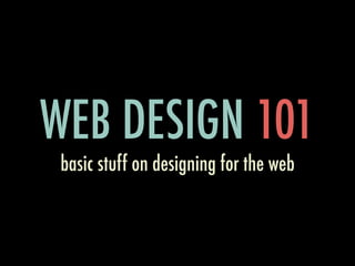
- 1. WEB DESIGN 101 basic stuff on designing for the web
- 2. ABOUT T.S. Lim ME Flexnode Solutions Web Developer Used <blink> Decent Designer? www.clipsoflogic.com
- 3. WHAT YOU NEED TO KNOW ABOUT WEB DESIGN HOW YOU CAN IMPROVE YOUR WEB DESIGN
- 4. 8 THINGS YOU NEED TO KNOW ABOUT WEB DESIGN
- 6. HTML hypertext markup language <html> <head> <title>Webcamp KK</title> </head> <body> <h1>This is awesome</h1> </body> </html>
- 7. CSS cascading style sheets body { background-color: black; } h1 { font-size: 40px; text-decoration: underline; }
- 8. JAVASCRIPT scripting language for web pages <script type=”text/javascript”> // comment document.write(‘Webcamp KK’); alert(‘This is awesome!’); </script>
- 9. 2. LAYOUTS
- 10. FIXED LAYOUT & F L U I D L AYO U T
- 11. FIXED LAYOUT Better control on looks and content Easier to read and style Might cause horizontal scroll on small screens Changing font size might break layout
- 13. FLUID LAYOUT Adapts to any screen size Handles font size change well Less control on the placement of content Content might be stretched or squashed
- 15. SOME TIPS Start with Fixed Layout. 960px / 1140px Use base CSS (Bootstrap, Blueprint, GGS) Mix Fluid layout for certain content (e.g. pics) Learn how to float and position elements
- 16. 3. TYPOGRAPHY
- 17. TYPOGRAPHY SIZE serif sans serif cursive { line-height: 1.5em } l e t t e r s p a c i n g text decoration left all about the arrangement right
- 18. CUSTOM FONTS Google Web Fonts - @font-face Typekit - @font-face Cufon - VML & Canvas sIFR - Scalable Inman Flash Replacement
- 19. USEFUL STUFF Lettering.js - jQuery plugin for font control FontsInUse.com - Discover fonts being used FitText - jQuery plugin for fluid headlines HTML ipsum - placeholder text in HTML
- 22. SOME TIPS Body font size 12-14px Line height at 1.5em Left align body of text Use preset in CSS base frameworks Test with different content
- 23. 4. WHITESPACE
- 24. WHITESPACE Goes together with typography All the negative spaces between content Key to aesthetic composition There are active and passive whitespace
- 25. WITHOUT WHITE SPACES Pellentesque habitant morbi tristique senectus et netus et malesuada fames ac turpis egestas. Vestibulum tortor quam, feugiat vitae, ultricies eget, tempor sit amet, ante. Donec eu libero sit amet quam egestas semper. Aenean ultricies mi vitae est. Mauris placerat eleifend leo. •Lorem ipsum dolor sit amet, consectetuer adipiscing elit. •Aliquam tincidunt mauris eu risus. •Vestibulum auctor dapibus neque.
- 26. WITH WHITE SPACES Pellentesque habitant morbi tristique senectus et netus et malesuada fames ac turpis egestas. Vestibulum tortor quam, feugiat vitae, ultricies eget, tempor sit amet, ante. Donec eu libero sit amet quam egestas semper. Aenean ultricies mi vitae est. Mauris placerat eleifend leo. • Lorem ipsum dolor sit amet, consectetuer adipiscing elit. • Aliquam tincidunt mauris eu risus. • Vestibulum auctor dapibus neque.
- 28. SOME TIPS Practice and test with your content Base CSS Frameworks provide good defaults Use it to structure and emphasize content Add padding to your text container
- 29. 5. COLORS
- 30. COLOR WHEEL
- 31. SOME THEORIES Primary, secondary, tertiary colors Analogous and complementary color schemes Color contrast and context matters Use nature as a guide
- 32. Primary colors Secondary colors Tertiary colors Analogous colors Complementary colors Colors from Nature Colors Context
- 34. SOME TIPS ColourLovers.com - Awesome color resource Pick a color scheme and stick with it Different color for link and visited link Use colors for call to action
- 35. 6. GRAPHICS
- 36. GRAPHICS Visual impact & communication - branding Easier to consume information - graphs Complement or replace textual info - icons Create emotional connection
- 40. SOME TIPS Famfamfam.com icon packs iStockPhoto.com PNGs for text, logos - Lossless compression JPEGs for photos - Lossy compression Avoid animation if possible
- 42. INFO SOFTWARE DESIGN Most software is information software Design of context-sensitive info graphics What and how the information is presented Approach as graphic design first
- 47. MORE INFO Read Magic Ink Article by Bret Victor Finish it. It’s a MUST READ Showtimes.my was inspired by it
- 49. USER EXPERIENCE How a user feel when using your site Design a site that’s fun to use Match the conceptual model of the user Used to shape the user behavior
- 50. UX IS NOT... Just the user interface or usability About the technology or even the web Focused just on the user but the entire product Expensive but not easy either
- 53. USER EXPERIENCE IS PART OF YOUR PRODUCT UX IS NOT A STEP IN THE PROCESS BUT THE PROCESS
- 54. Facets of UX by Peter Morville
- 55. UX TOOLS Wireframe & Prototyping - Balsamiq Mockups A/B Test your design - Optimizely Analyze user behavior - KISSmetrics Survey and ask for feedbacks - Usabilla
- 56. 6 WAYS YOU CAN IMPROVE YOUR WEB DESIGN
- 57. 1. LOOK AT PRETTY SITES
- 58. LOOK AT PRETTY SITES Browse sites like Smashing Magazine Learn how and why a design is good Sharpen your design sense with exposure Start noticing good design in products
- 59. 2. COPY, PASTE, MODIFY
- 60. COPY, PASTE, MODIFY Start with a design you like Use it as a base and modify to your needs Nothing beats hands-on experience Never plagiarize and give credit where it’s due
- 61. 3. DESIGN AROUND YOUR CONTENT
- 62. DESIGN AROUND CONTENT Most websites exist mainly to deliver content Design should complement your content Understand the nature of your content Content should be first-class citizen
- 63. 4. THINK LIKE A USER
- 64. THINK LIKE A USER Try to actually use the site you designed Imagine yourself as a new visitor Make sure user gets what they are here for Bring in fresh eyes for feedbacks
- 65. 5. PAY ATTENTION TO THE DETAILS
- 66. ATTENTION TO DETAILS Don’t include unnecessary details Do care about every little details Separates good design from the great E.g. iCloud logo infused with golden ratio
- 68. 6. ASK FOR HELP
- 69. ASK FOR HELP Don’t be shy and get input from others A lot of design is trial and error Familiarity trumps cool design any day Adopt good ideas, ignore the bad ones
- 70. Most people make the mistake of thinking design is what it looks like. People think it’s this veneer — that the designers are handed this box and told, ‘Make it look good!’ That’s not what we think design is. It’s not just what it looks like and feels like. Design is how it works.” - Steve Jobs
- 71. CREDITS Colors by MMMiguel @ ColourLovers Smashing Magazine for awesome info Magic Ink Article by Bret Victor Help from Marissa - real designer Get the complete list of links at my blog
- 72. THANK YOU! for listening :)
Hinweis der Redaktion
- \n
- \n
- \n
- \n
- \n
- \n
- \n
- \n
- \n
- \n
- \n
- \n
- \n
- \n
- \n
- \n
- \n
- \n
- \n
- \n
- \n
- \n
- \n
- \n
- \n
- \n
- \n
- \n
- \n
- \n
- \n
- \n
- \n
- \n
- \n
- \n
- \n
- \n
- \n
- \n
- \n
- \n
- \n
- \n
- \n
- \n
- \n
- \n
- \n
- \n
- \n
- \n
- \n
- \n
- \n
- \n
- \n
- \n
- \n
- \n
- \n
- \n
- \n
- \n
- \n
- \n
- \n
- \n
- \n
- \n
- \n
- \n