SlideShare ist ein Scribd-Unternehmen logo
1 von 126
HTML5 &
      CSS3
    MAKEOVER
      HIGHEDWEB 2012


      Christopher Schmitt
    http://twitter.com/@teleject
1
TODAY’S AGENDA

• What    is CSS3?

• Explore   new CSS3 selectors, properties

 • (and    some other things, too)

• How    to make them cross-browser, when possible

• Tinker   with CSS3 examples on our own

• Lookat resources to help include CSS3 into your
 designs                  2
WHAT IS CSS3?


      3
~50 CSS3 Modules


http://www.w3.org/Style/CSS/current-work#CSS3
                      4
WHERE IS
             CSS3 COMING?
• The
    specification is divided into different chunks,
 modules
 • http://www.w3.org/Style/CSS/current-work

   • Transformations

   • Animations

   • Media   Queries
   • and   so on, and so on...
   • at   a glacial pace ever towards yesterday
                             5
WHERE IS
            CSS3 COMING?
• The
    specification is divided into different chunks,
 modules
 • http://www.w3.org/Style/CSS/current-work

• The   specification is being written by W3C
 • http://www.w3.org/Style/CSS/


                           6
WHERE IS
            CSS3 COMING?
• The
    specification is divided into different chunks,
 modules
 • http://www.w3.org/Style/CSS/current-work

• The   specification is being written by W3C
 • http://www.w3.org/Style/CSS/

• Browser vendors (like Firefox, Safari, and Opera)
 are implementing their own versions of these
 unfinished standards

                           7
8
EXPLORING CSS3
  (AND STUFF)


      9
COLOR


  10
COLOR:
    OPACITY ON
BACKGROUND COLORS
      (RGBA)


        11
12
OPACITY

#number4 {
 background-color: rgba(255, 255, 0, .4);
}


                          13
OPACITY

#number4 {
 background-color: rgb(255, 255, 0);
 background-color: rgba(255, 255, 0, .4);
}


                          14
LESSONS LEARNED

• Firefox   3+, Opera 10+, IE9+, and Safari support
 RGBA

• Requiresanother background-color property for
 cross-browser support.

• IE   Support?


                            15
OPACITY IN IE
#number4 {
 background-color: transparent;
filter:progid:DXImageTransform.Microsoft.gr
adient(
  startColorstr=#66FFFF00,
  endColorstr=#66FFFF00
   );
}


                    16
OPACITY IN IE
• First
      step is to convert the RGB value of the color
 to hexadecimal. In this example, rgb(255,255,0)
 converts to #FFFF00.

• Next,
      convert the alpha transparency value to
 hexadecimal string . In this example, the value is
 66.

  • E.g.,
        alpha value of .3 equals 4D in hexadecimal
   values

• Then assemble the hexadecimal value for
 transparency and the color together in one string,
 starting with the transparency: #66FFFF00.
                          17
OPACITY ON ELEMENTS


         18
19
OPACITY ON ELEMENTS

#number4 {
  opacity: .4; /* .4 = 40% transparency */
  filter: alpha(opacity=40); /* 40 = 40%
transparency */
}


                       20
LESSONS LEARNED
• Supported     in Firefox 1.5+, Opera 9+, Safari 1.2+ and Chrome.

• IE5.5+ requires the use of its own alpha filter in order for the
 effect to be cross-browser.

•A     drawback to using the opacity filter is that the value is inherited:

  • If   a parent element is set to be 10% transparent, the child
       elements’ transparency is also going to be 10%.

  • Watch     out for legibility issues within the Web page.

                                     21
TEXT


 22
TEXT-OVERFLOW


      23
PNEUMONOULTRAMICROSCOPICSILICOVOLCANOCONIOSIS


        The longest word in the Oxford English
       dictionary is used to name a lung disease
       caused by the inhalation of very fine silica
        dust, causing inflammation in the lungs.
                           24
25
TEXT-OVERFLOW

p{
 text-overflow: ellipsis;
 -o-text-overflow: ellipsis;
}


                       26
LESSONS LEARNED
• Support:

  • Safari

  • Opera

  • and   IE


                      27
TEXT-SELECTION


      28
29
TEXT-SELECTION

::selection {
 color: #90c;
 background: #cf0;
}
::-moz-selection {
 color: #90c;
 background: #cf0;
}

                     30
LESSONS LEARNED
• Support:

  • Safari

  • Firefox

  • IE9+

• Nice   subtle effect, esp. if you deal with a lot of text on your site.


                                     31
http://tr.im/Knr0


        32
TEXT COLUMNS


     33
34
TEXT COLUMNS
<div id="column">
<p>…<p>
<h2>…</h2>
<p>…<p>
<h2>…</h2>
<p>…<p>
</div>


                    35
TEXT COLUMNS
#column {
 -moz-column-gap: 3em;
 -moz-column-width: 11em;
 -webkit-column-gap: 3em;
 -webkit-column-width: 11em;
 padding: 10px;	

}


                    36
TEXT COLUMNS
#column {
 -moz-column-gap: 3em;
 -moz-column-width: 11em;
 -moz-column-rule: 1px solid #ccc;
 -webkit-column-gap: 3em;
 -webkit-column-width: 11em;
 -webkit-column-rule: 1px solid #ccc;
 padding: 10px;	

}


                      37
LESSONS LEARNED
• Proprietary   CSS extensions in Firefox and Safari.

• JavaScriptsolution through a jQuery plugin:
 http://welcome.totheinter.net/2008/07/22/multi-column-layout-
 with-css-and-jquery/


                                    38
http://tr.im/KnrJ


        39
@FONT-FACE


    40
41
FONT FILE SUPPORT
               .ttf        .otf   .eot

Safari 3.1+    Y           Y

Opera 10+      Y           Y

Firefox 3.5+   Y           Y

   IE4+                           Y

                      42
@FONT-FACE
@font-face {
   font-family: 'MyFontFamily';
   src: url('myfont-webfont.eot'); /* IE9 Compat Modes */
   src: url('myfont-webfont.eot?iefix') format('eot'), /* IE6-IE8 */
   url('myfont-webfont.woff') format('woff'), /* Modern Browsers */
   url('myfont-webfont.ttf') format('truetype'), /* Safari, Android,
iOS */
   url('myfont-webfont.svg#svgFontName') format('svg'); /* Legacy
iOS */
	

 }
h1 {
   font-family: “MyFontFamily”, Verdana, sans-serif;
}

  http://paulirish.com/2009/bulletproof-font-face-implementation-syntax/
                                    43
LESSONS LEARNED
•   Getting @font-face to work is a little tough.

    •   Use http://fontsquirrel.com for pre-made kits, @font-face
        generator

•   Chrome supports @font-face

•   Don’t feel like bothering with all that hassle?

    •   Use font services like typekit.com for 100s of licensed fonts.

    •   Use commercially free fonts (see http://fontsquirrel.com)
                                       44
LESSONS LEARNED
•   Font files are LARGE

    •   gzip them, if you use them:
        http://articles.sitepoint.com/article/web-site-optimization-steps/2

•   New font file format: WOFF:
    http://hacks.mozilla.org/2009/10/woff/

    •   Font files are already compressed and supports meta information telling
        where the font came from. (Vendors happy.)

    •   It’s supported FF3.6+, IE9+

                                         45
OH? YOU WANT “ITALICS”?

@font-face {
   font-family: 'MyFontFamilyItalic';
   src: url('myfont-webfont-italic.eot'); /* IE9 Compat Modes */
   src: url('myfont-webfont-italic.eot?iefix') format('eot'), /* IE6-IE8 */
   url('myfont-webfont-italic.woff') format('woff'), /* Modern Browsers */
   url('myfont-webfont-italic.ttf') format('truetype'), /* Safari, Android, iOS */
   url('myfont-webfont-italic.svg#svgFontName') format('svg'); /* Legacy iOS
*/
	

 }


http://www.fontspring.com/blog/further-hardening-of-the-bulletproof-syntax
                                         46
TEXT-SHADOW


     47
48
TEXT-SHADOW
h1 {
 font-size: 2.5em;
 font-family: Myriad, Helvetica, Arial, sans-serif;
 width: 66.6%;
 text-shadow: yellow .15em .15em .15em;
 margin: 0 0 0.1em 0;
}


                           49
50
BEVEL TEXT-SHADOW

body {
 background-color: #999;
}
h1 {
 text-shadow: 0 1px 0 rgba(255,255,255,.6);
}
52
TEXT-SHADOW FLAME
h1 {
 color: red;
 text-shadow: rgba(0, 0, 0, .9) 0px 0px 1px,
  rgba(255, 255, 51, .9) 0px −5px 5px,
  rgba(255, 204, 51, .7) 2px −10px 7px,
  rgba(255, 153, 0, .6) −2px −15px 10px;
}


                         53
54
SOLAR TEXT-SHADOW
body {
	

 background-color: #dcaa96; /* not white */
	

 background-image: url(tile.jpg);
}
h1 {
   color: white;
   text-shadow: black 0px 0px 6px;
}


                      55
BORDERS


   56
BOX-SHADOW


    57
58
BOX-SHADOW

#header {
text-shadow: 0 −1px 0 rgba(0,0,0,.8);
box-shadow: 3px 3px 19px rgba(0,0,0,.8);
-webkit-box-shadow: 3px 3px 19px rgba(0,0,0,.8);
-moz-box-shadow: 3px 3px 19px rgba(0,0,0,.8);
}


          Works like text-shadow, but on boxes!
                             59
BORDER-IMAGE


     60
61
BORDER-IMAGE
<div id="section">
<h2>Images on Borders</h2>
<p>Epsum factorial non deposit quid pro quo hic escorol.
Olypian quarrels et
gorilla congolium sic ad nauseum. Souvlaki ignitus
carborundum
e pluribus unum..</p>
</div><!-- /#section -->


                            62
BORDER-IMAGE
#section {
 border-style: solid;
 border-color: #930;
 border-width: 26px 39px 37px 43px;
 border-image: url(frame.png) 26 39 37 43 stretch stretch;
 -webkit-border-image: url(frame.png) 26 39 37 43 stretch
stretch;
 -moz-border-image: url(frame.png) 26 39 37 43 stretch
round;
}


                             63
LESSONS LEARNED

• Works    in FF 3.1+ and Safari 4+.

• Image   is scaled, if text is also scaled.


                                       64
65
BORDER-IMAGE


<form action="/" method="get">
<button>Submit</button>
</form>


                                 66
BORDER-IMAGE

button {
background: none;
width: 250px;
padding: 10px 0 10px 0;
border-style: solid;
border-color: #666;
border-width: 0 17px 0 17px;
}


                               67
BORDER-IMAGE

button {
background: none;
width: 250px;
padding: 10px 0 10px 0;
border-style: solid;
border-color: #666;
border-width: 0 17px 0 17px;
border-image: url(bkgd-button.png);
}


                               68
BORDER-IMAGE

button {
background: none;
width: 250px;
padding: 10px 0 10px 0;
border-style: solid;
border-color: #666;
border-width: 0 17px 0 17px;
border-image: url(bkgd-button.png) 0 17 0 17 stretch stretch;
}


                                      69
BORDER-IMAGE
button {
background: none;
width: 250px;
padding: 10px 0 10px 0;
border-style: solid;
border-color: #666;
border-width: 0 17px 0 17px;
border-image: url(bkgd-button.png) 0 17 0 17 stretch stretch;
-webkit-border-image: url(bkgd-button.png) 0 17 0 17 stretch
stretch;
-moz-border-image: url(bkgd-button.png) 0 17 0 15 stretch
stretch;
}


                                70
BORDER-IMAGE
button {
background: none;
width: 250px;
padding: 10px 0 10px 0;
border-style: solid;
border-color: #666;
border-width: 0 17px 0 17px;
border-image: url(bkgd-button.png) 0 17 0 17 stretch stretch;
-webkit-border-image: url(bkgd-button.png) 0 17 0 17 stretch stretch;
-moz-border-image: url(bkgd-button.png) 0 17 0 15 stretch stretch;
color: white;
font-family: "Gill Sans", Trebuchet, Calibri, sans-serif;
font-weight: bold;
text-transform: uppercase;
text-shadow: 0px 0px 5px rgba(0,0,0,.8);
}

                                          71
LESSONS LEARNED

• Works    in FF 3.1+ and Safari 4+.

• Image   is scaled, if text is also scaled.

• Other values besides “stretch” are “repeat” (tiles the image);
 “round”, which tiles and filled it with whole images; and “space”,
 which is like “round” except it leaves empty space


                                       72
BORDER-RADIUS


      73
74
BORDER-RADIUS
div {
background-image: url(beach.jpg);
width: 375px;
height: 500px;
border: 8px solid #666;
border-radius: 40px;
-moz-border-radius: 40px;
-webkit-border-radius: 40px;
}

                         75
BORDER-RADIUS
         CSS3                     Firefox               WebKit

border-radius             -moz-border-radius    -webkit-border-radius

                          -moz-border-radius-   -webkit-border-top-left-
border-top-left-radius
                          topleft               radius
                          -moz-border-radius-   -webkit-border-top-
border-top-right-radius
                          topright              right-radius
border-bottom-            -moz-border-radius-   -webkit-border-bottom-
right-radius              bottomright           right-radius

border-bottom-left-       -moz-border-radius-   -webkit-border-bottom-
radius                    bottomleft            left-radius
                                     76
LESSONS LEARNED
• Radius   is half the distance of the diameter. (Stay in school, kids!)

• Radius   border can be applied to one, two, three or all corners.

• The   higher the value for the radius, the more rounded the corner
  will be.

• If
   borders on an inline image (IMG element) are rather large,
  borders are shown behind the image (see previous screenshot).

   • Workaround     is to either keep border-radius value small or place
       image in background.
                                     77
EFFECTS


   78
IMAGE MASKS


     79
80
81
IMAGE MASKS

img {
display: block;
float: left;
margin-right:20px;
border: 10px solid #ccc;
padding: 2px;
background-color: #666;
-webkit-mask-box-image: url(mask.png);
}


                           82
LESSONS LEARNED
• When creating a mask, every part of the image that is transparent
 becomes the mask or the part that hides a portion of the
 background image.

  • Approach is somewhat hard to understand, since typically, alpha
   transparency is, well, transparent.

• Themasks scale to the complete width of image, including
 borders.

• The   background shows through, including background images.

  • Might   work best with areas of flat color behind the images
                                  83
84
GRADIENTS
div.building {
border: 1px solid #666;
float: left;
width: 300px;
height: 300px;
margin: 20px;
background-image:
   -webkit-gradient(radial,center center,900,center
   bottom,0,from(#0cf ),to(white));
background-image:
   -moz-radial-gradient(center,900px,center
   bottom,0,from(#0cf ),to(white));
background-repeat: no-repeat;
}

                              85
SAFARI GRADIENTS


background-image:
  -webkit-gradient();


Recommend using background-image over background shorthand.
                            86
SAFARI GRADIENTS


background-image:
  -webkit-gradient(radial);


                Other value it accepts is linear.
                               87
SAFARI GRADIENTS


background-image:
  -webkit-gradient(radial,center center,900);


              Set the starting position of gradient.
                                88
SAFARI GRADIENTS


background-image:
  -webkit-gradient(radial,center center,900,center
  bottom,0);


               Set the end position of gradient.
                              89
SAFARI GRADIENTS


background-image:
  -webkit-gradient(radial,center center,900,center
  bottom,0,from(#0cf ),to(white));


              Set the starting and stopping colors.
                               90
LESSONS LEARNED

• Gradients in Safari can be applied to not just background images
 of block-level elements, but also:

  • list   bullets, generated content, and border-images!

• Unit     values aren’t accepted (px, em, etc.) It’s assumed to be pixels.

• Don’t     use background-position shorthand values.

• Use    a background-image with a gradient for “older” browsers.

                                       91
FIREFOX GRADIENTS

• Whereas   Safari sets the type of gradient within its own
 proprietary property, Firefox has properties for both types of
 gradients: -moz-radial-gradient() and -moz-radiallinear().

• Unlikethe Safari gradient, you can use background-position
 shorthand values and unit values when setting the starting and
 stopping points of gradients.

• Firefox’s   implementation of CSS gradients concerns transparency.

                                    92
FIREFOX GRADIENTS


background-image: -moz-linear-gradient(left top, left bottom,
from(rgba(153,51,0,.3)), to(#6b3703), color-stop(0.5, #903000));


                                   93
http://colorzilla.com/gradient-editor/
                  94
95
GRADIENT MASKS
img {
display: block;
float: left;
margin-right:20px;
border: 10px solid #ccc;
padding: 2px;
background-color: #666;
-webkit-mask-box-image:
   -webkit-gradient(linear, left bottom, left top,
from(rgba(0,0,0,1)), to(rgba(0,0,0,0)));
}

                      Only works in Safari.
                               96
Example of transparent gradients,
 border image, PNG8, text-shadow,
 box-shadow
97
TRANSFORM


    98
99
TRANSFORM

img+img {
 transform: rotate(270deg);
 -webkit-transform: rotate(270deg);
 -moz-transform: rotate(270deg);
 filter: progid:DXImageTransform.Microsoft.BasicImage(rotation=3);
}


                                     100
TRANSFORM <IE9 CONVERSION
       Degree           BasicImage
       Rotation         filter value
          0                 0

         90                 1

        180                 2

        270                 3

                  101
ANIMATING LINKS


       102
103
ANIMATING LINKS


#navsite a {
 -webkit-transition-timing-function: linear;
 -webkit-transition-duration: .66s;
 -webkit-transition-property: background-color;
}


           Style rollover links normally.
                            104
LESSONS LEARNED

• The transitioning-timing-function function states
 the type of animation the effect is going to take.

 • In
    this example, the value is set to linear, which
  means each frame of the animation length takes
  the same amount of time.

 • Other values for transitioning-timing-function
  include ease, ease-in, ease-out, and cubic-bezier
  (x1, y1, x2, y2).
                         105
CUBIC BEZIER CURVE
http://www.w3.org/TR/css3-transitions/#transition-timing-function_tag


                                 106
CUBIC BEZIER CURVE
             cubic-bezier(x1, y1, x2, y2)

• Thefirst two values of cubic-bezier represent the
 transition on a curve, as shown in the figure.

 • Values for y1 and y2 represent the start and end
  of the transition and are always equal to the
  values of 0.0 and 1.0, respectively.

 • The speed with which the transition takes hold is
  represented by the values x1 and x2. The greater
  the value for x1 and x2, the slower the transition
  occurs.
                          107
CUBIC BEZIER CURVE
            cubic-bezier(x1, y1, x2, y2)


•A value of ease-in starts the transition at a slow
 speed and then speeds up. This value is
 equivalent to cubic-bezier(0.42, 0, 1.0, 1).

• Theease-out value starts the transition at a fast
 speed and then slows down. This value is
 equivalent to cubic-bezier(0.42, 0, 1.0, 1).

• The ease value is equivalent to cubic-bezier(0.25,
 0.1, 0.25, 1.0).
                         108
DURATION & DELAY

• The   transition-duration property’s default value is
 0.

 • Any    negative value is treated as though it’s zero.

 • Units     the value may take include, but are not
      limited to, “s” for seconds and “ms” for
      milliseconds.

• Thetransition-delay property sets the amount of
 time before a transition starts.
                            109
TRANSITION PROPERTY


• The transition-property property defines which CSS
 visual property the transition is applied to.

 • In
    the animated link example, the transition is
  applied to the background color.


                        110
SHORTHAND PROPERTY

• You can write the properties of the transition
 effect in one value for the transition property:


#navsite a {
 -webkit-transition: background-color .66s linear;
}


                              111
http://matthewlein.com/ceaser/

     112
COMPLEX ANIMATING LINKS


           113
114
COMPLEX ANIMATED LINKS


• Web  designer Faruk Ateş’s personal site (see http://farukat.es/)
 uses the transition property to change the color of the element.

 • As well as the color, width, box shadow, text shadow, and
   opacity.


                                 115
COMPLEX ANIMATED LINKS
#web20 li a {
 text-shadow: rgba(0,0,0, 0) 1px 1px 2px;
-moz-box-shadow: rgba(0,0,0, 0) 2px 2px 2px;
-webkit-box-shadow: rgba(0,0,0, 0) 2px 2px 2px;
-moz-border-radius-topright: 31px;
-moz-border-radius-bottomright: 31px;
-webkit-border-top-right-radius: 31px;
-webkit-border-bottom-right-radius: 31px;
-webkit-transition: background-color .25s ease,
  color .5s ease,
  width .2s ease-out,
  -webkit-box-shadow .25s ease,
  text-shadow .2s ease,
  opacity .2s ease;
}
                             116
ANIMATING ELEMENTS


        117
118
ANIMATING ELEMENTS


<body>
<div id="clouds1"></div>
[...]
</body>


                           119
ANIMATING ELEMENTS

#clouds1 {
 width: 627px;
 height: 410px;
 position: absolute;
 right: −300px;
 top: 0;
 background-image: url(clouds.png);
}


                             120
ANIMATING ELEMENTS

@-webkit-keyframes "clouds" {
 from {
  right: 0px;
 }
 to {
  right: 100px;
 }
}


                           121
ANIMATING ELEMENTS
#clouds1 {
 width: 627px;
 height: 410px;
 position: absolute;
 right: −300px;
 top: 0;
 background-image: url(clouds.png);
 -webkit-transform: translate(300px, 0px);
 -webkit-animation-name: "clouds";
 -webkit-animation-duration: 10s;
 -webkit-animation-iteration-count: 10;
 -webkit-animation-direction: alternate;
}

                             122
ANIMATING ELEMENTS
•   Animations can take on more than one property (think
    offset properties and even opacity for some interesting
    effects).

•   The animation-transform property is used to associate
    which keyframe rule is used (“clouds).

•   The animation-duration is set for how long the effect should
    occur. (Negative values are treated as zero.)

•   The animation-iteration-count tells how many times it
    should happen. For constant looping, use value of “infinite”.

•   Use animation-direction property set to normal loops
    animation, while “alternate” creates a more seamless
    presentation (back and forth).
                                123
RESOURCES

•   “When Can I Use…”
    http://a.deveria.com/caniuse/

•   Modernizr
    http://www.modernizr.com/

•   CSS Cookbook, 3rd Edition
    http://oreilly.com/catalog/9780596155940

•   CSS3 Sandbox
    http://westciv.com/tools/gradients/

•   “10 Amazing Examples of Innovative CSS3 Animation”
    http://designshack.co.uk/articles/css/10-amazing-examples-of-innovative-css3-animation


                                                     124
THANK YOU!
   Christopher Schmitt
schmitt@heatvision.com
http://twitter.com/teleject
             125
Creative Commons Citations:
http://www.flickr.com/photos/camkage/3682824473/
 http://www.flickr.com/photos/dabiri/2538913191/
               http://en.wikipedia.org/wiki/
       File:Bridge_across_continents_iceland.jpg
 http://en.wikipedia.org/wiki/File:Plates_tect2_en.svg


                          126

Weitere ähnliche Inhalte

Andere mochten auch

Oocss & progressive css3 selectors
Oocss & progressive css3 selectorsOocss & progressive css3 selectors
Oocss & progressive css3 selectorsdaniel_sternlicht
 
Html basics IML 140 (weeks 2-3)
Html basics IML 140 (weeks 2-3)Html basics IML 140 (weeks 2-3)
Html basics IML 140 (weeks 2-3)Evan Hughes
 
CSS3 Implementable Features
CSS3 Implementable FeaturesCSS3 Implementable Features
CSS3 Implementable FeaturesEstelle Weyl
 
Creating Lifelike Designs with CSS3
Creating Lifelike Designs with CSS3Creating Lifelike Designs with CSS3
Creating Lifelike Designs with CSS3Meagan Fisher
 
It's Business Time: Givin' User Experience Love with CSS3
It's Business Time: Givin' User Experience Love with CSS3It's Business Time: Givin' User Experience Love with CSS3
It's Business Time: Givin' User Experience Love with CSS3Denise Jacobs
 
HTML Basics 2 workshop
HTML Basics 2 workshopHTML Basics 2 workshop
HTML Basics 2 workshopJohn Allan
 
Mastering CSS3 Selectors
Mastering CSS3 SelectorsMastering CSS3 Selectors
Mastering CSS3 SelectorsRachel Andrew
 
CSS3: Simply Responsive
CSS3: Simply ResponsiveCSS3: Simply Responsive
CSS3: Simply ResponsiveDenise Jacobs
 
Dominik Veselý - Vše co jste kdy chtěli vědět o CI a báli jste se zeptat
Dominik Veselý - Vše co jste kdy chtěli vědět o CI a báli jste se zeptatDominik Veselý - Vše co jste kdy chtěli vědět o CI a báli jste se zeptat
Dominik Veselý - Vše co jste kdy chtěli vědět o CI a báli jste se zeptatmdevtalk
 
20131108 cs query by howard
20131108 cs query by howard20131108 cs query by howard
20131108 cs query by howardLearningTech
 
Eye catching HTML BASICS tips: Learn easily
Eye catching HTML BASICS tips: Learn easilyEye catching HTML BASICS tips: Learn easily
Eye catching HTML BASICS tips: Learn easilyshabab shihan
 
UI Design with HTML5 & CSS3
UI Design with HTML5 & CSS3UI Design with HTML5 & CSS3
UI Design with HTML5 & CSS3Shay Howe
 

Andere mochten auch (20)

Oocss & progressive css3 selectors
Oocss & progressive css3 selectorsOocss & progressive css3 selectors
Oocss & progressive css3 selectors
 
Html basics IML 140 (weeks 2-3)
Html basics IML 140 (weeks 2-3)Html basics IML 140 (weeks 2-3)
Html basics IML 140 (weeks 2-3)
 
CSS3
CSS3CSS3
CSS3
 
CSS3 Implementable Features
CSS3 Implementable FeaturesCSS3 Implementable Features
CSS3 Implementable Features
 
Basics Of Html
Basics Of HtmlBasics Of Html
Basics Of Html
 
Creating Lifelike Designs with CSS3
Creating Lifelike Designs with CSS3Creating Lifelike Designs with CSS3
Creating Lifelike Designs with CSS3
 
It's Business Time: Givin' User Experience Love with CSS3
It's Business Time: Givin' User Experience Love with CSS3It's Business Time: Givin' User Experience Love with CSS3
It's Business Time: Givin' User Experience Love with CSS3
 
CSS3 Refresher
CSS3 RefresherCSS3 Refresher
CSS3 Refresher
 
HTML Basics 2 workshop
HTML Basics 2 workshopHTML Basics 2 workshop
HTML Basics 2 workshop
 
HTML basics
HTML basicsHTML basics
HTML basics
 
Mastering CSS3 Selectors
Mastering CSS3 SelectorsMastering CSS3 Selectors
Mastering CSS3 Selectors
 
CSS3: Simply Responsive
CSS3: Simply ResponsiveCSS3: Simply Responsive
CSS3: Simply Responsive
 
Html basics
Html basicsHtml basics
Html basics
 
Dominik Veselý - Vše co jste kdy chtěli vědět o CI a báli jste se zeptat
Dominik Veselý - Vše co jste kdy chtěli vědět o CI a báli jste se zeptatDominik Veselý - Vše co jste kdy chtěli vědět o CI a báli jste se zeptat
Dominik Veselý - Vše co jste kdy chtěli vědět o CI a báli jste se zeptat
 
20131108 cs query by howard
20131108 cs query by howard20131108 cs query by howard
20131108 cs query by howard
 
Html basics
Html basicsHtml basics
Html basics
 
Eye catching HTML BASICS tips: Learn easily
Eye catching HTML BASICS tips: Learn easilyEye catching HTML BASICS tips: Learn easily
Eye catching HTML BASICS tips: Learn easily
 
UI Design with HTML5 & CSS3
UI Design with HTML5 & CSS3UI Design with HTML5 & CSS3
UI Design with HTML5 & CSS3
 
Html basics
Html basicsHtml basics
Html basics
 
HTML and CSS Basics
HTML and CSS BasicsHTML and CSS Basics
HTML and CSS Basics
 

Ähnlich wie [heweb11] CSS3 Makeover

[Worskhop Summits] CSS3 Workshop
[Worskhop Summits] CSS3 Workshop[Worskhop Summits] CSS3 Workshop
[Worskhop Summits] CSS3 WorkshopChristopher Schmitt
 
It's a Mod World - A Practical Guide to Rocking Modernizr
It's a Mod World - A Practical Guide to Rocking ModernizrIt's a Mod World - A Practical Guide to Rocking Modernizr
It's a Mod World - A Practical Guide to Rocking ModernizrMichael Enslow
 
CSS3: The Future is Now at DrupalCon San Francisco
CSS3: The Future is Now at DrupalCon San FranciscoCSS3: The Future is Now at DrupalCon San Francisco
CSS3: The Future is Now at DrupalCon San FranciscoJen Simmons
 
CSS @font-face : Personalized fonts
CSS @font-face : Personalized fontsCSS @font-face : Personalized fonts
CSS @font-face : Personalized fontsYves Van Goethem
 
Ease into HTML5 and CSS3
Ease into HTML5 and CSS3Ease into HTML5 and CSS3
Ease into HTML5 and CSS3Brian Moon
 
CSS3: Are you experienced?
CSS3: Are you experienced?CSS3: Are you experienced?
CSS3: Are you experienced?Denise Jacobs
 
HTML5 Dev Conf - Sass, Compass & the new Webdev tools
HTML5 Dev Conf - Sass, Compass &  the new Webdev toolsHTML5 Dev Conf - Sass, Compass &  the new Webdev tools
HTML5 Dev Conf - Sass, Compass & the new Webdev toolsDirk Ginader
 
A brief look at CSS3 techniques by Aaron Rodgers, Web Designer @ vzaar.com
A brief look at CSS3 techniques by Aaron Rodgers, Web Designer @ vzaar.comA brief look at CSS3 techniques by Aaron Rodgers, Web Designer @ vzaar.com
A brief look at CSS3 techniques by Aaron Rodgers, Web Designer @ vzaar.comapplicake
 
html5 an introduction
html5 an introductionhtml5 an introduction
html5 an introductionvrt-medialab
 
CSS3: the new style council
CSS3: the new style councilCSS3: the new style council
CSS3: the new style councilChris Mills
 
LeSS in action
LeSS in actionLeSS in action
LeSS in actionPu Shiming
 
Basic html5 and javascript
Basic html5 and javascriptBasic html5 and javascript
Basic html5 and javascriptwendy017
 
Progressive enhancement
Progressive enhancementProgressive enhancement
Progressive enhancementZohar Arad
 
HTML5 History & Features
HTML5 History & FeaturesHTML5 History & Features
HTML5 History & FeaturesDave Ross
 
HTML5 and CSS3 Techniques You Can Use Today
HTML5 and CSS3 Techniques You Can Use TodayHTML5 and CSS3 Techniques You Can Use Today
HTML5 and CSS3 Techniques You Can Use TodayTodd Anglin
 

Ähnlich wie [heweb11] CSS3 Makeover (20)

[Worskhop Summits] CSS3 Workshop
[Worskhop Summits] CSS3 Workshop[Worskhop Summits] CSS3 Workshop
[Worskhop Summits] CSS3 Workshop
 
It's a Mod World - A Practical Guide to Rocking Modernizr
It's a Mod World - A Practical Guide to Rocking ModernizrIt's a Mod World - A Practical Guide to Rocking Modernizr
It's a Mod World - A Practical Guide to Rocking Modernizr
 
CSS3: The Future is Now at DrupalCon San Francisco
CSS3: The Future is Now at DrupalCon San FranciscoCSS3: The Future is Now at DrupalCon San Francisco
CSS3: The Future is Now at DrupalCon San Francisco
 
CSS @font-face : Personalized fonts
CSS @font-face : Personalized fontsCSS @font-face : Personalized fonts
CSS @font-face : Personalized fonts
 
Css3 101
Css3 101Css3 101
Css3 101
 
Ease into HTML5 and CSS3
Ease into HTML5 and CSS3Ease into HTML5 and CSS3
Ease into HTML5 and CSS3
 
Echo HTML5
Echo HTML5Echo HTML5
Echo HTML5
 
CSS3: Are you experienced?
CSS3: Are you experienced?CSS3: Are you experienced?
CSS3: Are you experienced?
 
Html5 more than just html5 v final
Html5  more than just html5 v finalHtml5  more than just html5 v final
Html5 more than just html5 v final
 
HTML5 Dev Conf - Sass, Compass & the new Webdev tools
HTML5 Dev Conf - Sass, Compass &  the new Webdev toolsHTML5 Dev Conf - Sass, Compass &  the new Webdev tools
HTML5 Dev Conf - Sass, Compass & the new Webdev tools
 
A brief look at CSS3 techniques by Aaron Rodgers, Web Designer @ vzaar.com
A brief look at CSS3 techniques by Aaron Rodgers, Web Designer @ vzaar.comA brief look at CSS3 techniques by Aaron Rodgers, Web Designer @ vzaar.com
A brief look at CSS3 techniques by Aaron Rodgers, Web Designer @ vzaar.com
 
html5 an introduction
html5 an introductionhtml5 an introduction
html5 an introduction
 
CSS3: the new style council
CSS3: the new style councilCSS3: the new style council
CSS3: the new style council
 
LeSS in action
LeSS in actionLeSS in action
LeSS in action
 
The Future of CSS
The Future of CSSThe Future of CSS
The Future of CSS
 
Basic html5 and javascript
Basic html5 and javascriptBasic html5 and javascript
Basic html5 and javascript
 
Progressive enhancement
Progressive enhancementProgressive enhancement
Progressive enhancement
 
HTML5 History & Features
HTML5 History & FeaturesHTML5 History & Features
HTML5 History & Features
 
HTML5 and CSS3 Techniques You Can Use Today
HTML5 and CSS3 Techniques You Can Use TodayHTML5 and CSS3 Techniques You Can Use Today
HTML5 and CSS3 Techniques You Can Use Today
 
Demystifying HTML5
Demystifying HTML5Demystifying HTML5
Demystifying HTML5
 

Mehr von Christopher Schmitt

Keeping Colors from Killing Your Product
Keeping Colors from Killing Your ProductKeeping Colors from Killing Your Product
Keeping Colors from Killing Your ProductChristopher Schmitt
 
[funka] Adaptive Images in Responsive Web Design
[funka] Adaptive Images in Responsive Web Design[funka] Adaptive Images in Responsive Web Design
[funka] Adaptive Images in Responsive Web DesignChristopher Schmitt
 
[Austin WordPress Meetup] Adaptive Images in Responsive Web Design
[Austin WordPress Meetup] Adaptive Images in Responsive Web Design[Austin WordPress Meetup] Adaptive Images in Responsive Web Design
[Austin WordPress Meetup] Adaptive Images in Responsive Web DesignChristopher Schmitt
 
[CSSDevConf] Adaptive Images in Responsive Web Design 2014
[CSSDevConf] Adaptive Images in Responsive Web Design 2014[CSSDevConf] Adaptive Images in Responsive Web Design 2014
[CSSDevConf] Adaptive Images in Responsive Web Design 2014Christopher Schmitt
 
[rwdsummit] Adaptive Images in Responsive Web Design
[rwdsummit] Adaptive Images in Responsive Web Design[rwdsummit] Adaptive Images in Responsive Web Design
[rwdsummit] Adaptive Images in Responsive Web DesignChristopher Schmitt
 
[artifactconf] Github for People Who Don't Code
[artifactconf] Github for People Who Don't Code[artifactconf] Github for People Who Don't Code
[artifactconf] Github for People Who Don't CodeChristopher Schmitt
 
[cssdevconf] Adaptive Images in Responsive Web Design
[cssdevconf] Adaptive Images in Responsive Web Design[cssdevconf] Adaptive Images in Responsive Web Design
[cssdevconf] Adaptive Images in Responsive Web DesignChristopher Schmitt
 
[parisweb] Adaptive Images in Responsive Web Design
[parisweb] Adaptive Images in Responsive Web Design[parisweb] Adaptive Images in Responsive Web Design
[parisweb] Adaptive Images in Responsive Web DesignChristopher Schmitt
 
[peachpit] Adaptive Images in Responsive Web Design
[peachpit] Adaptive Images in Responsive Web Design[peachpit] Adaptive Images in Responsive Web Design
[peachpit] Adaptive Images in Responsive Web DesignChristopher Schmitt
 
[jqconatx] Adaptive Images for Responsive Web Design
[jqconatx] Adaptive Images for Responsive Web Design[jqconatx] Adaptive Images for Responsive Web Design
[jqconatx] Adaptive Images for Responsive Web DesignChristopher Schmitt
 
[wvbcn] Adaptive Images in Responsive Web Design
[wvbcn] Adaptive Images in Responsive Web Design[wvbcn] Adaptive Images in Responsive Web Design
[wvbcn] Adaptive Images in Responsive Web DesignChristopher Schmitt
 
[drupalcampatx] Adaptive Images in Responsive Web Design
[drupalcampatx] Adaptive Images in Responsive Web Design[drupalcampatx] Adaptive Images in Responsive Web Design
[drupalcampatx] Adaptive Images in Responsive Web DesignChristopher Schmitt
 
[refreshpitt] Adaptive Images in Responsive Web Design
[refreshpitt] Adaptive Images in Responsive Web Design[refreshpitt] Adaptive Images in Responsive Web Design
[refreshpitt] Adaptive Images in Responsive Web DesignChristopher Schmitt
 
[psuweb] Adaptive Images in Responsive Web Design
[psuweb] Adaptive Images in Responsive Web Design[psuweb] Adaptive Images in Responsive Web Design
[psuweb] Adaptive Images in Responsive Web DesignChristopher Schmitt
 
GitHub for People Who Don't Code
GitHub for People Who Don't CodeGitHub for People Who Don't Code
GitHub for People Who Don't CodeChristopher Schmitt
 
[wcatx] Adaptive Images in Responsive Web Design
[wcatx] Adaptive Images in Responsive Web Design[wcatx] Adaptive Images in Responsive Web Design
[wcatx] Adaptive Images in Responsive Web DesignChristopher Schmitt
 
[HEWEBFL] Adaptive Images in Responsive Web Design
[HEWEBFL] Adaptive Images in Responsive Web Design[HEWEBFL] Adaptive Images in Responsive Web Design
[HEWEBFL] Adaptive Images in Responsive Web DesignChristopher Schmitt
 
[refreshaustin] Adaptive Images in Responsive Web Design
[refreshaustin] Adaptive Images in Responsive Web Design[refreshaustin] Adaptive Images in Responsive Web Design
[refreshaustin] Adaptive Images in Responsive Web DesignChristopher Schmitt
 
[sxsw2013] Extremely Compressed JPEGs
[sxsw2013] Extremely Compressed JPEGs[sxsw2013] Extremely Compressed JPEGs
[sxsw2013] Extremely Compressed JPEGsChristopher Schmitt
 

Mehr von Christopher Schmitt (20)

Keeping Colors from Killing Your Product
Keeping Colors from Killing Your ProductKeeping Colors from Killing Your Product
Keeping Colors from Killing Your Product
 
[funka] Adaptive Images in Responsive Web Design
[funka] Adaptive Images in Responsive Web Design[funka] Adaptive Images in Responsive Web Design
[funka] Adaptive Images in Responsive Web Design
 
[Austin WordPress Meetup] Adaptive Images in Responsive Web Design
[Austin WordPress Meetup] Adaptive Images in Responsive Web Design[Austin WordPress Meetup] Adaptive Images in Responsive Web Design
[Austin WordPress Meetup] Adaptive Images in Responsive Web Design
 
[CSSDevConf] Adaptive Images in Responsive Web Design 2014
[CSSDevConf] Adaptive Images in Responsive Web Design 2014[CSSDevConf] Adaptive Images in Responsive Web Design 2014
[CSSDevConf] Adaptive Images in Responsive Web Design 2014
 
[rwdsummit] Adaptive Images in Responsive Web Design
[rwdsummit] Adaptive Images in Responsive Web Design[rwdsummit] Adaptive Images in Responsive Web Design
[rwdsummit] Adaptive Images in Responsive Web Design
 
[artifactconf] Github for People Who Don't Code
[artifactconf] Github for People Who Don't Code[artifactconf] Github for People Who Don't Code
[artifactconf] Github for People Who Don't Code
 
[cssdevconf] Adaptive Images in Responsive Web Design
[cssdevconf] Adaptive Images in Responsive Web Design[cssdevconf] Adaptive Images in Responsive Web Design
[cssdevconf] Adaptive Images in Responsive Web Design
 
[parisweb] Adaptive Images in Responsive Web Design
[parisweb] Adaptive Images in Responsive Web Design[parisweb] Adaptive Images in Responsive Web Design
[parisweb] Adaptive Images in Responsive Web Design
 
[peachpit] Adaptive Images in Responsive Web Design
[peachpit] Adaptive Images in Responsive Web Design[peachpit] Adaptive Images in Responsive Web Design
[peachpit] Adaptive Images in Responsive Web Design
 
[jqconatx] Adaptive Images for Responsive Web Design
[jqconatx] Adaptive Images for Responsive Web Design[jqconatx] Adaptive Images for Responsive Web Design
[jqconatx] Adaptive Images for Responsive Web Design
 
[wvbcn] Adaptive Images in Responsive Web Design
[wvbcn] Adaptive Images in Responsive Web Design[wvbcn] Adaptive Images in Responsive Web Design
[wvbcn] Adaptive Images in Responsive Web Design
 
[drupalcampatx] Adaptive Images in Responsive Web Design
[drupalcampatx] Adaptive Images in Responsive Web Design[drupalcampatx] Adaptive Images in Responsive Web Design
[drupalcampatx] Adaptive Images in Responsive Web Design
 
[refreshpitt] Adaptive Images in Responsive Web Design
[refreshpitt] Adaptive Images in Responsive Web Design[refreshpitt] Adaptive Images in Responsive Web Design
[refreshpitt] Adaptive Images in Responsive Web Design
 
[psuweb] Adaptive Images in Responsive Web Design
[psuweb] Adaptive Images in Responsive Web Design[psuweb] Adaptive Images in Responsive Web Design
[psuweb] Adaptive Images in Responsive Web Design
 
GitHub for People Who Don't Code
GitHub for People Who Don't CodeGitHub for People Who Don't Code
GitHub for People Who Don't Code
 
[wcatx] Adaptive Images in Responsive Web Design
[wcatx] Adaptive Images in Responsive Web Design[wcatx] Adaptive Images in Responsive Web Design
[wcatx] Adaptive Images in Responsive Web Design
 
[HEWEBFL] Adaptive Images in Responsive Web Design
[HEWEBFL] Adaptive Images in Responsive Web Design[HEWEBFL] Adaptive Images in Responsive Web Design
[HEWEBFL] Adaptive Images in Responsive Web Design
 
[refreshaustin] Adaptive Images in Responsive Web Design
[refreshaustin] Adaptive Images in Responsive Web Design[refreshaustin] Adaptive Images in Responsive Web Design
[refreshaustin] Adaptive Images in Responsive Web Design
 
[sxsw2013] Extremely Compressed JPEGs
[sxsw2013] Extremely Compressed JPEGs[sxsw2013] Extremely Compressed JPEGs
[sxsw2013] Extremely Compressed JPEGs
 
[amigos] HTML5 and CSS3
[amigos] HTML5 and CSS3[amigos] HTML5 and CSS3
[amigos] HTML5 and CSS3
 

Kürzlich hochgeladen

So einfach geht modernes Roaming fuer Notes und Nomad.pdf
So einfach geht modernes Roaming fuer Notes und Nomad.pdfSo einfach geht modernes Roaming fuer Notes und Nomad.pdf
So einfach geht modernes Roaming fuer Notes und Nomad.pdfpanagenda
 
Digital Identity is Under Attack: FIDO Paris Seminar.pptx
Digital Identity is Under Attack: FIDO Paris Seminar.pptxDigital Identity is Under Attack: FIDO Paris Seminar.pptx
Digital Identity is Under Attack: FIDO Paris Seminar.pptxLoriGlavin3
 
[Webinar] SpiraTest - Setting New Standards in Quality Assurance
[Webinar] SpiraTest - Setting New Standards in Quality Assurance[Webinar] SpiraTest - Setting New Standards in Quality Assurance
[Webinar] SpiraTest - Setting New Standards in Quality AssuranceInflectra
 
React JS; all concepts. Contains React Features, JSX, functional & Class comp...
React JS; all concepts. Contains React Features, JSX, functional & Class comp...React JS; all concepts. Contains React Features, JSX, functional & Class comp...
React JS; all concepts. Contains React Features, JSX, functional & Class comp...Karmanjay Verma
 
Modern Roaming for Notes and Nomad – Cheaper Faster Better Stronger
Modern Roaming for Notes and Nomad – Cheaper Faster Better StrongerModern Roaming for Notes and Nomad – Cheaper Faster Better Stronger
Modern Roaming for Notes and Nomad – Cheaper Faster Better Strongerpanagenda
 
Genislab builds better products and faster go-to-market with Lean project man...
Genislab builds better products and faster go-to-market with Lean project man...Genislab builds better products and faster go-to-market with Lean project man...
Genislab builds better products and faster go-to-market with Lean project man...Farhan Tariq
 
How to Effectively Monitor SD-WAN and SASE Environments with ThousandEyes
How to Effectively Monitor SD-WAN and SASE Environments with ThousandEyesHow to Effectively Monitor SD-WAN and SASE Environments with ThousandEyes
How to Effectively Monitor SD-WAN and SASE Environments with ThousandEyesThousandEyes
 
React Native vs Ionic - The Best Mobile App Framework
React Native vs Ionic - The Best Mobile App FrameworkReact Native vs Ionic - The Best Mobile App Framework
React Native vs Ionic - The Best Mobile App FrameworkPixlogix Infotech
 
QCon London: Mastering long-running processes in modern architectures
QCon London: Mastering long-running processes in modern architecturesQCon London: Mastering long-running processes in modern architectures
QCon London: Mastering long-running processes in modern architecturesBernd Ruecker
 
2024 April Patch Tuesday
2024 April Patch Tuesday2024 April Patch Tuesday
2024 April Patch TuesdayIvanti
 
Use of FIDO in the Payments and Identity Landscape: FIDO Paris Seminar.pptx
Use of FIDO in the Payments and Identity Landscape: FIDO Paris Seminar.pptxUse of FIDO in the Payments and Identity Landscape: FIDO Paris Seminar.pptx
Use of FIDO in the Payments and Identity Landscape: FIDO Paris Seminar.pptxLoriGlavin3
 
Testing tools and AI - ideas what to try with some tool examples
Testing tools and AI - ideas what to try with some tool examplesTesting tools and AI - ideas what to try with some tool examples
Testing tools and AI - ideas what to try with some tool examplesKari Kakkonen
 
Transcript: New from BookNet Canada for 2024: BNC SalesData and LibraryData -...
Transcript: New from BookNet Canada for 2024: BNC SalesData and LibraryData -...Transcript: New from BookNet Canada for 2024: BNC SalesData and LibraryData -...
Transcript: New from BookNet Canada for 2024: BNC SalesData and LibraryData -...BookNet Canada
 
Data governance with Unity Catalog Presentation
Data governance with Unity Catalog PresentationData governance with Unity Catalog Presentation
Data governance with Unity Catalog PresentationKnoldus Inc.
 
A Glance At The Java Performance Toolbox
A Glance At The Java Performance ToolboxA Glance At The Java Performance Toolbox
A Glance At The Java Performance ToolboxAna-Maria Mihalceanu
 
The Fit for Passkeys for Employee and Consumer Sign-ins: FIDO Paris Seminar.pptx
The Fit for Passkeys for Employee and Consumer Sign-ins: FIDO Paris Seminar.pptxThe Fit for Passkeys for Employee and Consumer Sign-ins: FIDO Paris Seminar.pptx
The Fit for Passkeys for Employee and Consumer Sign-ins: FIDO Paris Seminar.pptxLoriGlavin3
 
Top 10 Hubspot Development Companies in 2024
Top 10 Hubspot Development Companies in 2024Top 10 Hubspot Development Companies in 2024
Top 10 Hubspot Development Companies in 2024TopCSSGallery
 
The Role of FIDO in a Cyber Secure Netherlands: FIDO Paris Seminar.pptx
The Role of FIDO in a Cyber Secure Netherlands: FIDO Paris Seminar.pptxThe Role of FIDO in a Cyber Secure Netherlands: FIDO Paris Seminar.pptx
The Role of FIDO in a Cyber Secure Netherlands: FIDO Paris Seminar.pptxLoriGlavin3
 
Decarbonising Buildings: Making a net-zero built environment a reality
Decarbonising Buildings: Making a net-zero built environment a realityDecarbonising Buildings: Making a net-zero built environment a reality
Decarbonising Buildings: Making a net-zero built environment a realityIES VE
 
Passkey Providers and Enabling Portability: FIDO Paris Seminar.pptx
Passkey Providers and Enabling Portability: FIDO Paris Seminar.pptxPasskey Providers and Enabling Portability: FIDO Paris Seminar.pptx
Passkey Providers and Enabling Portability: FIDO Paris Seminar.pptxLoriGlavin3
 

Kürzlich hochgeladen (20)

So einfach geht modernes Roaming fuer Notes und Nomad.pdf
So einfach geht modernes Roaming fuer Notes und Nomad.pdfSo einfach geht modernes Roaming fuer Notes und Nomad.pdf
So einfach geht modernes Roaming fuer Notes und Nomad.pdf
 
Digital Identity is Under Attack: FIDO Paris Seminar.pptx
Digital Identity is Under Attack: FIDO Paris Seminar.pptxDigital Identity is Under Attack: FIDO Paris Seminar.pptx
Digital Identity is Under Attack: FIDO Paris Seminar.pptx
 
[Webinar] SpiraTest - Setting New Standards in Quality Assurance
[Webinar] SpiraTest - Setting New Standards in Quality Assurance[Webinar] SpiraTest - Setting New Standards in Quality Assurance
[Webinar] SpiraTest - Setting New Standards in Quality Assurance
 
React JS; all concepts. Contains React Features, JSX, functional & Class comp...
React JS; all concepts. Contains React Features, JSX, functional & Class comp...React JS; all concepts. Contains React Features, JSX, functional & Class comp...
React JS; all concepts. Contains React Features, JSX, functional & Class comp...
 
Modern Roaming for Notes and Nomad – Cheaper Faster Better Stronger
Modern Roaming for Notes and Nomad – Cheaper Faster Better StrongerModern Roaming for Notes and Nomad – Cheaper Faster Better Stronger
Modern Roaming for Notes and Nomad – Cheaper Faster Better Stronger
 
Genislab builds better products and faster go-to-market with Lean project man...
Genislab builds better products and faster go-to-market with Lean project man...Genislab builds better products and faster go-to-market with Lean project man...
Genislab builds better products and faster go-to-market with Lean project man...
 
How to Effectively Monitor SD-WAN and SASE Environments with ThousandEyes
How to Effectively Monitor SD-WAN and SASE Environments with ThousandEyesHow to Effectively Monitor SD-WAN and SASE Environments with ThousandEyes
How to Effectively Monitor SD-WAN and SASE Environments with ThousandEyes
 
React Native vs Ionic - The Best Mobile App Framework
React Native vs Ionic - The Best Mobile App FrameworkReact Native vs Ionic - The Best Mobile App Framework
React Native vs Ionic - The Best Mobile App Framework
 
QCon London: Mastering long-running processes in modern architectures
QCon London: Mastering long-running processes in modern architecturesQCon London: Mastering long-running processes in modern architectures
QCon London: Mastering long-running processes in modern architectures
 
2024 April Patch Tuesday
2024 April Patch Tuesday2024 April Patch Tuesday
2024 April Patch Tuesday
 
Use of FIDO in the Payments and Identity Landscape: FIDO Paris Seminar.pptx
Use of FIDO in the Payments and Identity Landscape: FIDO Paris Seminar.pptxUse of FIDO in the Payments and Identity Landscape: FIDO Paris Seminar.pptx
Use of FIDO in the Payments and Identity Landscape: FIDO Paris Seminar.pptx
 
Testing tools and AI - ideas what to try with some tool examples
Testing tools and AI - ideas what to try with some tool examplesTesting tools and AI - ideas what to try with some tool examples
Testing tools and AI - ideas what to try with some tool examples
 
Transcript: New from BookNet Canada for 2024: BNC SalesData and LibraryData -...
Transcript: New from BookNet Canada for 2024: BNC SalesData and LibraryData -...Transcript: New from BookNet Canada for 2024: BNC SalesData and LibraryData -...
Transcript: New from BookNet Canada for 2024: BNC SalesData and LibraryData -...
 
Data governance with Unity Catalog Presentation
Data governance with Unity Catalog PresentationData governance with Unity Catalog Presentation
Data governance with Unity Catalog Presentation
 
A Glance At The Java Performance Toolbox
A Glance At The Java Performance ToolboxA Glance At The Java Performance Toolbox
A Glance At The Java Performance Toolbox
 
The Fit for Passkeys for Employee and Consumer Sign-ins: FIDO Paris Seminar.pptx
The Fit for Passkeys for Employee and Consumer Sign-ins: FIDO Paris Seminar.pptxThe Fit for Passkeys for Employee and Consumer Sign-ins: FIDO Paris Seminar.pptx
The Fit for Passkeys for Employee and Consumer Sign-ins: FIDO Paris Seminar.pptx
 
Top 10 Hubspot Development Companies in 2024
Top 10 Hubspot Development Companies in 2024Top 10 Hubspot Development Companies in 2024
Top 10 Hubspot Development Companies in 2024
 
The Role of FIDO in a Cyber Secure Netherlands: FIDO Paris Seminar.pptx
The Role of FIDO in a Cyber Secure Netherlands: FIDO Paris Seminar.pptxThe Role of FIDO in a Cyber Secure Netherlands: FIDO Paris Seminar.pptx
The Role of FIDO in a Cyber Secure Netherlands: FIDO Paris Seminar.pptx
 
Decarbonising Buildings: Making a net-zero built environment a reality
Decarbonising Buildings: Making a net-zero built environment a realityDecarbonising Buildings: Making a net-zero built environment a reality
Decarbonising Buildings: Making a net-zero built environment a reality
 
Passkey Providers and Enabling Portability: FIDO Paris Seminar.pptx
Passkey Providers and Enabling Portability: FIDO Paris Seminar.pptxPasskey Providers and Enabling Portability: FIDO Paris Seminar.pptx
Passkey Providers and Enabling Portability: FIDO Paris Seminar.pptx
 

[heweb11] CSS3 Makeover

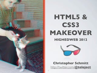
  • 1. HTML5 & CSS3 MAKEOVER HIGHEDWEB 2012 Christopher Schmitt http://twitter.com/@teleject 1
  • 2. TODAY’S AGENDA • What is CSS3? • Explore new CSS3 selectors, properties • (and some other things, too) • How to make them cross-browser, when possible • Tinker with CSS3 examples on our own • Lookat resources to help include CSS3 into your designs 2
  • 5. WHERE IS CSS3 COMING? • The specification is divided into different chunks, modules • http://www.w3.org/Style/CSS/current-work • Transformations • Animations • Media Queries • and so on, and so on... • at a glacial pace ever towards yesterday 5
  • 6. WHERE IS CSS3 COMING? • The specification is divided into different chunks, modules • http://www.w3.org/Style/CSS/current-work • The specification is being written by W3C • http://www.w3.org/Style/CSS/ 6
  • 7. WHERE IS CSS3 COMING? • The specification is divided into different chunks, modules • http://www.w3.org/Style/CSS/current-work • The specification is being written by W3C • http://www.w3.org/Style/CSS/ • Browser vendors (like Firefox, Safari, and Opera) are implementing their own versions of these unfinished standards 7
  • 8. 8
  • 9. EXPLORING CSS3 (AND STUFF) 9
  • 11. COLOR: OPACITY ON BACKGROUND COLORS (RGBA) 11
  • 12. 12
  • 13. OPACITY #number4 { background-color: rgba(255, 255, 0, .4); } 13
  • 14. OPACITY #number4 { background-color: rgb(255, 255, 0); background-color: rgba(255, 255, 0, .4); } 14
  • 15. LESSONS LEARNED • Firefox 3+, Opera 10+, IE9+, and Safari support RGBA • Requiresanother background-color property for cross-browser support. • IE Support? 15
  • 16. OPACITY IN IE #number4 { background-color: transparent; filter:progid:DXImageTransform.Microsoft.gr adient( startColorstr=#66FFFF00, endColorstr=#66FFFF00 ); } 16
  • 17. OPACITY IN IE • First step is to convert the RGB value of the color to hexadecimal. In this example, rgb(255,255,0) converts to #FFFF00. • Next, convert the alpha transparency value to hexadecimal string . In this example, the value is 66. • E.g., alpha value of .3 equals 4D in hexadecimal values • Then assemble the hexadecimal value for transparency and the color together in one string, starting with the transparency: #66FFFF00. 17
  • 19. 19
  • 20. OPACITY ON ELEMENTS #number4 { opacity: .4; /* .4 = 40% transparency */ filter: alpha(opacity=40); /* 40 = 40% transparency */ } 20
  • 21. LESSONS LEARNED • Supported in Firefox 1.5+, Opera 9+, Safari 1.2+ and Chrome. • IE5.5+ requires the use of its own alpha filter in order for the effect to be cross-browser. •A drawback to using the opacity filter is that the value is inherited: • If a parent element is set to be 10% transparent, the child elements’ transparency is also going to be 10%. • Watch out for legibility issues within the Web page. 21
  • 24. PNEUMONOULTRAMICROSCOPICSILICOVOLCANOCONIOSIS The longest word in the Oxford English dictionary is used to name a lung disease caused by the inhalation of very fine silica dust, causing inflammation in the lungs. 24
  • 25. 25
  • 26. TEXT-OVERFLOW p{ text-overflow: ellipsis; -o-text-overflow: ellipsis; } 26
  • 27. LESSONS LEARNED • Support: • Safari • Opera • and IE 27
  • 29. 29
  • 30. TEXT-SELECTION ::selection { color: #90c; background: #cf0; } ::-moz-selection { color: #90c; background: #cf0; } 30
  • 31. LESSONS LEARNED • Support: • Safari • Firefox • IE9+ • Nice subtle effect, esp. if you deal with a lot of text on your site. 31
  • 34. 34
  • 36. TEXT COLUMNS #column { -moz-column-gap: 3em; -moz-column-width: 11em; -webkit-column-gap: 3em; -webkit-column-width: 11em; padding: 10px; } 36
  • 37. TEXT COLUMNS #column { -moz-column-gap: 3em; -moz-column-width: 11em; -moz-column-rule: 1px solid #ccc; -webkit-column-gap: 3em; -webkit-column-width: 11em; -webkit-column-rule: 1px solid #ccc; padding: 10px; } 37
  • 38. LESSONS LEARNED • Proprietary CSS extensions in Firefox and Safari. • JavaScriptsolution through a jQuery plugin: http://welcome.totheinter.net/2008/07/22/multi-column-layout- with-css-and-jquery/ 38
  • 41. 41
  • 42. FONT FILE SUPPORT .ttf .otf .eot Safari 3.1+ Y Y Opera 10+ Y Y Firefox 3.5+ Y Y IE4+ Y 42
  • 43. @FONT-FACE @font-face { font-family: 'MyFontFamily'; src: url('myfont-webfont.eot'); /* IE9 Compat Modes */ src: url('myfont-webfont.eot?iefix') format('eot'), /* IE6-IE8 */ url('myfont-webfont.woff') format('woff'), /* Modern Browsers */ url('myfont-webfont.ttf') format('truetype'), /* Safari, Android, iOS */ url('myfont-webfont.svg#svgFontName') format('svg'); /* Legacy iOS */ } h1 { font-family: “MyFontFamily”, Verdana, sans-serif; } http://paulirish.com/2009/bulletproof-font-face-implementation-syntax/ 43
  • 44. LESSONS LEARNED • Getting @font-face to work is a little tough. • Use http://fontsquirrel.com for pre-made kits, @font-face generator • Chrome supports @font-face • Don’t feel like bothering with all that hassle? • Use font services like typekit.com for 100s of licensed fonts. • Use commercially free fonts (see http://fontsquirrel.com) 44
  • 45. LESSONS LEARNED • Font files are LARGE • gzip them, if you use them: http://articles.sitepoint.com/article/web-site-optimization-steps/2 • New font file format: WOFF: http://hacks.mozilla.org/2009/10/woff/ • Font files are already compressed and supports meta information telling where the font came from. (Vendors happy.) • It’s supported FF3.6+, IE9+ 45
  • 46. OH? YOU WANT “ITALICS”? @font-face { font-family: 'MyFontFamilyItalic'; src: url('myfont-webfont-italic.eot'); /* IE9 Compat Modes */ src: url('myfont-webfont-italic.eot?iefix') format('eot'), /* IE6-IE8 */ url('myfont-webfont-italic.woff') format('woff'), /* Modern Browsers */ url('myfont-webfont-italic.ttf') format('truetype'), /* Safari, Android, iOS */ url('myfont-webfont-italic.svg#svgFontName') format('svg'); /* Legacy iOS */ } http://www.fontspring.com/blog/further-hardening-of-the-bulletproof-syntax 46
  • 48. 48
  • 49. TEXT-SHADOW h1 { font-size: 2.5em; font-family: Myriad, Helvetica, Arial, sans-serif; width: 66.6%; text-shadow: yellow .15em .15em .15em; margin: 0 0 0.1em 0; } 49
  • 50. 50
  • 51. BEVEL TEXT-SHADOW body { background-color: #999; } h1 { text-shadow: 0 1px 0 rgba(255,255,255,.6); }
  • 52. 52
  • 53. TEXT-SHADOW FLAME h1 { color: red; text-shadow: rgba(0, 0, 0, .9) 0px 0px 1px, rgba(255, 255, 51, .9) 0px −5px 5px, rgba(255, 204, 51, .7) 2px −10px 7px, rgba(255, 153, 0, .6) −2px −15px 10px; } 53
  • 54. 54
  • 55. SOLAR TEXT-SHADOW body { background-color: #dcaa96; /* not white */ background-image: url(tile.jpg); } h1 { color: white; text-shadow: black 0px 0px 6px; } 55
  • 56. BORDERS 56
  • 58. 58
  • 59. BOX-SHADOW #header { text-shadow: 0 −1px 0 rgba(0,0,0,.8); box-shadow: 3px 3px 19px rgba(0,0,0,.8); -webkit-box-shadow: 3px 3px 19px rgba(0,0,0,.8); -moz-box-shadow: 3px 3px 19px rgba(0,0,0,.8); } Works like text-shadow, but on boxes! 59
  • 61. 61
  • 62. BORDER-IMAGE <div id="section"> <h2>Images on Borders</h2> <p>Epsum factorial non deposit quid pro quo hic escorol. Olypian quarrels et gorilla congolium sic ad nauseum. Souvlaki ignitus carborundum e pluribus unum..</p> </div><!-- /#section --> 62
  • 63. BORDER-IMAGE #section { border-style: solid; border-color: #930; border-width: 26px 39px 37px 43px; border-image: url(frame.png) 26 39 37 43 stretch stretch; -webkit-border-image: url(frame.png) 26 39 37 43 stretch stretch; -moz-border-image: url(frame.png) 26 39 37 43 stretch round; } 63
  • 64. LESSONS LEARNED • Works in FF 3.1+ and Safari 4+. • Image is scaled, if text is also scaled. 64
  • 65. 65
  • 67. BORDER-IMAGE button { background: none; width: 250px; padding: 10px 0 10px 0; border-style: solid; border-color: #666; border-width: 0 17px 0 17px; } 67
  • 68. BORDER-IMAGE button { background: none; width: 250px; padding: 10px 0 10px 0; border-style: solid; border-color: #666; border-width: 0 17px 0 17px; border-image: url(bkgd-button.png); } 68
  • 69. BORDER-IMAGE button { background: none; width: 250px; padding: 10px 0 10px 0; border-style: solid; border-color: #666; border-width: 0 17px 0 17px; border-image: url(bkgd-button.png) 0 17 0 17 stretch stretch; } 69
  • 70. BORDER-IMAGE button { background: none; width: 250px; padding: 10px 0 10px 0; border-style: solid; border-color: #666; border-width: 0 17px 0 17px; border-image: url(bkgd-button.png) 0 17 0 17 stretch stretch; -webkit-border-image: url(bkgd-button.png) 0 17 0 17 stretch stretch; -moz-border-image: url(bkgd-button.png) 0 17 0 15 stretch stretch; } 70
  • 71. BORDER-IMAGE button { background: none; width: 250px; padding: 10px 0 10px 0; border-style: solid; border-color: #666; border-width: 0 17px 0 17px; border-image: url(bkgd-button.png) 0 17 0 17 stretch stretch; -webkit-border-image: url(bkgd-button.png) 0 17 0 17 stretch stretch; -moz-border-image: url(bkgd-button.png) 0 17 0 15 stretch stretch; color: white; font-family: "Gill Sans", Trebuchet, Calibri, sans-serif; font-weight: bold; text-transform: uppercase; text-shadow: 0px 0px 5px rgba(0,0,0,.8); } 71
  • 72. LESSONS LEARNED • Works in FF 3.1+ and Safari 4+. • Image is scaled, if text is also scaled. • Other values besides “stretch” are “repeat” (tiles the image); “round”, which tiles and filled it with whole images; and “space”, which is like “round” except it leaves empty space 72
  • 74. 74
  • 75. BORDER-RADIUS div { background-image: url(beach.jpg); width: 375px; height: 500px; border: 8px solid #666; border-radius: 40px; -moz-border-radius: 40px; -webkit-border-radius: 40px; } 75
  • 76. BORDER-RADIUS CSS3 Firefox WebKit border-radius -moz-border-radius -webkit-border-radius -moz-border-radius- -webkit-border-top-left- border-top-left-radius topleft radius -moz-border-radius- -webkit-border-top- border-top-right-radius topright right-radius border-bottom- -moz-border-radius- -webkit-border-bottom- right-radius bottomright right-radius border-bottom-left- -moz-border-radius- -webkit-border-bottom- radius bottomleft left-radius 76
  • 77. LESSONS LEARNED • Radius is half the distance of the diameter. (Stay in school, kids!) • Radius border can be applied to one, two, three or all corners. • The higher the value for the radius, the more rounded the corner will be. • If borders on an inline image (IMG element) are rather large, borders are shown behind the image (see previous screenshot). • Workaround is to either keep border-radius value small or place image in background. 77
  • 78. EFFECTS 78
  • 80. 80
  • 81. 81
  • 82. IMAGE MASKS img { display: block; float: left; margin-right:20px; border: 10px solid #ccc; padding: 2px; background-color: #666; -webkit-mask-box-image: url(mask.png); } 82
  • 83. LESSONS LEARNED • When creating a mask, every part of the image that is transparent becomes the mask or the part that hides a portion of the background image. • Approach is somewhat hard to understand, since typically, alpha transparency is, well, transparent. • Themasks scale to the complete width of image, including borders. • The background shows through, including background images. • Might work best with areas of flat color behind the images 83
  • 84. 84
  • 85. GRADIENTS div.building { border: 1px solid #666; float: left; width: 300px; height: 300px; margin: 20px; background-image: -webkit-gradient(radial,center center,900,center bottom,0,from(#0cf ),to(white)); background-image: -moz-radial-gradient(center,900px,center bottom,0,from(#0cf ),to(white)); background-repeat: no-repeat; } 85
  • 86. SAFARI GRADIENTS background-image: -webkit-gradient(); Recommend using background-image over background shorthand. 86
  • 87. SAFARI GRADIENTS background-image: -webkit-gradient(radial); Other value it accepts is linear. 87
  • 88. SAFARI GRADIENTS background-image: -webkit-gradient(radial,center center,900); Set the starting position of gradient. 88
  • 89. SAFARI GRADIENTS background-image: -webkit-gradient(radial,center center,900,center bottom,0); Set the end position of gradient. 89
  • 90. SAFARI GRADIENTS background-image: -webkit-gradient(radial,center center,900,center bottom,0,from(#0cf ),to(white)); Set the starting and stopping colors. 90
  • 91. LESSONS LEARNED • Gradients in Safari can be applied to not just background images of block-level elements, but also: • list bullets, generated content, and border-images! • Unit values aren’t accepted (px, em, etc.) It’s assumed to be pixels. • Don’t use background-position shorthand values. • Use a background-image with a gradient for “older” browsers. 91
  • 92. FIREFOX GRADIENTS • Whereas Safari sets the type of gradient within its own proprietary property, Firefox has properties for both types of gradients: -moz-radial-gradient() and -moz-radiallinear(). • Unlikethe Safari gradient, you can use background-position shorthand values and unit values when setting the starting and stopping points of gradients. • Firefox’s implementation of CSS gradients concerns transparency. 92
  • 93. FIREFOX GRADIENTS background-image: -moz-linear-gradient(left top, left bottom, from(rgba(153,51,0,.3)), to(#6b3703), color-stop(0.5, #903000)); 93
  • 95. 95
  • 96. GRADIENT MASKS img { display: block; float: left; margin-right:20px; border: 10px solid #ccc; padding: 2px; background-color: #666; -webkit-mask-box-image: -webkit-gradient(linear, left bottom, left top, from(rgba(0,0,0,1)), to(rgba(0,0,0,0))); } Only works in Safari. 96
  • 97. Example of transparent gradients, border image, PNG8, text-shadow, box-shadow 97
  • 98. TRANSFORM 98
  • 99. 99
  • 100. TRANSFORM img+img { transform: rotate(270deg); -webkit-transform: rotate(270deg); -moz-transform: rotate(270deg); filter: progid:DXImageTransform.Microsoft.BasicImage(rotation=3); } 100
  • 101. TRANSFORM <IE9 CONVERSION Degree BasicImage Rotation filter value 0 0 90 1 180 2 270 3 101
  • 103. 103
  • 104. ANIMATING LINKS #navsite a { -webkit-transition-timing-function: linear; -webkit-transition-duration: .66s; -webkit-transition-property: background-color; } Style rollover links normally. 104
  • 105. LESSONS LEARNED • The transitioning-timing-function function states the type of animation the effect is going to take. • In this example, the value is set to linear, which means each frame of the animation length takes the same amount of time. • Other values for transitioning-timing-function include ease, ease-in, ease-out, and cubic-bezier (x1, y1, x2, y2). 105
  • 107. CUBIC BEZIER CURVE cubic-bezier(x1, y1, x2, y2) • Thefirst two values of cubic-bezier represent the transition on a curve, as shown in the figure. • Values for y1 and y2 represent the start and end of the transition and are always equal to the values of 0.0 and 1.0, respectively. • The speed with which the transition takes hold is represented by the values x1 and x2. The greater the value for x1 and x2, the slower the transition occurs. 107
  • 108. CUBIC BEZIER CURVE cubic-bezier(x1, y1, x2, y2) •A value of ease-in starts the transition at a slow speed and then speeds up. This value is equivalent to cubic-bezier(0.42, 0, 1.0, 1). • Theease-out value starts the transition at a fast speed and then slows down. This value is equivalent to cubic-bezier(0.42, 0, 1.0, 1). • The ease value is equivalent to cubic-bezier(0.25, 0.1, 0.25, 1.0). 108
  • 109. DURATION & DELAY • The transition-duration property’s default value is 0. • Any negative value is treated as though it’s zero. • Units the value may take include, but are not limited to, “s” for seconds and “ms” for milliseconds. • Thetransition-delay property sets the amount of time before a transition starts. 109
  • 110. TRANSITION PROPERTY • The transition-property property defines which CSS visual property the transition is applied to. • In the animated link example, the transition is applied to the background color. 110
  • 111. SHORTHAND PROPERTY • You can write the properties of the transition effect in one value for the transition property: #navsite a { -webkit-transition: background-color .66s linear; } 111
  • 114. 114
  • 115. COMPLEX ANIMATED LINKS • Web designer Faruk Ateş’s personal site (see http://farukat.es/) uses the transition property to change the color of the element. • As well as the color, width, box shadow, text shadow, and opacity. 115
  • 116. COMPLEX ANIMATED LINKS #web20 li a { text-shadow: rgba(0,0,0, 0) 1px 1px 2px; -moz-box-shadow: rgba(0,0,0, 0) 2px 2px 2px; -webkit-box-shadow: rgba(0,0,0, 0) 2px 2px 2px; -moz-border-radius-topright: 31px; -moz-border-radius-bottomright: 31px; -webkit-border-top-right-radius: 31px; -webkit-border-bottom-right-radius: 31px; -webkit-transition: background-color .25s ease, color .5s ease, width .2s ease-out, -webkit-box-shadow .25s ease, text-shadow .2s ease, opacity .2s ease; } 116
  • 118. 118
  • 120. ANIMATING ELEMENTS #clouds1 { width: 627px; height: 410px; position: absolute; right: −300px; top: 0; background-image: url(clouds.png); } 120
  • 121. ANIMATING ELEMENTS @-webkit-keyframes "clouds" { from { right: 0px; } to { right: 100px; } } 121
  • 122. ANIMATING ELEMENTS #clouds1 { width: 627px; height: 410px; position: absolute; right: −300px; top: 0; background-image: url(clouds.png); -webkit-transform: translate(300px, 0px); -webkit-animation-name: "clouds"; -webkit-animation-duration: 10s; -webkit-animation-iteration-count: 10; -webkit-animation-direction: alternate; } 122
  • 123. ANIMATING ELEMENTS • Animations can take on more than one property (think offset properties and even opacity for some interesting effects). • The animation-transform property is used to associate which keyframe rule is used (“clouds). • The animation-duration is set for how long the effect should occur. (Negative values are treated as zero.) • The animation-iteration-count tells how many times it should happen. For constant looping, use value of “infinite”. • Use animation-direction property set to normal loops animation, while “alternate” creates a more seamless presentation (back and forth). 123
  • 124. RESOURCES • “When Can I Use…” http://a.deveria.com/caniuse/ • Modernizr http://www.modernizr.com/ • CSS Cookbook, 3rd Edition http://oreilly.com/catalog/9780596155940 • CSS3 Sandbox http://westciv.com/tools/gradients/ • “10 Amazing Examples of Innovative CSS3 Animation” http://designshack.co.uk/articles/css/10-amazing-examples-of-innovative-css3-animation 124
  • 125. THANK YOU! Christopher Schmitt schmitt@heatvision.com http://twitter.com/teleject 125
  • 126. Creative Commons Citations: http://www.flickr.com/photos/camkage/3682824473/ http://www.flickr.com/photos/dabiri/2538913191/ http://en.wikipedia.org/wiki/ File:Bridge_across_continents_iceland.jpg http://en.wikipedia.org/wiki/File:Plates_tect2_en.svg 126