
Empfohlen
Empfohlen
Weitere ähnliche Inhalte
Kürzlich hochgeladen
Kürzlich hochgeladen (20)
Empfohlen
Empfohlen (20)
10 deadly web design sins and how to stay away from them
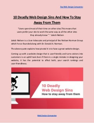
- 1. Top Web Design Companies 10 Deadly Web Design Sins And How To Stay Away From Them “Users spend most of their time on other sites.This means that users prefer your site to work the same way as all the other sites they already know ” ~ Jakob Nielsen Jakob Nielsen is a User Advocate and principal of the Nielsen Norman Group which he co-founded along with Dr. Donald A. Norman. The above quote explains how pivotal it is to have a great website design. Coming up with a website design that is user-friendly and turns visitors into customers is an uphill task.Even if there is a single mistake in designing your website, it has the potential to affect both, your search rankings and user-friendliness. Web Design Companies
- 2. Top Web Design Companies You need to build a solid framework for an interactive design.Adding crisp textures and beautiful animations are not enough to make a great web design. Simplicity is the key when it comes to web design. Here are a few mistakes that companies make when it comes to web design.This list also comprises of ways to avoid these mistakes: 1. Complex navigation One ground rule of web design is to keep the navigation as simple as possible.Complex navigation includes having the menu at an odd place, a thousand submenus, a non-standard style and including generic labels without proper description. Fundamentally, your website shouldn’t be tough for the visitors to navigate through. Don’t send your users on a wild goose chase when browsing through your site. Solution: Make a horizontal menu which has short description tags. There should be no more than seven or eight labels on the top of the page.Each label should have just one level of the drop-down menu. Ensure that there is a clearly visible search box on the upper left side or the upper right side of the page. Web Design Companies
- 3. Top Web Design Companies 2) Free web design software Relying on a free website designing software is a big no.Some software also has the “drag and drop” web building apps which claim that the user can launch the app in minutes.You should stay with those as well. Now, where does the problem lie in both these cases? For each aspect of the design, a dozen lines are added to the back end code which increases the loading time of the website.With time, it also leads to a stack of errors and severe performance lags. Solution: Hence, it is advisable to stay with the umpteen free web design software available.It would be best for your business if you hire a top web design company which will help you get a minimalistic, responsive and intuitive design for your website. 3) Disabling Zoom on Mobile Sites Nowadays, most of the people use their mobile phones for browsing, more than they use desktops.When you open a webpage on your mobile and find that you can’t zoom in to make the text large enough to read, it’s a turn-off. As a result, the readers will stray away from your page. Solution: Your site must be optimized for mobile as well.While designing the site keep in mind, that it has to be optimized according to mobile usage. Features like zoom in and zoom out should be enabled. Web Design Companies
- 4. Top Web Design Companies 4) Typography Good typography makes reading effortless, whereas poor typography turns users off.Using a combination of many different fonts, using typeface excessively and minimizing the spacing between the lines are all signs of bad typography. Try to avoid novelty typefaces, condensed styles and letterforms which have thin strokes.It gives a shoddy appearance to your web page. Solution: Use fonts with distinguishable letters.Avoid All caps.To enhance readability, limit the line length and keep typefaces simple.The text size should be selected keeping in mind that the site will be used on desktop and mobile.It should neither be too small or nor too large. 5) Cluttered Pages When a website is stacked to the brim with text and graphics, it’s extremely distracting. As a result, the user hardly retains any information.This is the exact opposite of your main motive. Use white spaces to key out content. Without whitespace, you wouldn’t be able to tell the difference between objects in a sequence.Take the article you’re currently reading as an example: without the white space between every paragraph, how readable would it be? Web Design Companies
- 5. Top Web Design Companies Solution: Use a minimalistic approach and try not to overhaul your page with graphics or text or images.Embrace white spaces wherever possible.Try to come up with a design which is not congested and has white spaces. 6) Orphan pages An orphan page is a page on the website which has no easy way back to the site. After all the efforts you put into designing and developing your page, it would be a shame that your visitors disappear from your page just because it couldn’t redirect them back to your site. With the advent of various CMS platforms, orphan pages are not that common.If you are considering a minimalistic landing approach for your main page, instead of removing them altogether you can consider reducing the number of links. Solution: If all these sound complicated to you, it’s never too late to hire a website designing company, especially if you require an audit for your page or have a lot of indexed pages. 7) No visible contact information Not listing contact information clearly is a big mistake that website designers make.Nobody likes to dig around for information.It becomes annoying for the visitor. Web Design Companies
- 6. Top Web Design Companies So, it is wise to have the contact information listed clearly on your page.Because ultimately your website is a sales tool and it should serve its purpose. Solution: Ensure that all of your contact details are noticeable without having to scroll through. One way to be sure of this is to insert all your contact details as the sidebar, header, footer or you could also go ahead and merge all of it. 8) Overusing interstitials Interstitials are the ads that encroach the main page content. Apart from being bothersome, they attract a penalty from Google as well. Cramming a page with interstitials, be it slide in pop-ups, or full screen is considered as bad UX. Solution: Try to use interstitials sparingly.And if it is unavoidable, use them only if your content demands it and not for raising revenue. Instead, focus on improving the web design to earn more subscribers. 9) Not paying attention to analytics: One major mistake that companies make while designing a website is not properly set up the analytics of the website.Let’s say what happens after someone fills out a form. How does the website say thank you?Or how do you integrate email sign up? Web Design Companies
- 7. Top Web Design Companies Solution: Set up the site analytics through Google webmaster tools or an identical program. A “destination goal” is a type of conversion in Analytics. It measures when a visitor reaches a goal URL, typically a thank you page. They are easy to create, and thus make conversion tracking simple.Make it a point to use Google Analytics to check for browser issues. 10) Scrolljacking: This is probably the biggest blunder that people make when it comes to web design. When designers manipulate the scroll bar to work rather differently on their web page, it is known as scrolljacking. It is typically done by adding animation, having a fixed scroll point. Mostly you would notice this in websites which have a series of slides instead of the normal vertical layout. It is preferred by webmasters because they can fit in more advertisements in this manner. But it kills the usability and is visually unappealing. Solution: Try not to incorporate this into your web design.Retain the normal scrollbar which is universal throughout. Web Design Companies
- 8. Top Web Design Companies Endnote: Website navigation mistakes are expensive and can cost a lot.Avoiding these mistakes will help your website look professional and keep potential customers from bouncing. Don’t let these sins ruin an otherwise great site.Go ahead and design a website which strikes the right chord with your visitors! Source Link:- https://uxplanet.org/10-deadly-web-design-sins-and-how-to-stay-away-from-them-367fea1dad13 Web Design Companies