The Power of Responsive Web Design
•
0 gefällt mir•543 views

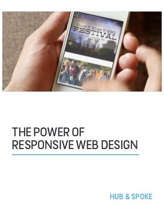
Americans are never more than three feet from their mobile phones, while 70% will even use them in the bathroom. Mobile is and will continue to be everywhere.

Empfohlen
Empfohlen
Weitere ähnliche Inhalte
Andere mochten auch
Andere mochten auch (20)
Kürzlich hochgeladen
Kürzlich hochgeladen (20)
The Power of Responsive Web Design
- 2. THEPOWEROFRESPONSIVEWEBDESIGN 2 You may also remember the exorbitant prices to own one of these innovative mobile phones, making them available mostly to traveling business people or those with budgets beyond typical means. Fast forward to the present day and two out of three people carry a mobile phone, with 94% of all adults aged 18-44 owning one. Half of all phones are now smart phones, and over 80,000,000 Americans have phones that are email enabled. Other research has shown that Americans are never more than three feet from their mobile phones, while 70% will even use them in the bathroom. Mobile is and will continue to be everywhere. With it evolving so rapidly, mobile is practically indefinable and not relegated only to phones. Mobile encompasses tablets, mp3 players, netbooks and any other devices that allow users to access the Internet while on the move. A mere thirty years ago, in 1983 to be exact, the first commercially available mobile was produced. You may remember a mobile phone being a cumbersome bag that you had to haul around. THEPOWEROFRESPONSIVE WEBDESIGN
- 3. THEPOWEROFRESPONSIVEWEBDESIGN 3 Perhaps Barbara Ballard, author of Designing the Mobile User Experience summed it up best when she stated, “Fundamentally, mobile refers to the user, and not the device or the application.” Essentially, we can surmise that mobility is connected to the user and how they are accessing the Internet rather than focusing on the device or application they are using to do so. Since mobile is a burgeoning market and continued growth is inevitable, websites need to be designed with flexible content in mind and not the restrictive methods used in designing for desktops. Single platform design days are now a thing of the past and now content needs to be not only flexible, but scalable to accommodate any type of device in any type of scenario. Whereas in the past people used their mobile devices mostly for text messaging, now they use their mobile devices while sitting at home on the sofa, or while out and about in cafes, stores or anywhere else they have access to wireless Internet, and they are using them for many reasons. They are browsing the Internet; they are searching for locations and even making purchasing decisions while in stores. What’s even more important is they are willing to perform complicated tasks on their We’re always on the move, and so is the web. THEWEBOFTHE USER,NOTTHEDEVICE “Single platform design days are now a thing of the past... content needs to be not only flexible, but scalable.” HOW WE HELPED It is best to consider mobile as an experience we are creating rather than a separate entity, and design for flexibility and adaptability. It is best to consider mobile as an experience we are creating rather than a separate entity, and design for flexibility and adaptability. It is best to consider mobile as an experience we are creating rather than a separate entity, and design for flexibility and adaptability. mobile devices, and they are spending money. It is no longer safe to guess what a user is trying to achieve on a mobile device; assume they want to do everything. Since mobile is a burgeoning market and continued growth is inevitable, websites need to be designed with flexible content in mind and not the restrictive methods used in designing for desktops.
- 4. THEPOWEROFRESPONSIVEWEBDESIGN 4 Although apps are popular and in some cases necessary, there are a lot of drawbacks to using them as a means to promote your brand. Essentially, an app is a delivery service that brings content to the user, but while some apps are great experiences, many are not. With a variety of delivery options available the high cost of app development for multi platforms, the time involved in app creation and the maintenance required for them is just not feasible for most purposes. Seeing your apps listed in an app store may have a certain appeal, but it will not guarantee more users and views for your content. A better and much more economical solution is having a website that works everywhere, on every platform regardless of screen size. This is where responsive web design comes into play. Responsive web design is the latest buzzword that is taking the Internet by storm, but it has an important meaning and application. It represents a fundamental shift in website design; a move towards creating websites that are flexible and adaptable to any platform on any device. Responsive web design creates cohesion and a seamless brand experience, while removing the need to create separate apps for each platform. For organizations that wish to deliver unique and innovative experiences to mobile consumers, responsive web design may not be the best solution since it is meant to scale your web content fluidly across multiple screen sizes and devices. Developing a strategy to deliver the kind of experience you want your mobile users to access will help determine if adopting a responsive design philosophy is the best method of delivery for your brand. It really comes down to how you view your connected brand and how closely you want all the pieces of it to fit together. For organizations that wish to deliver unique and innovative experiences to mobile consumers, responsive web design may not be the best solution since it is meant to scale your web content fluidly across multiple screen sizes and devices. The Pro’s & Con’s of Responsive Web Design MOBILEAPPS
- 5. THEPOWEROFRESPONSIVEWEBDESIGN 5 THE MOBILE EXPERIENCE You have likely heard the term “mobile Web” many times. In reality, there is no distinction between a “mobile Web” and the actual Web, the only distinction is in how users are accessing and viewing it. It is best to consider mobile as an experience we are creating rather than a separate entity, and design for flexibility and adaptability. With the wide array of mobile devices that can access the Web it would be impossible to accommodate each and every one, so being focused on content from the onset will help you design with brand experience in mind and not become trapped by the visual limitations that can accompany the wide variety of devices. Believe it or not every three minutes in the UK, a vehicle is purchased using the eBay mobile app! This is further proof the main focus needs to be on delivering a great user experience no matter what the device, and not limiting them. SMALLER SCREENS DO NOT EQUATE TO SMALLER EXPERIENCES Mobile users are demanding customers, and if they receive fewer features because you design with limitations in mind, they can potentially be left without the means or desire to engage with your actual product. It is absolutely critical to put your users’ needs first. People are using their mobile devices to perform all kinds of actions while using a wide range of devices. For example, 25% of mobile users engage in online shopping through their phones and tablets, and a higher number of users research products on their phones; sometimes while right in the store. Believe it or not every three minutes in the UK, a vehicle is purchased using the eBay mobile app! This is further proof the main focus needs to be on delivering a great user experience no matter what the device, and not limiting them.
- 6. THEPOWEROFRESPONSIVEWEBDESIGN 6 LESS IS MORE Earlier, it was mentioned that limiting experience due to the smaller screen sizes would limit user experience. Expanding on that now, get into the mindset that mobile actually means more. Better network connectivity, smaller device sizes and constant availability means people are continually connected and seeking content. More than ever, you have opportunity to push your brand awareness if you create an experience that delivers what consumers are seeking and wanting to engage with. FINAL NOTE The case is pretty clear for the need for mobile web design for your brand. It is worth noting that if you do adopt responsive web design for your organization, this can help with search engine placement. A main site that is mobile-enabled places higher in search engine rankings than several sites for various applications. Considering the lower cost of using responsive web design compared to the alternatives, your return on investment will be highest with this platform. Trey Quinlan of Trey Bistro wanted a mobile site that would work correctly for all mobile devices. We delivered. TREY BISTRO A mere thirty years ago, in 1983 to be exact, the first commercially available mobile was produced. You may remember a mobile phone being a cumbersome bag that you had to haul around.
- 7. THEPOWEROFRESPONSIVEWEBDESIGN 7 This is just an introduction, skimming the surface of the depths of what responsive web design and development is all about. Thank you for taking a look, and we hope to hear from you soon! Contact us today to schedule your risk free consultation to learn more about responsive web design and how Hub & Spoke can connect your brand. Copyright © 2014 Hub & Spoke All Rights Reserved (888)573-4482 HELLO@HUBANDSPKECREATIVE.COM HUB&SPOKE