SlideShare ist ein Scribd-Unternehmen logo
1 von 22
Page tested (filename
or URL)

Date tested

Start time

End time

Tester name

Tester's Job/Role

Tester phone no.

Tester email

Connection used
(network, dial-up,
ISDN)

Browser used (IE,
Netscape, Opera)

Platform/OS Used


General comments
about the site (after
testing)


How would you rate
the usability of this
checklist?


Do you have any
suggestions for
additions to this
checklist?
Severity
       Criteria
No.                                         Yes   No   N/A     (0-4)
       Visual Presentation and
 1     Design
       Does the page layout contain
       enough open space to not be
1.1    cluttered?
       Is the page moderate in its use of
1.2    color?
       Is page length appropriate in its
1.3    content?
       Does the page provide feedback
       whenever possible (e.g., "reply"
1.4    screen for forms-based pages)?
       Is the page length two screens or
1.5    less?
       Can each page "stand alone"?
1.6
       Is the formatting scheme logical
1.7    and standard?
       Are row and column headers
1.8    visible for data tables?
       Is the site aesthetically pleasing
1.9    enough to keep users interested?
       Is the text (size, color, font) on
       the background (color, texture,
1.10   etc.) easy to read?
       Are the text columns no wider
1.11   than 3.5 inches on your screen?
       Do graphic elements (photos,
1.12   images, etc.) match context?


 2     Clarity of Communication


                                                              2
Can you determine quickly the
       purpose and features of the
2.1    page?
       Can you easily find contact
2.2    information?
       Can you easily send an email to
2.3    the contact person?
       Are links and icons labeled in a
2.4    way that makes sense?
       Are clear instructions given for
2.5    performing processes?
       Are FAQs organized by
2.6    category?
       Are information and error
       messages useful, accurate and
2.7    correctly spelled?
       Does the page convey a clear
2.8    sense of its intended audience?
       Is the language used in a way
       that's familiar and comfortable to
2.9    you?
       Are the page title and headings
2.10   short and meaningful?
       Is the language kept clear and
2.11   simple?
       Are header elements used to
2.12   convey page structure?
       Is the target of each link clearly
2.13   identified?
       Are acronyms and abbreviations
2.14   defined?
       Are the contents ordered in a
       logical way (e.g., alpha,
2.15   temporally, spatially,
       categorically, or by magnitude)?
       Are you provided with a preview
       of what will happen or where
       you'll go before you click on a
2.16
       hyperlink?


                                            3
Is information "chunked" into
       short, readable paragraphs or
2.17   bullets? page use an "inverted
       Does the
       pyramid" information structure,
       with summary information
2.18   presented first, followed by more
       detail? page title accurately
       Does the
       describe the contents of the
2.19   page?


       Navigation
 3
       Is there a lack of excessive
       "page bouncing" where you must
       visit several pages to get the
3.1
       information you need?
       Is there a link to a site map, site
       index or list or commonly
3.2    accessed sections?
       Is hyperlinking used frequently,
       to prevent large pages from         `
3.3    being` downloaded?
       Is there a clear and obvious link
3.4    to the home page?
       Is the navigation flow consistent
3.5    and logical?
       Does the page use
       (approximately) standard link
3.6
       colors?
       Are the links obvious in (i.e.,
       clearly labeled for) their intent
3.7    and destination?
       Is there a convenient, obvious
       way to maneuver among related
       pages, and between different
3.8
       sections?
       Are meaningless links avoided?
3.9
       Are links provided to other
3.10   relevant pages?


                                               4
Are links provided to more in-
3.11   depth coverage of information?
       Are navigational aids provided on
       both the top and bottom of each
       page (if page is longer than one
3.12
       screen in length)?
       Is this page easy to find from
3.13   other pages?
       Can you search the entire site
3.14   from this page?
       Does the site avoid "orphaned"
3.15   pages?
       Does the page avoid the need to
3.16   scroll horizontally?
       Is there a "you are here" visual
3.17   cue?
       Does all underlined text link to
3.18   something else?


3.19


       Consistency
 4
       Is the page visually consistent in
       its "look and feel" with other
4.1    pages?
       Is the page visually consistent
4.2    even without graphics?
       Are navigation elements used
4.3    consistently?


       Accessibility
 5
       Are graphics optimized to
5.1    download quickly?


                                            5
Can a user navigate using text
5.2   only?
      Are response times fast enough
5.3   to keep you in a flow state?
      Does the page allow mistakes to
5.4   be easily undone?
      Is load time appropriate to
5.5   content, even on a dial-up?
      Is there a text equivalent for
      every non-text element? (e.g.,
      image map regions, animation
5.6
      scripts, audio and video)
      Is the text readable by people
      with color blindness?
5.7
      Are ALT attributes used to
      describe images?
5.8


      General/Other
6
      Is there a "printer friendly"
6.1   version for this page?
      Are all links active (live)?
6.2
      Do all CGI scripts work?
6.3
      Does every form have a
6.4   function?
      Do you immediately see the
6.5   results of your actions?


                                        6
7
Comments/Suggestions for Improvement


                                       8
9
10
11
12
13
Heuristic Principle                                               Severity
                                                              Met   Violated   N/A    (0-4)     Comments/Suggestion to Remedy Problem
1. Organize data into meaningful framework.
Organize the user interface purposefully, in
meaningful and useful ways that put related things
together and separate unrelated things based on
clear, consistent (conceptual) models or site
metaphors that are apparent and recognizable to
others.

    1.1 Keep all needed options and materials for a
    given task visible without distracting the user with
    extraneous or redundant information.

    1.2 Instead of cramming everything about a product
    or topic into a single page, use hypertext to structure
    the content space into a starting, overview page and
    several secondary pages that each focus on a
    specific topic. Help users avoid wasting time on
    subtopics that don’t concern them.

    1.3 Recognize that users rarely read Web pages
    word by word; instead, they scan the page, picking
    out individual words and sentences. Use lists,
    headings, and other HTML formatting tools to help
    users find the information that suits their needs.

2. Visibility of system status: Keep users informed
about what is going on, through appropriate
feedback within reasonable time.

    2.1 Structure helps users navigate. Without
    structural links, pages are orphaned in cyberspace.
    Provide users with a path to higher levels of
    navigation and content. (example: breadcrumbing)
2.2 Accommodate and support user-controlled
    navigation. Do not force users through set paths.
    Make alternate paths easy to follow, consistent, and
    logical.

    2.3 Provide feedback by keeping users informed of
    actions or interpretations, changes of state or
    condition, and errors or exceptions using clear,
    concise, and unambiguous language familiar to
    users.

3. Match between system and the real world: Speak
the users’ language, with words, phrases and
concepts familiar to the user, rather than system-
oriented terms. Follow real-world conventions,
making information appear in a natural and logical
order.
    3.1 Avoid using technical, scientific or legal
    language. On main pages of the site, create content
    that can be understood by a general audience.

    3.2 Provide a simple process for completing simple
    tasks.
    3.3 When creating your site’s navigation, do not
    simply copy your organization’s structure. Create a
    navigation design and options that reflect user tasks
    on your site.

4. User control and freedom: Be flexible and tolerant,
reducing the cost of mistakes and misuse by
allowing undoing and redoing while preventing
errors wherever possible by tolerating varied inputs.
Provide users with a clearly marked "emergency
exit" to easily recover from mistakes.
4.1 Don’t disable the Back button on a browser by
    opening a new window or using an immediate
    redirect. The Back button is the second-most used
    navigation feature (after following hypertext links).
    Users know that they can try anything on the Web
    and then click on the Back to return to familiar
    territory.

    4.2 Help users recognize, diagnose and recover
    from errors by providing error messages that are
    written in plain language (not code), clearly indicate
    the problem, and constructively suggest or provide a
    solution.

5. Consistency and standards: Reduce the need for
users to rethink and remember by reusing internal
and external components and behaviors, maintaining
consistency with purpose rather than merely
arbitrary consistency. Follow platform conventions.
    5.1 Do the same as everybody else. If most big Web
    sites do something in a certain way, then follow
    along. Users will expect things to work the same way
    on your site.

    5.2 Avoid using HTML that does not comply with
    standards or causing the user’s browser to engage
    in a nonstandard behavior.

6. Error prevention: Even better than a good error
message is a careful design which prevents a
problem from occurring in the first place.

    6.1 Use link titles to provide users with a preview of
    where each link will take them, before they have
    clicked on it. Help them avoid waiting for
    unnecessary page downloads.
6.2 Avoid link-rot by keeping pages up indefinitely
    once they have been put on the Web or provide
    redirect messages and auto-redirect capabilities.
    Other sites may link to your page. Users may have
    bookmarked the page because they want to go
    directly to a relevant part of your site. Search
    engines are slow in updating their databases, so
    they too will lead users astray if you remove pages.


    6.3 Avoid using a new technology if you suspect that
    a large percentage of your users have not adopted
    the new technology.

7. Recognition rather than recall: Make objects,
actions, and options visible. The user should not
have to remember information from one part of the
dialogue to another. Instructions for use of the
system should be visible or easily retrievable
whenever appropriate.

    7.1 Provide search if the site has more than 100
    pages.
    7.2 Write straightforward and simple headlines and
    page titles that clearly explain what the page is
    about and that will make sense when read out-of-
    context in a search engine results listing.
    7.3 Structure the page to facilitate scanning; for
    example, use grouping and subheadings to break
    content into smaller "chunks."

    7.4 Page titles, headlines, and subject lines needs
    to clear and succinct. You only get 40-60 characters
    to explain your content. Unless the title or subject
    makes it absolutely clear what the page or email is
    about, users will never open it.
8. Flexibility and efficiency of use: Accelerators --
unseen by the novice user -- may often speed up the
interaction for the expert user such that the system
can cater to both inexperienced and experienced
users. Allow users to tailor frequent actions.


    8.1 Create the default interface as simple as the task
    will allow, offering more powerful features available
    to intermediate or expert users through customizable
    interfaces, keyboard shortcuts or other subtle
    mechanism. (an example: provide a basic search on
    every page with a link to an advanced search option
    for those who want to use it).


9. Aesthetic and minimalist design: Include in the
displays only the information needed by the user at
that given time/place. Every extra unit of information
in a display competes with the relevant units of
information and diminishes their relative visibility.


    9.1 When designing for the Web, download speed
    must be the overriding criterion. To keep page sizes
    small, graphics should be kept to a minimum, and
    multimedia effects should be used only when they
    can add to a user’s understanding of the information.
    Keep it simple.

    9.2 Split long pages of text into multiple pages,
    connected with hyperlinks. Each "chunk" of content
    should cover a specific topic. No more, no less.


    9.3 Avoid creating huge scrolling pages of text; as
    they move down the page, users will no longer be
    able to see navigation options. or….
9.4 Practice judicious redundancy. For example, on
    a long page with a lot of content, repeat the
    navigation that disappears as the user scrolls down.


10. Help and documentation: Any Help or
documentation should be easy to search, focused on
the user’s task, list concrete steps to be carried out,
and not be too large.

    10.1 When writing documentation, provide multiple
    examples to help the user contextualize their
    problem.
    10.2 When designing help, begin with “how do I…”
    for topics that show the user how to accomplish a
    task.
Please read each statement
  carefully and check a number
  from 1 to 7,
  where "1" means you strongly
  disagree with the statement and
  "7" means you strongly agree
  with the statement.

                                     Strongly                               Strongly
            Statement                           1   2   3   4   5   6   7              N/A
                                     Disagree                                Agree

The site satisfied the needs of
various audiences.

The site was easy to use.


The site was useful.

The site provided material
appropriate for the audiences.

The site did everything I expected
it to do.

The fewest steps possible were
required to accomplish each task.

I was able to use the site
successfully.

With a little practice, I could
become skillful with the site.

The site used words and phrases
that were familiar to me.

Content was presented in an
intuitive and logical manner.
I didn't wonder whether words or
buttons on the same page meant the
same thing.
I didn't have to remember
information on one page in order to
successfully accomplish something
on another page.

Content provided by the site was
relevant to my needs.

I would recommend a site like this
one to a friend or family member.
Heuristic Ratings

0   I don't agree that this is a usability problem.

1   Nominal problem only -- fix if time permits or if changing other things at that location

2   Minor usability problem -- fixing this should be given low priority.

3   Major usability problem -- important to fix, so should be given high priority.

4   Usability catastrophe -- imperative to fix this before product can be released.

Weitere ähnliche Inhalte

Andere mochten auch

Smartphones powerpoint presentation
Smartphones powerpoint presentationSmartphones powerpoint presentation
Smartphones powerpoint presentationnhla4
 
Advantages and Disadvantages of Mobile phone
Advantages and Disadvantages of Mobile phoneAdvantages and Disadvantages of Mobile phone
Advantages and Disadvantages of Mobile phoneMuhammad Ali
 
Smartphones presentation
Smartphones presentationSmartphones presentation
Smartphones presentationfdla1
 
Powerpoint presentation1 smartphones
Powerpoint presentation1  smartphonesPowerpoint presentation1  smartphones
Powerpoint presentation1 smartphonestkmaz1
 
Ppt on World Of Smartphones
Ppt on World Of SmartphonesPpt on World Of Smartphones
Ppt on World Of SmartphonesPulkit Syal
 
Presentation on mobile phones
Presentation on mobile phonesPresentation on mobile phones
Presentation on mobile phonessirtwinkles
 

Andere mochten auch (7)

Mobile ppt
Mobile pptMobile ppt
Mobile ppt
 
Smartphones powerpoint presentation
Smartphones powerpoint presentationSmartphones powerpoint presentation
Smartphones powerpoint presentation
 
Advantages and Disadvantages of Mobile phone
Advantages and Disadvantages of Mobile phoneAdvantages and Disadvantages of Mobile phone
Advantages and Disadvantages of Mobile phone
 
Smartphones presentation
Smartphones presentationSmartphones presentation
Smartphones presentation
 
Powerpoint presentation1 smartphones
Powerpoint presentation1  smartphonesPowerpoint presentation1  smartphones
Powerpoint presentation1 smartphones
 
Ppt on World Of Smartphones
Ppt on World Of SmartphonesPpt on World Of Smartphones
Ppt on World Of Smartphones
 
Presentation on mobile phones
Presentation on mobile phonesPresentation on mobile phones
Presentation on mobile phones
 

Ähnlich wie Heuristic checklist

Web Site Design Principles
Web Site Design PrinciplesWeb Site Design Principles
Web Site Design PrinciplesMukesh Tekwani
 
Website usability ideas for business growth
Website usability ideas for business growthWebsite usability ideas for business growth
Website usability ideas for business growthJames Smith
 
Plan For Accessibility - TODCon 2008
Plan For Accessibility - TODCon 2008Plan For Accessibility - TODCon 2008
Plan For Accessibility - TODCon 2008Denise Jacobs
 
Web Accessibility Made Easy
Web Accessibility Made EasyWeb Accessibility Made Easy
Web Accessibility Made Easybeckymiller
 
Professional ui for a website design
Professional ui for a website designProfessional ui for a website design
Professional ui for a website designRavi Bhadauria
 
Section 508-checklist
Section 508-checklistSection 508-checklist
Section 508-checklistLarry Wilson
 
Zen and the Art of Web-Site Evaluation
Zen and the Art of Web-Site EvaluationZen and the Art of Web-Site Evaluation
Zen and the Art of Web-Site EvaluationDamian T. Gordon
 
Putting the "C" in WCAG: accessibility for web writers
Putting the "C" in WCAG: accessibility for web writersPutting the "C" in WCAG: accessibility for web writers
Putting the "C" in WCAG: accessibility for web writers4 Syllables
 
Jims Book Review Web Design Power Point V2
Jims Book Review Web Design Power Point V2Jims Book Review Web Design Power Point V2
Jims Book Review Web Design Power Point V2JamesMcGrath
 
Design for Accessibility
Design for AccessibilityDesign for Accessibility
Design for Accessibilityqixingz
 
Making Your Website Sing!
Making Your Website Sing!Making Your Website Sing!
Making Your Website Sing!Embolden
 
Making Your Website Sing!
Making Your Website Sing!Making Your Website Sing!
Making Your Website Sing!Embolden
 
Global Scope Final Report
Global Scope Final ReportGlobal Scope Final Report
Global Scope Final ReportKamil Mustaffa
 

Ähnlich wie Heuristic checklist (20)

Web Site Design Principles
Web Site Design PrinciplesWeb Site Design Principles
Web Site Design Principles
 
Website usability ideas for business growth
Website usability ideas for business growthWebsite usability ideas for business growth
Website usability ideas for business growth
 
Plan For Accessibility - TODCon 2008
Plan For Accessibility - TODCon 2008Plan For Accessibility - TODCon 2008
Plan For Accessibility - TODCon 2008
 
Web Accessibility Made Easy
Web Accessibility Made EasyWeb Accessibility Made Easy
Web Accessibility Made Easy
 
Professional ui for a website design
Professional ui for a website designProfessional ui for a website design
Professional ui for a website design
 
Siegman "Practicalities of Accessibility"
Siegman "Practicalities of Accessibility"Siegman "Practicalities of Accessibility"
Siegman "Practicalities of Accessibility"
 
Section 508-checklist
Section 508-checklistSection 508-checklist
Section 508-checklist
 
Zen and the Art of Web-Site Evaluation
Zen and the Art of Web-Site EvaluationZen and the Art of Web-Site Evaluation
Zen and the Art of Web-Site Evaluation
 
WebBestPractices3
WebBestPractices3WebBestPractices3
WebBestPractices3
 
Usability
UsabilityUsability
Usability
 
508checklist
508checklist508checklist
508checklist
 
Putting the "C" in WCAG: accessibility for web writers
Putting the "C" in WCAG: accessibility for web writersPutting the "C" in WCAG: accessibility for web writers
Putting the "C" in WCAG: accessibility for web writers
 
Jims Book Review Web Design Power Point V2
Jims Book Review Web Design Power Point V2Jims Book Review Web Design Power Point V2
Jims Book Review Web Design Power Point V2
 
Design for Accessibility
Design for AccessibilityDesign for Accessibility
Design for Accessibility
 
Activate
ActivateActivate
Activate
 
Making Your Website Sing!
Making Your Website Sing!Making Your Website Sing!
Making Your Website Sing!
 
Making Your Website Sing!
Making Your Website Sing!Making Your Website Sing!
Making Your Website Sing!
 
Global Scope Final Report
Global Scope Final ReportGlobal Scope Final Report
Global Scope Final Report
 
Slides chapter 12
Slides chapter 12Slides chapter 12
Slides chapter 12
 
Web site design
Web site designWeb site design
Web site design
 

Mehr von Elisa Miller

Everything you want to know about DesignOps and were afraid to ask
Everything you want to know about DesignOps and were afraid to askEverything you want to know about DesignOps and were afraid to ask
Everything you want to know about DesignOps and were afraid to askElisa Miller
 
Agile & elusive big pic lutx
Agile & elusive big pic lutxAgile & elusive big pic lutx
Agile & elusive big pic lutxElisa Miller
 
Dipping a toe into Service Design
Dipping a toe into Service DesignDipping a toe into Service Design
Dipping a toe into Service DesignElisa Miller
 
Fitting a square peg in a round hole
Fitting a square peg in a round holeFitting a square peg in a round hole
Fitting a square peg in a round holeElisa Miller
 
Integrating usability testing into agile updated
Integrating usability testing into agile updatedIntegrating usability testing into agile updated
Integrating usability testing into agile updatedElisa Miller
 
The power of ux checklists
The power of ux checklistsThe power of ux checklists
The power of ux checklistsElisa Miller
 

Mehr von Elisa Miller (6)

Everything you want to know about DesignOps and were afraid to ask
Everything you want to know about DesignOps and were afraid to askEverything you want to know about DesignOps and were afraid to ask
Everything you want to know about DesignOps and were afraid to ask
 
Agile & elusive big pic lutx
Agile & elusive big pic lutxAgile & elusive big pic lutx
Agile & elusive big pic lutx
 
Dipping a toe into Service Design
Dipping a toe into Service DesignDipping a toe into Service Design
Dipping a toe into Service Design
 
Fitting a square peg in a round hole
Fitting a square peg in a round holeFitting a square peg in a round hole
Fitting a square peg in a round hole
 
Integrating usability testing into agile updated
Integrating usability testing into agile updatedIntegrating usability testing into agile updated
Integrating usability testing into agile updated
 
The power of ux checklists
The power of ux checklistsThe power of ux checklists
The power of ux checklists
 

Kürzlich hochgeladen

Anypoint Exchange: It’s Not Just a Repo!
Anypoint Exchange: It’s Not Just a Repo!Anypoint Exchange: It’s Not Just a Repo!
Anypoint Exchange: It’s Not Just a Repo!Manik S Magar
 
SIP trunking in Janus @ Kamailio World 2024
SIP trunking in Janus @ Kamailio World 2024SIP trunking in Janus @ Kamailio World 2024
SIP trunking in Janus @ Kamailio World 2024Lorenzo Miniero
 
The Fit for Passkeys for Employee and Consumer Sign-ins: FIDO Paris Seminar.pptx
The Fit for Passkeys for Employee and Consumer Sign-ins: FIDO Paris Seminar.pptxThe Fit for Passkeys for Employee and Consumer Sign-ins: FIDO Paris Seminar.pptx
The Fit for Passkeys for Employee and Consumer Sign-ins: FIDO Paris Seminar.pptxLoriGlavin3
 
Scale your database traffic with Read & Write split using MySQL Router
Scale your database traffic with Read & Write split using MySQL RouterScale your database traffic with Read & Write split using MySQL Router
Scale your database traffic with Read & Write split using MySQL RouterMydbops
 
New from BookNet Canada for 2024: BNC CataList - Tech Forum 2024
New from BookNet Canada for 2024: BNC CataList - Tech Forum 2024New from BookNet Canada for 2024: BNC CataList - Tech Forum 2024
New from BookNet Canada for 2024: BNC CataList - Tech Forum 2024BookNet Canada
 
Unraveling Multimodality with Large Language Models.pdf
Unraveling Multimodality with Large Language Models.pdfUnraveling Multimodality with Large Language Models.pdf
Unraveling Multimodality with Large Language Models.pdfAlex Barbosa Coqueiro
 
unit 4 immunoblotting technique complete.pptx
unit 4 immunoblotting technique complete.pptxunit 4 immunoblotting technique complete.pptx
unit 4 immunoblotting technique complete.pptxBkGupta21
 
How to write a Business Continuity Plan
How to write a Business Continuity PlanHow to write a Business Continuity Plan
How to write a Business Continuity PlanDatabarracks
 
The Role of FIDO in a Cyber Secure Netherlands: FIDO Paris Seminar.pptx
The Role of FIDO in a Cyber Secure Netherlands: FIDO Paris Seminar.pptxThe Role of FIDO in a Cyber Secure Netherlands: FIDO Paris Seminar.pptx
The Role of FIDO in a Cyber Secure Netherlands: FIDO Paris Seminar.pptxLoriGlavin3
 
"Subclassing and Composition – A Pythonic Tour of Trade-Offs", Hynek Schlawack
"Subclassing and Composition – A Pythonic Tour of Trade-Offs", Hynek Schlawack"Subclassing and Composition – A Pythonic Tour of Trade-Offs", Hynek Schlawack
"Subclassing and Composition – A Pythonic Tour of Trade-Offs", Hynek SchlawackFwdays
 
WordPress Websites for Engineers: Elevate Your Brand
WordPress Websites for Engineers: Elevate Your BrandWordPress Websites for Engineers: Elevate Your Brand
WordPress Websites for Engineers: Elevate Your Brandgvaughan
 
Ensuring Technical Readiness For Copilot in Microsoft 365
Ensuring Technical Readiness For Copilot in Microsoft 365Ensuring Technical Readiness For Copilot in Microsoft 365
Ensuring Technical Readiness For Copilot in Microsoft 3652toLead Limited
 
How AI, OpenAI, and ChatGPT impact business and software.
How AI, OpenAI, and ChatGPT impact business and software.How AI, OpenAI, and ChatGPT impact business and software.
How AI, OpenAI, and ChatGPT impact business and software.Curtis Poe
 
Rise of the Machines: Known As Drones...
Rise of the Machines: Known As Drones...Rise of the Machines: Known As Drones...
Rise of the Machines: Known As Drones...Rick Flair
 
From Family Reminiscence to Scholarly Archive .
From Family Reminiscence to Scholarly Archive .From Family Reminiscence to Scholarly Archive .
From Family Reminiscence to Scholarly Archive .Alan Dix
 
Merck Moving Beyond Passwords: FIDO Paris Seminar.pptx
Merck Moving Beyond Passwords: FIDO Paris Seminar.pptxMerck Moving Beyond Passwords: FIDO Paris Seminar.pptx
Merck Moving Beyond Passwords: FIDO Paris Seminar.pptxLoriGlavin3
 
Take control of your SAP testing with UiPath Test Suite
Take control of your SAP testing with UiPath Test SuiteTake control of your SAP testing with UiPath Test Suite
Take control of your SAP testing with UiPath Test SuiteDianaGray10
 
"ML in Production",Oleksandr Bagan
"ML in Production",Oleksandr Bagan"ML in Production",Oleksandr Bagan
"ML in Production",Oleksandr BaganFwdays
 
Transcript: New from BookNet Canada for 2024: Loan Stars - Tech Forum 2024
Transcript: New from BookNet Canada for 2024: Loan Stars - Tech Forum 2024Transcript: New from BookNet Canada for 2024: Loan Stars - Tech Forum 2024
Transcript: New from BookNet Canada for 2024: Loan Stars - Tech Forum 2024BookNet Canada
 
Sample pptx for embedding into website for demo
Sample pptx for embedding into website for demoSample pptx for embedding into website for demo
Sample pptx for embedding into website for demoHarshalMandlekar2
 

Kürzlich hochgeladen (20)

Anypoint Exchange: It’s Not Just a Repo!
Anypoint Exchange: It’s Not Just a Repo!Anypoint Exchange: It’s Not Just a Repo!
Anypoint Exchange: It’s Not Just a Repo!
 
SIP trunking in Janus @ Kamailio World 2024
SIP trunking in Janus @ Kamailio World 2024SIP trunking in Janus @ Kamailio World 2024
SIP trunking in Janus @ Kamailio World 2024
 
The Fit for Passkeys for Employee and Consumer Sign-ins: FIDO Paris Seminar.pptx
The Fit for Passkeys for Employee and Consumer Sign-ins: FIDO Paris Seminar.pptxThe Fit for Passkeys for Employee and Consumer Sign-ins: FIDO Paris Seminar.pptx
The Fit for Passkeys for Employee and Consumer Sign-ins: FIDO Paris Seminar.pptx
 
Scale your database traffic with Read & Write split using MySQL Router
Scale your database traffic with Read & Write split using MySQL RouterScale your database traffic with Read & Write split using MySQL Router
Scale your database traffic with Read & Write split using MySQL Router
 
New from BookNet Canada for 2024: BNC CataList - Tech Forum 2024
New from BookNet Canada for 2024: BNC CataList - Tech Forum 2024New from BookNet Canada for 2024: BNC CataList - Tech Forum 2024
New from BookNet Canada for 2024: BNC CataList - Tech Forum 2024
 
Unraveling Multimodality with Large Language Models.pdf
Unraveling Multimodality with Large Language Models.pdfUnraveling Multimodality with Large Language Models.pdf
Unraveling Multimodality with Large Language Models.pdf
 
unit 4 immunoblotting technique complete.pptx
unit 4 immunoblotting technique complete.pptxunit 4 immunoblotting technique complete.pptx
unit 4 immunoblotting technique complete.pptx
 
How to write a Business Continuity Plan
How to write a Business Continuity PlanHow to write a Business Continuity Plan
How to write a Business Continuity Plan
 
The Role of FIDO in a Cyber Secure Netherlands: FIDO Paris Seminar.pptx
The Role of FIDO in a Cyber Secure Netherlands: FIDO Paris Seminar.pptxThe Role of FIDO in a Cyber Secure Netherlands: FIDO Paris Seminar.pptx
The Role of FIDO in a Cyber Secure Netherlands: FIDO Paris Seminar.pptx
 
"Subclassing and Composition – A Pythonic Tour of Trade-Offs", Hynek Schlawack
"Subclassing and Composition – A Pythonic Tour of Trade-Offs", Hynek Schlawack"Subclassing and Composition – A Pythonic Tour of Trade-Offs", Hynek Schlawack
"Subclassing and Composition – A Pythonic Tour of Trade-Offs", Hynek Schlawack
 
WordPress Websites for Engineers: Elevate Your Brand
WordPress Websites for Engineers: Elevate Your BrandWordPress Websites for Engineers: Elevate Your Brand
WordPress Websites for Engineers: Elevate Your Brand
 
Ensuring Technical Readiness For Copilot in Microsoft 365
Ensuring Technical Readiness For Copilot in Microsoft 365Ensuring Technical Readiness For Copilot in Microsoft 365
Ensuring Technical Readiness For Copilot in Microsoft 365
 
How AI, OpenAI, and ChatGPT impact business and software.
How AI, OpenAI, and ChatGPT impact business and software.How AI, OpenAI, and ChatGPT impact business and software.
How AI, OpenAI, and ChatGPT impact business and software.
 
Rise of the Machines: Known As Drones...
Rise of the Machines: Known As Drones...Rise of the Machines: Known As Drones...
Rise of the Machines: Known As Drones...
 
From Family Reminiscence to Scholarly Archive .
From Family Reminiscence to Scholarly Archive .From Family Reminiscence to Scholarly Archive .
From Family Reminiscence to Scholarly Archive .
 
Merck Moving Beyond Passwords: FIDO Paris Seminar.pptx
Merck Moving Beyond Passwords: FIDO Paris Seminar.pptxMerck Moving Beyond Passwords: FIDO Paris Seminar.pptx
Merck Moving Beyond Passwords: FIDO Paris Seminar.pptx
 
Take control of your SAP testing with UiPath Test Suite
Take control of your SAP testing with UiPath Test SuiteTake control of your SAP testing with UiPath Test Suite
Take control of your SAP testing with UiPath Test Suite
 
"ML in Production",Oleksandr Bagan
"ML in Production",Oleksandr Bagan"ML in Production",Oleksandr Bagan
"ML in Production",Oleksandr Bagan
 
Transcript: New from BookNet Canada for 2024: Loan Stars - Tech Forum 2024
Transcript: New from BookNet Canada for 2024: Loan Stars - Tech Forum 2024Transcript: New from BookNet Canada for 2024: Loan Stars - Tech Forum 2024
Transcript: New from BookNet Canada for 2024: Loan Stars - Tech Forum 2024
 
Sample pptx for embedding into website for demo
Sample pptx for embedding into website for demoSample pptx for embedding into website for demo
Sample pptx for embedding into website for demo
 

Heuristic checklist

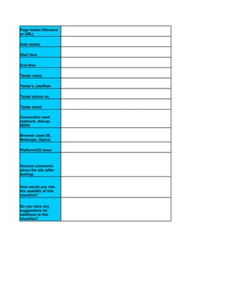
  • 1. Page tested (filename or URL) Date tested Start time End time Tester name Tester's Job/Role Tester phone no. Tester email Connection used (network, dial-up, ISDN) Browser used (IE, Netscape, Opera) Platform/OS Used General comments about the site (after testing) How would you rate the usability of this checklist? Do you have any suggestions for additions to this checklist?
  • 2. Severity Criteria No. Yes No N/A (0-4) Visual Presentation and 1 Design Does the page layout contain enough open space to not be 1.1 cluttered? Is the page moderate in its use of 1.2 color? Is page length appropriate in its 1.3 content? Does the page provide feedback whenever possible (e.g., "reply" 1.4 screen for forms-based pages)? Is the page length two screens or 1.5 less? Can each page "stand alone"? 1.6 Is the formatting scheme logical 1.7 and standard? Are row and column headers 1.8 visible for data tables? Is the site aesthetically pleasing 1.9 enough to keep users interested? Is the text (size, color, font) on the background (color, texture, 1.10 etc.) easy to read? Are the text columns no wider 1.11 than 3.5 inches on your screen? Do graphic elements (photos, 1.12 images, etc.) match context? 2 Clarity of Communication 2
  • 3. Can you determine quickly the purpose and features of the 2.1 page? Can you easily find contact 2.2 information? Can you easily send an email to 2.3 the contact person? Are links and icons labeled in a 2.4 way that makes sense? Are clear instructions given for 2.5 performing processes? Are FAQs organized by 2.6 category? Are information and error messages useful, accurate and 2.7 correctly spelled? Does the page convey a clear 2.8 sense of its intended audience? Is the language used in a way that's familiar and comfortable to 2.9 you? Are the page title and headings 2.10 short and meaningful? Is the language kept clear and 2.11 simple? Are header elements used to 2.12 convey page structure? Is the target of each link clearly 2.13 identified? Are acronyms and abbreviations 2.14 defined? Are the contents ordered in a logical way (e.g., alpha, 2.15 temporally, spatially, categorically, or by magnitude)? Are you provided with a preview of what will happen or where you'll go before you click on a 2.16 hyperlink? 3
  • 4. Is information "chunked" into short, readable paragraphs or 2.17 bullets? page use an "inverted Does the pyramid" information structure, with summary information 2.18 presented first, followed by more detail? page title accurately Does the describe the contents of the 2.19 page? Navigation 3 Is there a lack of excessive "page bouncing" where you must visit several pages to get the 3.1 information you need? Is there a link to a site map, site index or list or commonly 3.2 accessed sections? Is hyperlinking used frequently, to prevent large pages from ` 3.3 being` downloaded? Is there a clear and obvious link 3.4 to the home page? Is the navigation flow consistent 3.5 and logical? Does the page use (approximately) standard link 3.6 colors? Are the links obvious in (i.e., clearly labeled for) their intent 3.7 and destination? Is there a convenient, obvious way to maneuver among related pages, and between different 3.8 sections? Are meaningless links avoided? 3.9 Are links provided to other 3.10 relevant pages? 4
  • 5. Are links provided to more in- 3.11 depth coverage of information? Are navigational aids provided on both the top and bottom of each page (if page is longer than one 3.12 screen in length)? Is this page easy to find from 3.13 other pages? Can you search the entire site 3.14 from this page? Does the site avoid "orphaned" 3.15 pages? Does the page avoid the need to 3.16 scroll horizontally? Is there a "you are here" visual 3.17 cue? Does all underlined text link to 3.18 something else? 3.19 Consistency 4 Is the page visually consistent in its "look and feel" with other 4.1 pages? Is the page visually consistent 4.2 even without graphics? Are navigation elements used 4.3 consistently? Accessibility 5 Are graphics optimized to 5.1 download quickly? 5
  • 6. Can a user navigate using text 5.2 only? Are response times fast enough 5.3 to keep you in a flow state? Does the page allow mistakes to 5.4 be easily undone? Is load time appropriate to 5.5 content, even on a dial-up? Is there a text equivalent for every non-text element? (e.g., image map regions, animation 5.6 scripts, audio and video) Is the text readable by people with color blindness? 5.7 Are ALT attributes used to describe images? 5.8 General/Other 6 Is there a "printer friendly" 6.1 version for this page? Are all links active (live)? 6.2 Do all CGI scripts work? 6.3 Does every form have a 6.4 function? Do you immediately see the 6.5 results of your actions? 6
  • 7. 7
  • 9. 9
  • 10. 10
  • 11. 11
  • 12. 12
  • 13. 13
  • 14. Heuristic Principle Severity Met Violated N/A (0-4) Comments/Suggestion to Remedy Problem 1. Organize data into meaningful framework. Organize the user interface purposefully, in meaningful and useful ways that put related things together and separate unrelated things based on clear, consistent (conceptual) models or site metaphors that are apparent and recognizable to others. 1.1 Keep all needed options and materials for a given task visible without distracting the user with extraneous or redundant information. 1.2 Instead of cramming everything about a product or topic into a single page, use hypertext to structure the content space into a starting, overview page and several secondary pages that each focus on a specific topic. Help users avoid wasting time on subtopics that don’t concern them. 1.3 Recognize that users rarely read Web pages word by word; instead, they scan the page, picking out individual words and sentences. Use lists, headings, and other HTML formatting tools to help users find the information that suits their needs. 2. Visibility of system status: Keep users informed about what is going on, through appropriate feedback within reasonable time. 2.1 Structure helps users navigate. Without structural links, pages are orphaned in cyberspace. Provide users with a path to higher levels of navigation and content. (example: breadcrumbing)
  • 15. 2.2 Accommodate and support user-controlled navigation. Do not force users through set paths. Make alternate paths easy to follow, consistent, and logical. 2.3 Provide feedback by keeping users informed of actions or interpretations, changes of state or condition, and errors or exceptions using clear, concise, and unambiguous language familiar to users. 3. Match between system and the real world: Speak the users’ language, with words, phrases and concepts familiar to the user, rather than system- oriented terms. Follow real-world conventions, making information appear in a natural and logical order. 3.1 Avoid using technical, scientific or legal language. On main pages of the site, create content that can be understood by a general audience. 3.2 Provide a simple process for completing simple tasks. 3.3 When creating your site’s navigation, do not simply copy your organization’s structure. Create a navigation design and options that reflect user tasks on your site. 4. User control and freedom: Be flexible and tolerant, reducing the cost of mistakes and misuse by allowing undoing and redoing while preventing errors wherever possible by tolerating varied inputs. Provide users with a clearly marked "emergency exit" to easily recover from mistakes.
  • 16. 4.1 Don’t disable the Back button on a browser by opening a new window or using an immediate redirect. The Back button is the second-most used navigation feature (after following hypertext links). Users know that they can try anything on the Web and then click on the Back to return to familiar territory. 4.2 Help users recognize, diagnose and recover from errors by providing error messages that are written in plain language (not code), clearly indicate the problem, and constructively suggest or provide a solution. 5. Consistency and standards: Reduce the need for users to rethink and remember by reusing internal and external components and behaviors, maintaining consistency with purpose rather than merely arbitrary consistency. Follow platform conventions. 5.1 Do the same as everybody else. If most big Web sites do something in a certain way, then follow along. Users will expect things to work the same way on your site. 5.2 Avoid using HTML that does not comply with standards or causing the user’s browser to engage in a nonstandard behavior. 6. Error prevention: Even better than a good error message is a careful design which prevents a problem from occurring in the first place. 6.1 Use link titles to provide users with a preview of where each link will take them, before they have clicked on it. Help them avoid waiting for unnecessary page downloads.
  • 17. 6.2 Avoid link-rot by keeping pages up indefinitely once they have been put on the Web or provide redirect messages and auto-redirect capabilities. Other sites may link to your page. Users may have bookmarked the page because they want to go directly to a relevant part of your site. Search engines are slow in updating their databases, so they too will lead users astray if you remove pages. 6.3 Avoid using a new technology if you suspect that a large percentage of your users have not adopted the new technology. 7. Recognition rather than recall: Make objects, actions, and options visible. The user should not have to remember information from one part of the dialogue to another. Instructions for use of the system should be visible or easily retrievable whenever appropriate. 7.1 Provide search if the site has more than 100 pages. 7.2 Write straightforward and simple headlines and page titles that clearly explain what the page is about and that will make sense when read out-of- context in a search engine results listing. 7.3 Structure the page to facilitate scanning; for example, use grouping and subheadings to break content into smaller "chunks." 7.4 Page titles, headlines, and subject lines needs to clear and succinct. You only get 40-60 characters to explain your content. Unless the title or subject makes it absolutely clear what the page or email is about, users will never open it.
  • 18. 8. Flexibility and efficiency of use: Accelerators -- unseen by the novice user -- may often speed up the interaction for the expert user such that the system can cater to both inexperienced and experienced users. Allow users to tailor frequent actions. 8.1 Create the default interface as simple as the task will allow, offering more powerful features available to intermediate or expert users through customizable interfaces, keyboard shortcuts or other subtle mechanism. (an example: provide a basic search on every page with a link to an advanced search option for those who want to use it). 9. Aesthetic and minimalist design: Include in the displays only the information needed by the user at that given time/place. Every extra unit of information in a display competes with the relevant units of information and diminishes their relative visibility. 9.1 When designing for the Web, download speed must be the overriding criterion. To keep page sizes small, graphics should be kept to a minimum, and multimedia effects should be used only when they can add to a user’s understanding of the information. Keep it simple. 9.2 Split long pages of text into multiple pages, connected with hyperlinks. Each "chunk" of content should cover a specific topic. No more, no less. 9.3 Avoid creating huge scrolling pages of text; as they move down the page, users will no longer be able to see navigation options. or….
  • 19. 9.4 Practice judicious redundancy. For example, on a long page with a lot of content, repeat the navigation that disappears as the user scrolls down. 10. Help and documentation: Any Help or documentation should be easy to search, focused on the user’s task, list concrete steps to be carried out, and not be too large. 10.1 When writing documentation, provide multiple examples to help the user contextualize their problem. 10.2 When designing help, begin with “how do I…” for topics that show the user how to accomplish a task.
  • 20. Please read each statement carefully and check a number from 1 to 7, where "1" means you strongly disagree with the statement and "7" means you strongly agree with the statement. Strongly Strongly Statement 1 2 3 4 5 6 7 N/A Disagree Agree The site satisfied the needs of various audiences. The site was easy to use. The site was useful. The site provided material appropriate for the audiences. The site did everything I expected it to do. The fewest steps possible were required to accomplish each task. I was able to use the site successfully. With a little practice, I could become skillful with the site. The site used words and phrases that were familiar to me. Content was presented in an intuitive and logical manner.
  • 21. I didn't wonder whether words or buttons on the same page meant the same thing. I didn't have to remember information on one page in order to successfully accomplish something on another page. Content provided by the site was relevant to my needs. I would recommend a site like this one to a friend or family member.
  • 22. Heuristic Ratings 0 I don't agree that this is a usability problem. 1 Nominal problem only -- fix if time permits or if changing other things at that location 2 Minor usability problem -- fixing this should be given low priority. 3 Major usability problem -- important to fix, so should be given high priority. 4 Usability catastrophe -- imperative to fix this before product can be released.