Melbourne style guide
•
3 gefällt mir•932 views

Another branding style guide, this time from the fine folks at Melbourne. Crisp, smart, nicely done

Empfohlen
Weitere ähnliche Inhalte
Andere mochten auch
Andere mochten auch (20)
Ähnlich wie Melbourne style guide
Ähnlich wie Melbourne style guide (20)
Mehr von MoodLabs
Mehr von MoodLabs (10)
Kürzlich hochgeladen
Kürzlich hochgeladen (17)
Melbourne style guide
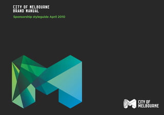
- 1. City of Melbourne Brand Manual Sponsorship styleguide April 2010
- 2. 2 Contents Definitions 3 Our Brandmark 4 Brandmark Lock-ups 5 Colour Palette 6 Clear Space 7 Minimum Size 8 Co-sponsorship 9 Incorrect Usage 10 File names 11 Contact 13 Intro The City of Melbourne corporate Identity is a visual representation of our brand positioning. It enables a unified, positive, flexible and future focus for the City of Melbourne. The following pages explain the multiple iterations of the City of Melbourne corporate identity system, and the rules around using them correctly to create an inspiring and forward thinking brand. Please follow the guidelines carefully. We have developed these guidelines to help to build and maintain a clear, consistent and successful visual identity.
- 3. A. Symbol The ‘M’ element in all colour versions. B. Type The words ‘City of Melbourne’. C. Lock-up The configuration of the symbol (A) and the type (B). D. Brandmark The brandmark (D) is the ‘M’ symbol in any of it’s versions (A), the type ‘City of Melbourne’ in either one or two lines (B) when used together in either lock-up (C). A+B+C=D definittions3
- 4. The City of Melbourne brandmark is a visual representation of our brand, and its integrity must be maintained at all times. It comprises of two elements: The Symbol The Type The brandmark must always appear in the proportions shown, and no attempt should be made to redraw, stretch, squeeze or distort the brandmark in any way. 4 Our Brandmark
- 5. The brandmark elements (symbol and type) can be used in two different lock-ups: Sponsorship A Stacked right Sponsorship B Horizontal stacked Brandmark lock-ups sponsorship A (Preferred lock-up) sponsorship B Used when legibility of the ‘City of Melbourne’ type requires equal prominence to the ‘M’ symbol, or where there are space and layout restrictions. For medium scale usage where the ‘City of Melbourne’ type needs greater prominence. Note minimum height of full colour symbol is 10mm. sponsorship A (Preferred lock-up) sponsorship B Used when legibility of the ‘City of Melbourne’ type requires equal prominence to the ‘M’ symbol, or where there are space and layout restrictions. For small scale usage where the ‘City of Melbourne’ type needs greater prominence. sponsorship A (Preferred lock-up) sponsorship B Used when legibility of the ‘City of Melbourne’ type requires equal prominence to the ‘M’ symbol, or where there are space and layout restrictions. For medium scale usage where the ‘City of Melbourne’ type needs greater prominence. Note minimum height of lined symbol is 10mm. 5
- 6. Background colour - DARK Background colour - LIGHT When used in a sponsorship capacity, the City of Melbourne colour palette consists of 2 variations – the ‘corporate’ blue and green as appears on page 4 and the ‘mono’ versions as per the additional examples on the same page. Colour usage The colour brandmark should only be used on a light or white background or dark or black background. The colour brandmark should never be reproduced as a grayscale brandmark. Use the mono versions. The 2 mono versions can both be used in positive and negative formats. For example, the black brandmark on white or light colour background or the white brandmark reversed out of a black or dark colour background. 6 Colour Palette
- 7. To maximise the brand’s presence and visual standout, there is a defined minimum clear space area. This clear zone around the brandmark defines the area into which no other graphic elements, such as text, imagery or other brandmarks can intrude. The distance marked x represents the width of the ‘M’ symbol leg. The formula shown opposite applies to all sizes of brandmark reproduction. Clear space X X X X X 1/2 X 1/2 X X 1/2 X 1/2 X 7
- 8. For ease of recognition, a minimum size has been set for the different versions of the brandmark, in order to assure successful reproduction. MINIMUM SIZE full colour brandmark minimum size preferred Solid Brandmark at minimum size ‘M’ height 10mm ‘M’ height 12mm Recommended small scale usage ‘M’ height 5mm ‘M’ height 10mm ‘M’ height 5mm Solid BrandmarkS minimum sizes 8
- 9. SINGULAR MULTIPLE When the City of Melbourne brandmark needs to sit side by side an additional sponsor or supporter, size, placement and relevance need to be considered. The Sponsorship A stacked right version of the brandmark should be used for the majority of co-sponsorship uses due to the equal legibility of symbol and ‘City of Melbourne’ type. The Sponsorship B horizontal brandmark can be used when proportionally a better match. CO-SPONSORSHIP When brandmarks must work side by side, the secondary brandmark must appear in equal size to the City of Melbourne brandmark. Taking the size ruling of the above singular rule, place multiple supporter brandmarks next to each other, adequate spacing must be left between each supporter brandmark. 9
- 10. CITY OF INCORRECT USAGE To maintain consistency throughout our identity application it is essential that the brandmark is never altered in any way. Here are a few examples of what not to do. The same rules shown here, will apply to the alternative configurations of the brandwork. It is essential that the brandmark is always reproduced from the master artwork. Do not use multiple patterns within a keyline brandmark. Do not use a colours that do not sit next to each other in the colour wheel. Do not place a facet on the same gradient used within the facet. Do not fill in the keyline brandmark sporadically. Do not use the grid and facet patterns together. Do not use conflicting colours together. Never place the brandmark on a very conflicting colour. Do not redraw the master brandmark. Do not put random elements inside brandmark. Do not place a facet on the same colour used within the facet. Do not use multiple colours that do not sit next to each other on the colour wheel within any brandmarks. Do not use brush strokes or change the keyline. Do not outline. Do not alter the configuration of the typography. Do not use multiple colours within a keyline brandmark. Do not use images within as master brandmark. Do not use ‘City of Melbourne’ type on its own. Do not change the ‘City of Melbourne’ type with other fonts. Do not use drop shadows. Never distort/stretch brandmark. Do not change the proportion/ relationship between the brandmark and the ‘City of Melbourne’ type. Do not use glows. Do not put brandmark on a perspective. Do not add any other elements within the clear space defined. Do not colour multiple shards within a facet with uncomplimentary colours. 10
- 11. The following are the exact file names for the corresponding brandmark. File Names CoM_sponsor_secA_Colour.eps CoM_sponsor_secB_Colour.eps CoM_sponsor_secA_Solidlines.eps CoM_sponsor_secB_Solidlines.eps CoM_sponsor_secA_Solid.eps CoM_sponsor_secB_solid.eps 11
- 12. The following are the exact file names for the corresponding brandmark. File Names CoM_sponsor_secA_Colour_Rev.eps CoM_sponsor_secB_Colour_Rev.eps CoM_sponsor_secA_Solidlines_Rev.eps CoM_sponsor_secB_Solidlines_Rev.eps CoM_sponsor_secA_Solid_Rev.eps CoM_sponsor_secB_solid_Rev.eps 12
- 13. For all City of Melbourne brandmark usage, artwork must be approved by a City of Melbourne Brand and Marketing staff member before proceeding. holly.franklin@melbourne.vic.gov.au janice.tyler@melbourne.vic.gov.au paul.custy@melbourne.vic.gov.au Contact13