
Empfohlen
Weitere ähnliche Inhalte
Ähnlich wie Storywraps report
Ähnlich wie Storywraps report (20)
Kürzlich hochgeladen
Kürzlich hochgeladen (20)
Storywraps report
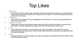
- 1. Top Likes 1. Reactions • Participants loved that wide range of possible reactions, especially the emotions as it allowed them to have more nuanced interactions with content and other users. The emotion reactions also lent a sense of fun to the app. 2. Chatterbox • Users liked the concept of having an aggregation of information on a story. Users especially liked video and news content. 3. Reaction Counter • Respondents enjoyed being able to clearly keep track of the number and types of reactions they had posted. They also enjoyed being able to see this information about other users. 4. Cast • Users liked that information on cast member was easily accessible. This was both a fun and functional feature as respondents noted that they often look up this information and appreciate that it is easily accessible. 5. Feed • Curation of stories in a single location was easy and simple and delivered information that the users were interested in seeing.
- 2. Top Dislikes1. Profile Page • Users were confused about the profile features and had a hard time differentiating between the pie chart and reaction grid. Many also felt that the layout was not pleasing and did not think the screen real estate was used well. Most suggested that a user’s comments be the first thing that appears. 2. Personalization • Participants wanted to be able to personalize their profile more, adding location, about me, and a picture after they had begun using the app. They felt that the profile picture and name were not large enough. 3. Search • The search feature did not work when users chose to type in their own cast member or story. In some cases cast member such as Lisa Vanderpump, clearly listed in a story did not yield any results. Users wanted to be able to look up stories that were not listed and possibly suggest their own. Having the search feature spread into three categories was also confusing to users, most wanted a simply search box. 4. Color Scheme • Users felt that the app was very 2 dimensional and the color scheme was somewhat abrasive and reminded them of early web apps. Many suggested using lighter colors with a clean white background. 5. Comments • Users were very frustrated that they could not immediately see where their posts and comments had ended up when posting from the story page. They wanted to make sure that their post went through and that they did not make any spelling errors, some also asked for autocorrect. Very few respondents found their comments on the recent page.
- 3. Top Issues1. Complexity of interface • The complexity and levels of the app make it difficult for users to intuitively pick up on actions and features. For all most all users details such as color and numbers indicating popularity next to stories, posts, cast members etc. were either overlooked or confusing. The multiple places to post from within the app were also confusing and caused users to think each place to post from had a different feature. A more universal language needs to be applied both in terms of navigation, like having 1 post button, and signifiers like colors and numbers. 2. Relevancy and validity of content • Users were concerned with sources of news articles and social media content because they wanted to ensure they were receive truthful information. They were also concerned with the relevancy of information posted by other users, for example some users tagging videos as trailers when they were not. One might considered implementing some sort of flagging or reporting system to make users feel like they have control over the quality of content that is coming in. 3. Navigation • The general navigation of the app was very confusing to most users. This caused them to spend time either only on the feed or on story pages, as they could not figure out how to navigate out of those streams. This was further complicated by issues with swiping to move to different screens. 4. Unique Value Proposition • Unclear expression of UVP left users confused as to the point of the app. The concept of stories did not translate to users who then sought out information on hobbies such as cooking and automobiles. 5. Personalization • Lack of ability to personalize account left users wanting more. Many also sought more information on other users via their profile to understand their similarities and decide if they wanted to follow. Users also sought more personalization of their feed wanting to decide the number of posts coming from certain stories.
- 4. Top Issues Cont.1. Social interaction • Lack of clear types of social interaction of the app left users wanting more. Many asked for direct messaging or chat rooms and felt that commenting on posts was not enough discussion. 2. Tutorial • Many respondents did not recall the hints and felt that more direction would have been helpful in learning how to navigate the app. 3. Differentiator • Some users questioned what set the app apart from other sites andapps that they currently get their information from. Users seemed to focus on social media, news and video content rather than user generated content, making it appear the STORYWRAPS was not bringing anything new to the table. 4. Language • Lack of relevant, clear, and consistent language confused users. Terms such as cast, episodes, and send were confusing to users. For stories of sports and current events users felt that cast did not make sense. Users also associated episodes with video and thought that episodes would lead them to links where they could go back and watch clips, highlights, and even full episodes. Send button instead of post caused users to think that their posts were getting sent to different locations or individuals, this prevented them from wanting to post and join the conversation. 5. Volume • Sheer volume of content was overwhelming to users, many did not know where to start or quickly left articles, episodes and cast summaries because they felt that the text was too long.
- 5. Next Steps1. Clarify UVP and definition for stories • Help users better understand the point of the app, this could be expressed through the initial tutorial and what pages are emphasized in the navigation of the application. • This might also mean emphasizing that that it is not just aggregating information on these stories, but the user comments and reactions that are the most important 2. Simplify interface • Get rid of buttons that currently have no function (camera button on left side of post bar, and gray button next to source on news sections) • Have one universal location to “join conversation” or post from • Remove number and colors on story page that correlate to popularity, remove or rethink number on cast and posts (users did not understand what this meant) 3. Redesign profile page • Alter layout to have better screen real estate usage • Possibly do away with pie chart • Rectify color discrepancy in pie chart and reaction grid. Currently colors correlate to an emotional reaction as well as a story. Using the same color, for example yellow, to represent both joy and game of thrones is very confusing to the user. • Allow users to edit their profile from their profile page including add a picture, about me, location, and visual representation of stories that are followed. 4. Shorten content • Shorten and simplify content like episodes and cast bios 5. Comments • Immediately show users where their comments have shown up within a story page, not just on the recent feed • Implement autocorrect or spell check
- 6. 0 2 4 6 8 10 12 IDI 1 IDI 2 IDI 3 IDI 4 IDI 5 IDI 6 IDI 7 IDI 8 IDI 9 IDI 10 IDI 11 IDI 12 Like Ease Ratings Average Like: 6.375 Average Ease: 7.16